| database: | GenBank | EMBL | DDBJ |
|---|---|---|---|
| maintained by: | NCBI (National Institute of Biotechnology Information, USA) | EBI (European Bioinformatics Institute, GB) | NIG (National Institute of Genetics, Japan) |
| access, search: | Entrez | SRS | getentry |
| URL: | ncbi.nlm.nih.gov | ebi.ac.uk | ddbj.nig.ac.jp |
Bioinformatics
A text developed for an introductory bioinformatics course at the University of Potsdam
version: 2022-09-08
Stefanie Hartmann
1 Bioinformatics?
You are studying to (possibly) be a scientist! You’re studying computer science or a natural science such as biology – but what is science? Science on the one hand is the body of knowledge that represents our current understanding of natural systems. So far in your studies, you probably have mostly had to learn and memorize parts of this body of knowledge. You had to remember facts and definitions and discover connections between them.
Science is also the process that continually extends, refines, and revises this body of knowledge. This is a more active aspect of science: you need to do something, apply knowledge or methods, interpret results, think about connections and hypotheses and possible causes, and come up up with strategies to test hypotheses. This aspect of science most likely hasn’t been too prominent in your studies so far, but it’s what this course is all about.
When you have worked through this chapter, you should understand why every biologist today is also a bioinformaticist. You should be able to give an example, in very general terms, of how computational analysis of biological data can be used to answer questions in biology.
1.1 So you’ll want to be a biologist?
You might want to be a biologist because you are interested in studying the natural world, and because you want to do basic or applied science. For this, you’ll need of course the current content knowledge of your field of study, and of related fields. This is what you have learned in your courses so far: biochemistry, molecular biology, physiology, genetics, ecology, evolution, and more. But as just mentioned, as a scientist you’ll also need skills! You need to be able to think critically, solve problems, collect data, analyze data, interpret data / results, collaborate and work independently, communicate results, read & analyze primary literature, and much more. Over the last several decades, our biological content knowledge has constantly increased – both in breadth and in depth. Accordingly, the tools that scientists commonly use have also changed.
If you had studied biology 100 years ago or so, maybe you would have studied organisms and their properties. By observing and describing them, you might have been interested in their taxonomy and classification, or in their evolution. Regardless, your tools most likely would have been paper and pen, and maybe a microscope, depending on the organism under investigation.
Around 70 years ago or so, the first ‘revolution’ in biology took place: with the development of molecular biology techniques, for the first time it was possible to study details about underlying mechanisms of life. The availability of means to study DNA and heredity, ATP and energy, or conserved protein and DNA sequences, for example, lead to a reductionist approach to study biology. The focus shifted, and biologists studied phenomena at the level of molecules and genes, of individual metabolic processes. The relevant tools were, for example, pipettors, agarose and polyacrylamide gels, PCR machines, and also increasingly computers.
The next revolution took place rather recently, maybe 15 years ago or so. It was the development of two fields in parallel that fed off each other: The technologies for high-throughput data acquisition (such as next generation sequencing), and also the development and improvement of information technology and the internet. The modern biologist, regardless of his chosen field of study, uses computers to manage and analyze data. If bioinformatics is the collection, storage, and analysis of biological data, then in 2020 every biologist is a bioinformaticist. Which is why you’re required to take this course if you’re a BSc biology student.
1.2 Biology today
Today, biological data is generally generated in an electronic format. Even if data is collected in the field, it is usually converted into an electronic format afterwards. And apart from the data you collect or generate yourself, there is an enormous amount of public data available online, and all of that is in electronic format. Many different data types and formats exist, and in this course you’ll work with the most commonly used ones.
Here are some examples of biological data that is commonly used in today’s research:
sequences: strings of nucleotides or amino acids
graphs (networks): metabolic pathways, regulatory networks, trees
small molecules: gene expression data, metabolites
geometric information: molecular structure data
images: microscopy, scanned images
text: literature, gene annotations
You will learn how to analyze some of these data types computationally. This includes learning about which data analysis tools exist and how they work, so that you can decide which tools are appropriate for a given data set or biological question. You will have to learn how these tools work in practice, i.e., what kind of data and which data formats they accept as input, and what the output looks like and means. Both of these aspects will be covered in this course.
To get started, I’ll focus on sequence data, which is currently the most abundant data generated by any of the high-throughput technologies. I’ll use sequence data as an example for learning computational data management and analysis skills, but later in the semester I’ll also cover protein structure and networks.
Sequence data is not just abundant, it is also relevant for just about any taxonomic lineage and biological discipline: Botany, zoology, microbiology, virology, evolution, ecology, genetics, cell & developmental biology, physiology, biochemistry, clinical diagnostics, pharmacology, agriculture, and forensics – they all use sequence data to answer questions in their respective fields.
Take a look at the research and publication sites of some of the biology groups at the University of Potsdam (https://www.uni-potsdam.de/de/ibb/arbeitsgruppen/professuren-ags): Regardless of whether they do field work or lab work, regardless of whether they do research on animals or plants, basic or applied science, they do computational data analysis to explore large and complex data sets, and to extract meaning from these data. Chances are, you’ll have to do computational data analysis for your bachelor thesis work.
Here are five (more or less) randomly selected articles that were recently published by groups working at the biology department here in Potsdam and their collaborators:
plant ecology, Prof. Lenhard, 2020: Supergene evolution via stepwise duplications and neofunctionalization of a floral-organ identity gene (https://doi.org/10.1073/pnas.2006296117)
marine biology, Prof. Wagner, 2021: The Microbiome Associated with the Reef Builder Neogoniolithon sp. in the Eastern Mediterranean (https://doi.org/10.3390/microorganisms9071374)
animal physiology, Prof. Seyfried, 2020: Antagonistic Activities of Vegfr3/Flt4 and Notch1b Fine-tune Mechanosensitive Signaling during Zebrafish Cardiac Valvulogenesis (https://doi.org/10.1016/j.celrep.2020.107883)
animal evolution, Prof. Hofreiter, 2020: Early pleistocene origin and extensive intra‑species diversity of the extinct cave lion (https://doi.org/10.1038/s41598-020-69474-1)
animal biology, Prof. Fickel, 2021: Genome assembly of the tayra (Eira barbara, Mustelidae) and comparative genomic analysis reveal adaptive genetic variation in the subfamily Guloninae (https://doi.org/10.1101/2021.09.27.461651)

You don’t need to read these articles in detail, but if you do skim them, you’ll find that they all use large amounts of sequence data to answer a biological question. Some of the data was generated in the context of the study: selected gene sequences, for example, or even entire organellar or nuclear genomes. Some data required for these analyses was already publicly available and had to be downloaded from online databases.
If you take a look at the methods sections of these articles, you’ll see that an important and large part of these studies was the computational analysis of data, and with a great number of different programs. For many of these analyses, sequence data was compared against itself or against public data for the purpose of assembly, identification of homologs, variant discovery, alignments and phylogenies, to assign taxonomic lineage, or to predict functions and effects on phenotype, for example.
These articles describe studies that were designed by biologists who were motivated by biological questions. They were interested in animal or marine biology, in plant or animal ecology, or in animal physiology of medical relevance. Using computer programs for data analysis wasn’t their goal, but it just happened to be what was required to get the job done. For these biologists, bioinformatics wasn’t a biological discipline itself, it was simply a toolbox. And that’s exactly how I’ll use bioinformatics in this course.
1.3 Bioinformatics as a toolbox
In this course, data and questions and motivation come from biology, and bioinformatics is only the toolbox for data analysis. This includes
algorithms (methods) for data analysis
databases and data management tools that make data accessible
presentation and visualization tools to help comprehend large data sets and analysis results
I will introduce and cover many different tools and show their relevance and application. In some weeks, the focus will be on analysis methods, and in other weeks the focus will be on their application. My goal is to provide an overview of the concepts, applications, opportunities, and problems in bioinformatics research today. You will gain practical experience with commonly used tools for biological research; some of them will be used only once, but a number of them will be used in multiple weeks, with different data and different objectives. If all goes as planned, in February of next year, you will be able to:
understand the principles and applications of important tools for biological data analysis
search and retrieve genes and associated information (sequences, structures, domains, annotations, ...) from science online databases
perform small-scale analyses of sequences and structures using online analysis tools
statistically describe and explore biological data, using the software package R
The specific schedule of topics will be given in the lecture.
These topics covered in this class are, however, only the tip of the bioinformatics iceberg! In one short semester, I can only cover the basics and selected topics. You might learn about additional bioinformatics tools and applications in other BSc or later in MSc courses, during your BSc thesis work, or when you’ll need them for a job or project. And some of the tools you will never learn about or use, and that’s ok, too.
2 Background: molecular genetics, sequence data
What is a gene? What is an intron? Which are the four bases found in DNA? What is meant by “complementarity of DNA” or “degenerative code”? What is an “open reading frame”? How are genomes and genes sequenced? If you don’t have problems answering these questions, you can skip this chapter. Otherwise: read on! This chapter presents a very condensed introduction to molecular genetics, although I start out with an overview of what early scientists knew about genes and inheritance even before it was clear that the molecule behind it all is actually DNA, deoxyribonuleic acid. I skip a lot of details that can be looked up in other textbooks. At the end of the chapter I provide a very brief overview of DNA sequencing. However, this is a rapidly developing field, and online information probably is a good supplement to this section. My main aim is to introduce the terms and concepts that will be important for later chapters.
When you have worked through this
chapter, you should be able to define the following terms and explain
the following concepts.
Terms: genotype, phenotype, DNA, allele, chromosome,
diploid, haploid, genome, exon, intron, transcription, translation,
(open) reading frame sequencing, sequence assembly, genome,
transcriptome
Concepts: gene vs. protein, nucleotides vs. amino
acids, complementarity of DNA strands, nuclear vs. organellar genomes,
eukaryotes vs. prokaryotes, first vs. next generation sequencing,
principles of sequencing by synthesis
2.1 Before the double-helix
2.1.1 It started with peas ...
It started with an Austrian monk, the famous Gregor Mendel (1822-1884), who crossed peas (Pisum sativum) and traced the inheritance of their phenotypes. A phenotype, or trait, is some characteristic that can be observed. The phenotypes of pea plants that Mendel investigated were for example, the color, size, or shape of peas, or the color of flowers or pea pods.
Mendel started with true breeding plants, these are called the parental (or P) generation. When he crossed parental plants that produced only green peas with those that produced only yellow peas, he noticed that the next generation (the F1, or filial 1 generation) produced all yellow peas and no green peas at all. However, in the following generation (the F2, or filial 2 generation), the green peas reappeared – but only at a ratio of 1:3 (Figure 2.2). This phenomenon of a trait not showing up in one generation but still being passed on to the next generation was observed for other pea phenotypes as well: crossing true breeding wrinkled peas and true breeding round parental peas produced only round F1 offspring. Again, in the F2 generation, Mendel observed for every three round peas also one wrinkled pea.
This is only a very small part of Mendel’s research results, and more on his experiments can be found in any introductory genetics textbook. For our purpose of defining a gene, I summarize the following:
the inheritance of a phenotype, or trait, is determined by “hereditary units” that are passed on from parents to offspring. These hereditary units are what are called ‘genes’ today.
alternative versions (green or yellow peas) of these traits exist. Today these alternative versions are called alleles. For each trait, an individual inherits two alleles: one from each parent.
other terms that are generally introduced in this context are the following, although they are not discussed further in this chapter or elsewhere in this book
dominant: a dominant allele is the one that is active (expressed) when two different alleles for a given trait are in a cell
recessive: an allele that is only active (expressed) when two such alleles for a given trait are present in a cell; when one dominant and one recessive are present, the dominant allele is expressed
homozygous: refers to having two identical alleles for a given trait, two dominant or two recessive alleles
heterozygous: refers to having two different alleles for a given trait, one dominant and one recessive allele
2.1.2 ... and continued with flies
Thomas Hunt Morgan (1866-1945) made the next important contribution by tracing Mendel’s hereditary units to chromosomes. Morgan and his students worked with fruit flies and not with peas, but their premise was the same: they crossed fruit flies Drosophila melanogaster with different phenotypes and traced their inheritance through the generations.
Among the traits that Morgan studied were the color of the flies’ eyes: red or white. He kept track of the flies’ gender and noticed that Mendels’ principles held up for his fly crosses as well – but that it was only the males (symbol: ) that ever had white eyes (Figure 2.3). The females (symbol: ) never ended up with white eyes.
Microscopic analyses had already revealed chromosomes, structures that occurred in pairs, but whose function was yet unknown. Thomas Hunt Morgan deduced that one member of each such homologous pair came from each of the parents of an organism. He also noticed that females always have identical pairs of chromosomes, but that males have one pair of unmatched (homologous) chromosomes: Fruit fly males have identical pairs of autosomal chromosomes (autosomes) but their sex chromosomes consist of one X chromosome that is inherited from their mothers and one Y chromosome that is inherited from their fathers. Females, in contrast, have the same set of autosomal chromosomes and a set of identical X chromosomes. X and Y chromosomes are the sex chromosomes, the ones that determine the gender of fruit flies and many other organisms. Morgan correlated the inheritance of eye color with the sex chromosomes and deduced that the hereditary unit responsible for the white and red eye colors may be located on these chromosomes.
Morgan and his colleagues studied many other traits in the fruit fly, and from their careful work they concluded that
genes are arranged linearly on chromosomes
genes that are near each other on the same chromosome tend to be inherited together
with an increased size between genes, there is increased recombination (the exchange of genetic material between pairs of homologous chromosomes, see below.)
Their research on flies revealed another very important aspect of how genes influence phenotypes. The traits studied by Mendel were determined by single genes, and today these kinds of traits are called monogenic. Although early geneticists believed that pretty much all traits were monogenic, Morgan found evidence to the contrary. Today we know that most traits are polygenic, also called complex traits: Multiple genes contribute to the phenotype. Moreover, environmental factors are generally also involved in the development of a complex trait.
2.1.2.1 A small digression: meiosis
Meiosis is the process by which gametes (i.e., sperm and egg cells in humans) are produced. Each of the two alleles for a given trait of Gregor Mendel’s peas or Thomas Hunt Morgan’s flies come from one of the parents. Before two parents can produce offspring, their gene set must be reduced in half – otherwise we’d have a doubling of genetic material after each new generation of offspring!
The process that reduces a diploid cell (i.e., a cell that contains two homologous copies of each chromosome) into four haploid gamete cells (i.e., four cells that each have only half the number of chromosomes) is called meiosis. It is is schematically shown in Figure 2.4. During meiosis, a crossing over between paired homologous chromosomes results in the exchange of genetic material, or recombination. This results in offspring having a genetic composition that is different from either parent.
2.1.3 One gene – one enzyme
The next important results for defining genes came not from genetics but from biochemistry. By 1910 or so it was clear that enzymes catalyze biochemical reactions: enzymes can, for example, convert one molecule into another by breaking down or synthesizing biomolecules.
George Beadle (1903-1989) and Edward Tatum (1909-1975) discovered in the 1940s that mutations in genes could cause defects in defined steps of metabolic pathways. The main conclusion from their work was that specific genes correspond to specific enzymes, and these enzymes are responsible for the reactions of specific steps in biochemical pathways. How did they come up with this result?
Beadle and Tatum worked with the bread mold Neurospora crassa that can easily be cultured in the laboratory. They mutated the bread mold by exposing it to radiation and then studied how the mutant Neurospora could not survive on a medium that wasn’t supplemented with specific essential nutrients such as vitamins.
Further biochemical and genetic analysis by Beadle and Tatum showed that they had mutated (“knocked out”) specific genes. These mutated genes could not carry out their normal functions in metabolic pathways, for example the synthesis of essential nutritional components. In order to survive, the bread mold therefore had to be given the specific compound that the functional protein would normally have synthesized from precursor molecules. This is schematically shown in Figure 2.5.
The result of Beadle and Tatum’s work was the famous “one gene, one enzyme” hypothesis, suggesting that one gene is coding for the information behind one enzyme.
2.1.4 It’s the DNA!
By the 1950s it had been established that chromosomes carry the hereditary information. It was also known that chromosomes contain two types of substances: proteins and nucleic acids. Alfred Hershey (1908-1997) and Martha Chase (1927-2003) performed a clever experiment to demonstrate that the genetic material was the nucleic acid (deoxyribonucleic acid, DNA), and not the protein.
Their study system was bacteriophages, which are viruses that infect bacteria: they attach to the bacterial membrane and inject their genetic material into bacteria, which results in the production of more viruses within the bacteria.
Hershey and Chase did two experiments in which they radioactively labeled either the protein of bacteriophages (Figure 2.6 A) or their DNA (Figure 2.6 B). They then showed that the radioactive phage protein remained outside, and the radioactive DNA was able to enter the bacteria. This finally resolved that the DNA on chromosomes was the genetic material responsible for Mendel’s “hereditary units”.
2.2 The famous double helix
After it was clear that DNA was the genetic material, it didn’t take long before the structure of this molecule was solved. Based on an X-ray photo of DNA by Rosalind Franklin (1920–1958), Francis Crick (1916-2004) and James Watson (1928) built a model of its 3-dimensional structure: DNA consists of two strands, the backbone of each is made up of pentose sugars (desoxyribose) and phosphates, in an alternating sequence (Figure 2.7). Covalently bound to the phosphates are the four different nucleotides: adenine, guanine, thymine, and cytosine. Biochemically, adenine and guanine are pyrimidines, and thymine and cytosine are purines.
Nucleotides of the two opposite DNA strands are non-covalently bound by hydrogen bonds: adenine always pairs with thymine, and there are two hydrogen bonds between them (dashed lines in Figure 2.7). Cytosine and guanine always pair, and between them there are three hydrogen bonds. This base pairing is also referred to as the ‘complementarity’ of DNA: Adenine and guanine complement each other, as do thymine and adenine. As a result, it is possible to deduce the nucleotides in one DNA strand if the sequence of the complementary strand is given:
     ACGTATACGACTATCG
     ||||||||||||||||
     TGCATATGCTGATAGC
The two strands of DNA have an antiparallel orientation, which means that their sugar-phosphate backbones are in opposite directions, as can be seen in Figure 2.7. The resulting asymmetric ends of the two DNA strands are generally referred to as 5’ (five prime) and 3’ (three prime). These numbers are derived from the carbons of the sugar rings in the sugar-phosphate backbone. The 5’ end of a DNA strand terminates in a phosphate group, and the 3’ end terminates in a sugar molecule. DNA sequence is generally written in 5’ to 3’ direction.
The four nucleotides are commonly represented by their first letters: A, G, T, and C. However, sometimes it is useful or necessary to be ambiguous about the nucleotide at a given position. For this purpose, one-letter codes for representing such ambiguity can be used. These are shown in Table 3.2.
| Symbol | Meaning | Origin of designation |
|---|---|---|
| G | G | Guanine |
| A | A | Adenine |
| T | T | Thymine |
| C | C | Cytosine |
| R | G or A | puRine |
| Y | T or C | pYrimidine |
| M | A or C | aMino |
| K | G or T | Keto |
| S | G or C | Strong interaction (3 H bonds) |
| W | A or T | Weak interaction (2 H bonds) |
| H | A or C or T | not-G, H follows G in the alphabet |
| B | G or T or C | not-A, B follows A |
| V | G or C or A | not-T (not-U), V follows U |
| D | G or A or T | not-C, D follows C |
| N | G or A or T or C | aNy |
Base pairing of complementary nucleotides in the DNA molecule was able to explain how genetic material can be copied: one strand serves as the template for the synthesis of the other. Furthermore, different phenotypes could be explained as occasional errors during the process of DNA replication that introduce mutations in one of the daughter copies of a newly synthesized DNA molecule. The newly discovered information lead to a refinement of the gene concept: Genes are the physical and functional units of heredity, and nucleotides on chromosomes are the physical location of genes.
2.2.1 The flow of information
DNA is the molecule for the storage of information, but enzymes (proteins) are the functional and structural workhorses of the cell. An intermediary molecule, ribonucleic acid, or RNA, plays an important role in the process of making a functional protein from the information stored in DNA. RNA is very similar to DNA, except that it is a single-stranded molecule, its sugar isn’t desoxyribose but a ribose, and instead of thymine it contains uracil (U).
The central dogma of molecular biology describes the flow of information in cells: DNA is copied (transcribed) into RNA. RNA is then translated into protein. However, DNA and RNA have four bases, whereas there are 20 amino acids that are the building blocks of proteins. How is the information in DNA encoded to make corresponding proteins?
The genetic code was solved in 1961 and explains how sets of three nucleotides (the codons) each specify translation into one amino acid (Figure 2.9 and Table 2.2). There are \(4^3 = 64\) possibilities of arranging four nucleotides into sets of three, but there are only 20 different amino acids. This means that some amino acids are encoded by more than one codon, and the genetic code is therefore degenerate: The amino acid tryptophan, for example, is only translated from the codon TGG, whereas alanine can be produced from either of four nucleotide triplets: GCA, GCC, GCG, or GCT.
To specify where the protein-coding region of a gene begins, and therefore where translation should begin, a designated start codon is used: ATG. Because this codon also codes for an amino acid, methionine, proteins usually begin with the amino acid methionine. In addition, there are three stop codons (TAA,TAG,TGA). These do not code for any amino acid and only indicate the position of translation termination.
| Amino Acid | 3-letter code | 1-letter code | Codons |
|---|---|---|---|
| Alanine | Ala | A | GCA,GCC,GCG,GCT |
| Cysteine | Cys | C | TGC,TGT |
| Aspartic Acid | Asp | D | GAC,GAT |
| Glutamic Acid | Glu | E | GAA,GAG |
| Phenylalanine | Phe | F | TTC,TTT |
| Glycine | Gly | G | GGA,GGC,GGG,GGT |
| Histidine | His | H | CAC,CAT |
| Isoleucine | Ile | I | ATA,ATC,ATT |
| Lysine | Lys | K | AAA,AAG |
| Leucine | Leu | L | TTA,TTG,CTA,CTC,CTG,CTT |
| Methionine | Met | M | ATG |
| Asparagine | Asn | N | AAC,AAT |
| Proline | Pro | P | CCA,CCC,CCG,CCT |
| Glutamine | Gln | Q | CAA,CAG |
| Arginine | Arg | R | CGA,CGC,CGG,CGT |
| Serine | Ser | S | TCA,TCC,TCG,TCT,AGC,AGT |
| Threonine | Thr | T | ACA,ACC,ACG,ACT |
| Valine | Val | V | GTA,GTC,GTG,GTT |
| Tryptophan | Trp | W | TGG |
| Tyrosine | Tyr | Y | TAC,TAT |
| Stop Codons | Ocr, Amb, Opl | Z | TAA,TAG,TGA |
Note: in some texts, the ‘first half of the genetic code’ refers to how a gene sequence is translated into a peptide sequence based on the nucleotide triplet code I just described. The term ‘the second half of the genetic code’ then refers to the rules that determine how a chain of amino acids folds into a functional protein.
2.2.1.1 Us and Them
Eukaryotes are organisms that contain the majority of their DNA in a special compartment within a cell, the nucleus. Eukaryotes can be unicellular or multicellular, and examples of eukaryotic organisms are animals, plants, or fungi. Their DNA in the nucleus is often called the “nuclear genome”. Eubacteria and archaebacteria (also referred to as Bacteria and Archaea), in contrast, are both prokaryotes: they do not contain their DNA in a special compartment within a cell.
In addition to their nuclear genome, Eukaryotes also contain one or two additional genomes: the organellar genomes. The mitochondria of all Eukaryotes contain their own DNA, as do the chloroplasts of photosynthetic Eukaryotes.
Of course, both eukaryotes and prokaryotes use DNA for storage of information, both use proteins for carrying out biochemical reactions, and transcription of DNA into RNA and translation of RNA into protein is carried out in eukaryotes as in prokaryotes. In eukaryotes, however, not all the transcribed information in an RNA molecule is actually used to produce a functional protein, and this extra material needs to be excised before the step of translation.
The regions in a DNA or RNA that actually make it into a protein are called exons. The regions that are spliced out are called spliceosomal introns. The RNA molecule that still contains both exons and introns is called pre-RNA or precursor RNA, and the reduced molecule is the mRNA or messenger RNA (see Figure 2.11 A).
Why are introns present in the DNA and the transcribed RNA if they don’t make it into the protein? Good question! For a while it was thought that introns are simply junk DNA that serve no purpose. It is now known that many introns contain information, for example, about the regulation of genes. The evolutionary origin of introns is an ongoing debate, and it has not been entirely settled whether prokaryotes once had introns and lost them, or whether introns and the machinery to splice them out was acquired only in the eukaryotic lineage.
A surprising discovery was the fact that a given DNA or pre-RNA sequence can give rise to more than one protein sequence – depending on which of the exons are used. The term alternative splicing refers to this fact, and an example is shown in Figure 2.11 B. Here, a pre-RNA sequence contains three exons. The final protein product may contain either all three exons, or the transcript may be alternatively spliced to give rise to a protein that only contains exons 1 and 3.
2.3 Hypothetical proteins
The availability of the genetic code, i.e., the ability to map amino acids of a translated protein to a sequence of nucleotides, lead to prediction of where genes could be. Based on where in a DNA sequence there are start codons, stop codons, and regions not interrupted by stop codons, the location of genes can be predicted. Of course, not every ATG in the genome codes for a start codon, and a lot of additional information is actually used to predict the location of genes in the genome!
Each DNA sequence has six so-called reading frames, or six possible ways to potentially make (read) a protein sequence: in the forward direction of a DNA strand, the first position of a codon could begin at the first position, at the second, or at the third, as shown below. A codon that starts at the fourth position is in the same reading frame as one that starts at the first position – it just has one less amino acid.
A protein could also be encoded on the complementary DNA strand, the one generally not shown but implicitly assumed. In order to get to the other strand and in order to write it into the same 5’ to 3’ direction, we just have to reverse and complement the original strand. Now there are again three possible reading frames for this strand, and that makes a total of six possible reading frames.
Although stretches of DNA that (potentially) code for proteins have six reading frames, they generally have only one open reading frame: one that is not interrupted by stop codons (indicated by asterisks) and could therefore potentially encode a protein sequence. Assuming that the DNA sequence below is taken from a stretch of protein-coding DNA, its open reading frame is most likely the second one, because it is the longest one and the one that doesn’t have one or more stop codons. As you can imagine, the presence of introns further complicates the matter of finding open reading frames and predicting gene locations.
forward
  AGAATGGCTTAGCATCTCTGCAAAACCAACACAAAGCTATATTCTCTTAAAAATCAGTTCAACAAAAGAAGAACCTGAACACAG
1  R  M  A  *  H  L  C  K  T  N  T  K  L  Y  S  L  K  N  Q  F  N  K  R  R  T  *  T
2   E  W  L  S  I  S  A  K  P  T  Q  S  Y  I  L  L  K  I  S  S  T  K  E  E  P  E  H
3    N  G  L  A  S  L  Q  N  Q  H  K  A  I  F  S  *  K  S  V  Q  Q  K  K  N  L  N  T

reverse
  CTGTGTTCAGGTTCTTCTTTTGTTGAACTGATTTTTAAGAGAATATAGCTTTGTGTTGGTTTTGCAGAGATGCTAAGCCATTCT
4 T  V  F  R  F  F  F  C  *  T  D  F  *  E  N  I  A  L  C  W  F  C  R  D  A  K  P  F
5  L  C  S  G  S  S  F  V  E  L  I  F  K  R  I  *  L  C  V  G  F  A  E  M  L  S  H
6   C  V  Q  V  L  L  L  L  N  *  F  L  R  E  Y  S  F  V  L  V  L  Q  R  C  *  A  I
Of course, just because a DNA sequence could potentially encode a protein doesn’t necessarily mean that it does. There is a lot more non-coding than coding DNA in eukaryotic genomes: only about 1% of our genomes, for example, codes for proteins. The other 99%, the “non-coding” rest, is made up of intergenic regions, introns. Here, “coding” refers to protein-coding, and RNA genes, which function without being translated into protein, are often called “non-coding (RNA) genes”. Examples include tRNAs, rRNAs, microRNAs, or snoRNAs.
There are both computational and experimental approaches for verifying whether a predicted open reading frame corresponds to an actually expressed (functional) gene. However, even though the best evidence comes from wet-lab experiments, there is currently too much sequence data to allow for experimental verification of all genes. Computational prediction of genes is therefore an important task in bioinformatics, but it is beyond the topics I set out to cover here. Suffice it to say, gene finding is both computationally and biologically very difficult, and even two decades after human genome has been sequenced, scientists still don’t completely agree on the exact number of protein-coding genes in our genomes. And international collaboration publishes reliable gene sets for human and mouse at https://www.ncbi.nlm.nih.gov/projects/CCDS; as of this writing it lists of 27,219 predicted transcripts for 20,486 genes. These numbers are roughly comparable to those found in other eukaryotic genomes.
2.4 Sequencing genes and genomes
2.4.1 The first generation
Not long ago, researchers mostly sequenced and then analyzed individual genes: starting in the lab from genomic DNA or mRNA, they applied various molecular biology and biochemistry methods to identify the exact nucleotide sequence of genomic regions, genes, or gene fragments. The technology they used was developed in the 1970s by Frederick Sanger (1918-2013), and it is called “Sanger sequencing” after him, or “dideoxy” or “chain termination” sequencing. For obvious reasons, it is also referred to as the first generation of sequencing technology. It is based on single reactions of irreversible termination with fluorescence-labeled nucleotides. The resulting fragments are separated by size, and laser-induced fluorescence is then optically detected as it passes by the laser and is translated into bases. When converting the color and intensity of the fluorescence into a nucleotide, the analysis software also computes a quality score for each base that indicates how likely a base was called incorrectly.
Using Sanger sequencing, thousands of genes and genomic regions from a variety of species were sequenced and subsequently analyzed. Soon, also entire genomes were sequenced, although initially only rather small genomes, like that of a bacteriophage in 1977 or of the bacterium Haemophilus influenzae in 1995. The first eukaryotic genomes to be sequenced were that of two model organisms, the nematode Caenorhabditis elegans and the plant Arabidopsis thaliana. Both have relatively small genomes of about 100-135 million base pairs (Mbp). In 2001, an international and highly collaborative effort to sequence the approximately three billion base pairs (Gbp) of the human genome was completed, and a first version of our genome was published. This endeavor took about 13 years and cost about 2.7 billion US Dollars at the time.
2.4.2 The next generation
Sequencing using Sanger technology had been steadily improved and increasingly automated when, in the early 2000s, it reached a near-optimum with respect to sequencing cost and quality. Progress in technology as well as the increased potential for use of short-read sequences resulted in the development of “second” or “next” generation sequencing technologies. The first of these was pyrosequencing in 2005, followed quickly by Solexa/Illumina and SOLiD sequencing. These approaches differ with respect to template preparation, the sequencing reaction, and the image/data capture, but they all have in common that throughput is considerably increased and costs are dramatically reduced, compared to sequencing by irreversible chain termination. At least in theory and in highest-throughput settings, the $1000-Genome is possible with some of these technologies, although this price does not include the cost for data storage and analysis.
Compared to Sanger sequencing, important improvements of the Illumina technology, for example, include reversible termination of the synthesis reaction as well as the sequencing of millions of reactions in parallel. This is accomplished by clonally amplifying DNA templates that are immobilized on a a surface. As in Sanger sequencing, the signal detection is based on fluorescence-labeled nucleotides. One labeled nucleotide after the other is added to the reactions, and if it is complementary to the next base in a template DNA, it is incorporated. The intensity and location of the incorporated nucleotides is detected optically with high-resolution cameras. Software then processes the image files (that can easily be 100 Gb in size for a single run), resulting in the conversion of nucleotides and a quality score for each called nucleotide. A clear disadvantage of Illumina sequencing, in contrast to Sanger sequencing, is that the sequence reads are considerably shorter, between 75 and 150 bp, instead of around 800 bp.
The development of next-generation sequencing technologies is still ongoing, and some of the recent approaches are promising much longer reads. These include SMRT Pacific Biosciences (PacBio) or Oxford Nanopore Technologies (ONT) sequencing platforms, which can achieve a median sequence length of 8-10 kbp, with some sequences reportedly as long as 100 kbp. Look up some of these methods online: Review articles and results of internet searches will give you current and detailed information, and for all of the methods described, informative online videos are also available.
2.4.3 Sequencing principles
The basis of most sequencing technologies is DNA synthesis from a template, and the incorporation of a new nucleotide (dNTP) is a chemical signal that is captured and converted into a digital signal. For example, if a guanine is incorporated at a particular position during the reaction, we know that the corresponding base of the template is a cytosine. The detection of this signal is often done using fluorescence: each of the four nucleotides is labeled with a different fluorescent dye. Once the labeled nucleotides are incorporated into a new DNA strand, the color of the emitted light can then be directly translated into information about the corresponding base.
Exceptions to these aspects of sequencing are some of the aforementioned technologies for long-read sequencing: apart from being able to generate sequences that are several thousand nucleotides in length, they also employ a different biochemistry. Nanopore sequencing, for example, does not involve the synthesis of a complementary strand and instead achieves a direct readout of a DNA sequence.
Short-read technologies can only sequence a fragment of a gene or genomic region at a time, since the generated reads range in length from about 35 bp to 1,000 bp. Genes and genomes (chromosomes) therefore have to be assembled into longer contiguous regions (“contigs”) from multiple overlapping individual sequence fragments (Figure 12.6). Sequence assembly is very challenging, because of multiple biological and computational reasons, and the resulting genes and chromosomes are often fragmented and incomplete.
Figure 12.6 illustrates the principle of assembly using just a handful of sequence reads. Of course, for an entire genome sequence, this has to be done on a much larger scale! Every region on a genome, whether it contains genes or intergenic regions, is represented multiple times in the millions of sequence reads. This is shown schematically in Figure 2.13: the blue line corresponds only to a tiny fragment of a single chromosome. On the left side, an the approach of assembling overlapping reads into a contig that contains a protein-coding gene is shown. As mentioned above, gene finding methods are then applied to predict the location of exons and introns.
The right hand side of Figure 2.13 shows the approach of sequencing and assembling a so-called transcriptome, which only represents the part of a genome that contains protein-coding genes expressed (transcribed) during a particular time in a particular tissue. How is this accomplished? In the cell, mRNA is produced, which would then be translated into an amino acid sequence. In transcriptome sequencing, this mRNA is isolated and reverse-transcribed into c(omplementary)DNA. The DNA is subsequently prepared, sequenced, and assembled. One of the computational advantages is that much shorter regions (i.e., just genes, not long genomic regions) have to be assembled from this kind of sequencing data. However, this is also not trivial, and so both genome and transcriptome assemblies are often incomplete and highly fragmented.
Nevertheless, even imperfect genome data can be (and have been) used to answer a plethora of biological questions. The massive amounts of currently available sequence data have already transformed almost every biological discipline, and gene and genome data from both model organisms and non-model organisms are providing unprecedented insights into their biology and evolution. However, the handling and analysis of large amounts of high-throughput data requires bioinformatics expertise, and so almost every biologist today also has to be a bioinformaticist: welcome to the club.
2.5 References
Selected references for the material in this chapter:
Campbell NA (2016) Biology. Eleventh Edition. The Benjamin/Cummings Publishing Company Inc.
Gerstein MB, Bruce C, Rozowsky JS, Zheng D, Du J, et al. (2007) What is a gene, post-ENCODE? History and updated definition. Genome Res 17: 669-681.
Goodwin S, McPherson J, McCombie W. (2016) Coming of age: ten years of next-generation sequencing technologies. Nat Rev Genet 17, 333–351.
Zimmer C. (2018) She Has Her Mother’s Laugh: The Powers, Perversions, and Potential of Heredity. ISBN: 978-1509818532
3 Biological databases online
Online databases make different kinds of data available and easily accessible to scientists, educators, students, and the interested general public. Available data includes DNA and RNA sequences, protein structures, and scientific literature, for example. Online databases and analysis tools have become an important component of research activities in just about any biological discipline, and these resources have greatly changed the way research is done today.
An important purpose of databases is to make the data available in a format that a computer can read and further process. Keep this in mind as I offer in this chapter a broad overview of some commonly used biological databases. I will introduce what kinds of data online resources store, how they store it so that humans and computers can access and analyze it optimally, and how you can best search and use this flood of scientific information.
When you have worked through this
chapter, you should be able to define the following terms &
concepts. You should also be able to describe the type and content of
the listed online databases.
Terms & concepts: flat-file vs. relational
databases, primary/raw vs. annotated/curated data, genbank & fasta
format for sequence data, domain databases (organization, purpose)
Online databases: GenBank, UniProt (sprot, trembl),
PFAM, PDB, CATH
3.1 Biological databases: some technical information first
A search engine such as Google or DuckDuckGo returns any website it has indexed and that matches your search term(s). The results usually vary considerably in quality, format, language, and type, and they include professional and hobbyist web pages, news, images, video, and research articles, for example. When using a search engine, you search more or less the entire world wide web.
When you search an online database, in contrast, you search only through content that the administrators and curators of that database have included and prepared and formatted according to the database standards. There are online databases for literature, DNA and protein sequences, organismal relationships, metabolic pathways, and much more. Biology has become a data-intensive science for which large amounts of heterogeneous data needs to be stored, managed, made publicly available, and analyzed, and so online databases have become important tools for today’s biologists.
3.1.0.0.1 Early biological databases
As early as the 1980s, scientists saw the need to centralize biological sequence data, and to make this data available both for the research community and for computer analysis. The format for these early sequence databases was the “flat file”: separate plain-text files (i.e., without any formatting) for each entry. An example is shown in Figure 3.1. Here, the first two letters of each line indicate the type of information for that line, but these identifiers are not universal. You’ll see later that different databases use different of these identifiers, and/or different abbreviations for them.
Initially these types of databases worked well, but some problems soon become apparent. These included:
it was rather cumbersome to add new types of information: imagine that it becomes necessary to add the information “subcellular location”, for example, to each entry. Every single file would have to be altered to include the new line(s).
the manual entering and updating of information soon lagged behind the generation of new data
complex relationships between entries were very difficult to find and display
3.1.0.0.2 Newer biological databases
In order to address the problems just mentioned, current biological databases generally employ what is called a “relational database”. These have much the same purpose as the earlier implementations, but they easily allow searching for and retrieving complex information across multiple entries. These databases are computer readable but can be made human readable, and the updating and entering of data can be done very efficiently. On their websites, biological online databases display their entries in interactive HTML versions, and you’ll get to explore several of these later. For bulk download and large-scale analyses on local computers, most databases also offer this data in different formats, including text-based versions.
A relational database consists of multiple linked tables, and each table contains one type of information. Figure 3.2A shows a small example with just four tables: one for the sequence data, one for the organism from which the sequence was isolated, one for the journals in which the sequence or research results using this sequence were published, and one for its function and other description. Links (“relations”) between the two of these tables are shown in Figure 3.2B.
Each independent online database builds its own sets of tables (the relational database), plus an interface for searching and viewing the data. However, different data types in different databases are logically connected to each another. These connections between are established as (hyper)links: on the page for a given protein sequence, for example, you can find links to the relevant entries for DNA, literature, associated diseases, or conserved functional domains. Some of these links point to data on the same database, but several links usually point to an entry on a different database. We’ll come to some examples in a moment.
3.2 Online data
Online databases are important resources for any established or aspiring biologist. Maybe you have already done one or more of the following:
- looking up & obtaining
-
Online resources allow you to look up information: you can, for example, look up (and download!) the sequence or 3D structure for a given gene, find out if there are scientific publications associated with this gene sequence, to what class or family it belongs, or whether its function is known.
- comparing
-
Focusing again on sequences, online databases and web services allow you to compare a given sequence to other sequences and to find out whether similar sequences already exist in the database. If so, a more careful comparison might let you know if and where there are regions that are especially conserved, and thus possibly of functional importance.
- predicting
-
Furthermore, online resources allow you to make predictions: It may be possible to predict, for example, what a protein’s secondary or 3D structure is, or where a protein might be localized within a cell.
If you are interested in these or in any of the many other uses of online databases and web services, you need to know which database has the relevant data for a given question. You also need to know how the data is organized, and how different data types are logically connected to another. So read on!
3.2.0.1 Categories of databases: primary vs. secondary
How can we characterize online databases (and structure this chapter)? There are several options:
by the type of data they hold: DNA or protein sequences, protein structures, protein domains or motifs, human diseases, gene families, metabolic pathways, etc
by whether the data is ‘primary’ data that is submitted by scientists who sequence a gene or solve the 3D structure of a protein, or whether the data contains additional annotations, classifications, quality control, or is analyzed in any other way (‘secondary’ data)
by whether the database simply makes data available, or whether there are also online tools that facilitate the analysis of this data
by the organisms for which data the is available. Databases can be specific for data from plants or fungi, for example, or they may even contain data from a single organism only
by whether the database is publicly available without restrictions, or whether it is a commercial database
by the technical design of the database
The last two points are mentioned for completeness sake, but I’ll actually ignore them: all databases I cover here are publicly available, and I won’t talk about the technical designs of databases and just mention that differences exist. The first three ways of classifying databases are somewhat problematic: different resources may store both DNA and protein sequence, they may hold both primary and secondary data, and many offer access to both data archives and analysis tools. Despite the fact that these lines can be blurred, I describe databases based on the type of data they hold, and I’ll indicate whether this data is (mostly) primary or secondary data.
But what exactly is “primary” and “secondary data”? Primary data is pretty much the raw/original data that a researcher generates and then uploads to a database. DNA sequence data is an example of primary data, but I’ll also cover primary databases for 3D structures. Along with this data the researcher is required to provide what is called “metadata”: data about the data. This generally includes the organism from which the sequence was obtained, the name and affiliation of the researcher submitting the data, the technology with which the data was generated, etc. .
Secondary databases contain data obtained from primary databases, and these primary data are then organized, annotated, validated, integrated, consolidated, and checked for quality, completeness, or consistency. This is often done by human curators with a background in biology and in computer science, but in some cases it is done in an automated fashion by computers. Please note that data curation is distinct from data analysis:
I sequence gene X from organism Y, and I upload the sequence data as well as the required metadata to a primary database.
After some time has passed, a secondary database obtains this sequence for their next update. A curator checks whether someone else also has uploaded sequence X from organism Y before, whether the sequence has conserved functional domains, or whether someone else has solved the 3D structure of the corresponding protein, for example. They add this information as well as links to relevant entries in other databases and then publish the entry on the secondary database’s website.
You take data that you have generated yourself and/or that you take from primary and/or secondary databases. You analyze this data with appropriate methods, with the aim to test a hypothesis or to discover trends, patterns, or new information about a biological process or phenomenon. You publish the results and your interpretation in a journal or in your thesis.
3.3 Nucleotide sequences
DNA data stored in the databases we cover in this chapter has been processed from trace chromatograms (Sanger sequencing) or high-resolution image files (most next generation sequencing technologies). The processing of this raw data and the conversion into nucleotides data is called “base calling” and is done using computer software. Raw sequencing data takes up a lot of storage space and is available from designated databases such as the Trace Archive (Sanger sequencing) and the Short Read Archive (next generation sequencing technologies) at the National Institute of Biotechnology Information in the US. We will not cover these databases or aspects of processing the raw data.
DNA sequence data in the most widely used primary databases contains a minimal amount of annotation and generally has not yet been curated. The three databases for nucleotide sequences are GenBank, the EMBL (European Molecular Biology Laboratory) database, and DDBJ (DNA database of Japan), summarized in Table 3.1.
Entries in these three databases are synchronized on a daily basis, so that within 24 hours any data submitted to NCBI, for example, can also be found in the EMBL database and DDBJ. However, although the three primary DNA sequence databases contain the same data, their interfaces and their software systems for searching and retrieving information are different (see Table 3.1). NCBI’s resources are probably more frequently used, so I’ll focus on these.
The volume of sequencing data has increased exponentially during the last 40 years, and managing this flood of data is not trivial. As of April 2020, there are 216,531,829 sequences with a total of 415,770,027,949 bases in GenBank. And that’s not all! The Whole Genome Shotgun (WGS) database contains incomplete genomes and chromosomes from eukaryotic and prokaryotic genome projects, and it currently holds 1,729,460,841 sequences with 8,162,441,243,179 nucleotides. This is publicly available information, and you can download it all. However, you’ll need about 1,142 GB of storage space on your computer just for the GenBank data...
Can you guess for which species the most sequence data is available in GenBank?
| entries | nucleotides | species |
|---|---|---|
| 1,942,470 | 172,374,368,927 | Triticum aestivum |
| 1,347,302 | 97,059,151,871 | Hordeum vulgare subsp. vulgare |
| 1,125,453 | 33,516,999,792 | Severe acute respiratory syndrome coronavirus 2 |
| 27,425,356 | 27,448,554,395 | Homo sapiens |
| 146,031 | 11,867,552,123 | Escherichia coli |
| 1,730,220 | 10,890,041,043 | Danio rerio |
| 10,028,841 | 10,457,481,544 | Mus musculus |
| 23,082 | 9,981,493,052 | Triticum turgidum subsp. durum |
| 4,219,148 | 7,410,260,496 | Zea mays |
| 21,522 | 6,749,235,260 | Secale cereale |
Focusing on our own species in this list: Do you know how many basepairs are in the human genome? – There are about 3.3 Gbp in a haploid human genome. And how many protein-coding genes do we have? – About 20,000. So regardless of whether the human data in GenBank predominantly consists of genomic fragments or of gene sequences: there is redundancy in this database. A case in point is the human tumor suppressor gene BRCA1, for which there are currently about 3,000 separate entries in GenBank. And that’s not even counting the other primary data repositories and all the still unpublished data of human genes and genomes. For a list of all DNA databases available just at NCBI, see https://www.ncbi.nlm.nih.gov/guide/dna-rna/.
For the purpose of efficient management, distribution, and analysis, the DNA data in GenBank, EMBL, and DDBJ is organized into different “divisions”. Current GenBank divisions group sequences based on taxonomy and on sequencing strategy: taxonomic divisions include BACT (bacterial sequences), PRI (primate sequences), ROD (rodent sequences), and PLN (plant sequences), for example. A large proportion of the data in GenBank is in the high-throughput divisions, these include sequence data from genomic data in the division HTG (high-throughput genome sequences) and from cDNA data in the division EST (expressed sequence tags). Once the low-quality sequences from high-throughput divisions have been ordered, quality-filtered, and/or re-sequenced, they are moved to the appropriate taxonomic divisions. See https://www.ncbi.nlm.nih.gov/genbank/htgs/divisions/ for a list of all GenBank divisions.
Here is where it might get confusing: GenBank is a primary database at NCBI; for management purposes, it is divided into divisions. Most GenBank divisions can be accessed through the “Nucleotide” database with the Entrez search system the ‘Nucleotide’’ database search function at NCBI searches GenBank. However, it also searches other databases, such as the RefSeq database that consists of curated GenBank entries (https://www.ncbi.nlm.nih.gov/refseq/). See Figure 3.3 for a visual of the “Nucleotide” searches.
3.3.0.1 A note on where the sequences come from
Sequences that are currently available in the online nucleotide databases are submitted directly by scientists or by genome sequencing groups. Sequences that are taken from the literature and patents are also stored here. The sequence data in GenBank varies greatly with respect to quality and annotation, and I briefly describe the main type of projects from which GenBank data is derived:
Individual research projects. Researchers that study (for example) specific metabolic pathways, signal transduction cascades, physiological responses, or developmental processes frequently study, isolate, and sequence the genes involved. They often characterize these genes and gene products very well on the biochemical, genetic, molecular, and/or structural level. Sequences submitted as a result of these studies are therefore usually annotated with an experimentally-derived function and other sequence features. They also are generally full-length sequences, i.e., they span the entire cDNA (or genomic) region of a protein-coding gene.
Large-scale projects. Genome projects aim to provide contiguous sequences of the chromosomes that make up a genome. Expression studies (transcriptome projects) aim to provide an inventory of genes that are expressed at a particular time or under a set of conditions. Both of these large-scale sequencing projects provide a lot of sequence data, for which experimental verification and functional annotation is generally not available. Often times, the only annotation associated with these sequences is the source organism. In addition, sequences generated in the context of a large-scale project are often unfinished when they are submitted to the database: they may be short, of low quality, and incomplete (ie., only gene fragments).
Environmental samples. Metagenomics is the genetic study of entire microbial communities: samples are taken from the environment, for example from ocean water, soil, or the human gut. DNA from the microorganisms in the samples is then extracted and directly sequenced, without first culturing the microbes in the laboratory. As a consequence, the source organisms of the sequences obtained might be unknown or even incorrectly assigned when they are submitted to the database.
3.3.0.2 Sequence entries at NCBI’s GenBank
Despite the problems of redundancy, incomplete gene sequences, and error, GenBank (as well as the other two primary databases mentioned) a tremendously useful resource. Let’s look at the structure and content of a typical GenBank entry.
A typical sequence entry at NCBI has three main sections: a header, features, and the DNA sequence (Figure 3.4). The header contains the unique ID of the entry, plus other brief descriptions of the sequence and from which organism it was isolated. We come back to the header in a moment. The next section describes the features of the particular sequence. A lot of different information can (but doesn’t have to) be listed here: if it is known where introns and exons are for genomic sequence, this is where you’ll find it. Other details, such as the presence and location of a mutation, of a binding site, or of a transit peptide can also be shown in this section. The third and final section gives the DNA sequence.
I mentioned at the beginning of this chapter that one of the purposes of databases is to make data available in a format that a computer can read. I’ll illustrate this using the header of a GenBank entry as an example.
Figure 3.5 shows the header of a sequence that was isolated from a plant, the lupine Lupinus luteus. The very first line starts with the word “LOCUS” in capitalized letters. You can read that the entry name for this sequence is X77043. The next item on the line lists the length of this particular sequence (836 base pairs), that it was isolated as mRNA and is a linear molecule (as opposed to, for example, a circular mitochondrial genome sequence). As mentioned above, sequences are labeled as belonging to one of several divisions, and the sequence shown here belongs to the plant division (PLN). Finally, you can read on the first line of this entry that it was entered or last modified on April 18 in 2005.
You can read and process this information, and you would have no problem if the order of the last two items (division and entry date) were switched, for example. Similarly, no human would have a problem finding out how long the sequence is if the information “836 bp” were shifted to the left by a few character positions – or even placed in a different relative position on this line.
For a computer, however, this makes much more of a difference. So that all entries can be automatically read and processed by a computer program, all information on this line is given in a precise order and at specific positions. The locus name, for example, always begins at the 13\(^\text{th}\) position of the first line. The number of base pairs in the sequence invariably ends in position 40, and the letters ‘bp’ are in positions 42 and 43.
The next line, the Definition, gives a brief description of the sequence, starting with the common name of the organism from which the sequence was isolated. If a function of the sequence or a gene name is available, this information is given here as well. The rules for this information, to make it computer-readable, is that it begins with the word ‘DEFINITION’ in capitalized letters, can span multiple lines, but invariably ends with a period.
Next comes the accession number, which is a stable identifier of the sequence in the entry. Even if the sequence changes, for example because an error was discovered and corrected, the accession number won’t change. However, you still can access the original sequence because the accession numbers are versioned: the line ‘VERSION’ gives the IDs of updated versions of an entry. These are called compound accession numbers.
If, for example, the lupine sequence with the accession X77043 changes for whatever reason, its compound accession number on the ‘VERSION’ line starts as X77043.1. If another change becomes necessary, the compound accession number would become X77043.2. This allows the individual user and other databases to access sequence data as it changes over time.
The final information in the header of a GenBank entry contains more detailed information about the source organism and, if available, a scientific publication associated with the sequence. One way to get to the corresponding protein sequence of a DNA entry (if it’s protein-coding), is the link after “protein_id” under “CDS”, listed under “FEATURES”.
The complete information of a sample GenBank entry can be found at the NCBI’s website (http://www.ncbi.nlm.nih.gov/Sitemap/samplerecord.html)
3.3.0.3 Other sequence formats
The GenBank format as described above provides a lot of information. But what if you don’t need all this information and just want the sequence? There is another very frequently used format for saving sequences, called ‘fasta’. It always starts with a ‘\(>\)’ sign, followed by a description of the sequence on a single line. On the next line, the actual sequence starts:
>gi|441458|emb|X77043.1| Lupinus luteus mRNA for leghemoglobin I (LlbI gene)
AGTGAAACGAATATGGGTGTTTTAACTGATGTGCAAGTGGCTTTGGTGAAGAGCTCATTTGAAGAATTTAATGCAAATATTCCTA
AAAACACCCATCGTTTCTTCACCTTGGTACTAGAGATTGCACCAGGAGCAAAGGATTTGTTCTCATTTTTGAAGGGATCTAGTGA
AGTACCCCAGAATAATCCTGATCTTCAGGCCCATGCTGGAAAGGTTTTTAAGTTGACTTACGAAGCAGCAATTCAACTTCAAGTG
AATGGAGCAGTGGCTTCAGATGCCACGTTGAAAAGTTTGGGTTCTGTCCATGTCTCAAAAGGAGTCGTTGATGCCCATTTTCCGG
TGGTGAAGGAAGCAATCCTGAAAACAATAAAGGAAGTGGTGGGAGACAAATGGAGCGAGGAACTGAACACTGCTTGGACCATAGC
CTATGACGAATTGGCAATTATAATTAAGAAGGAGATGAAGGATGCTGCTTAAATTAAAACGCATCACCTATTGCAATAAATAATG
AATTTTATTTTCAGTAACACTTGTTGAATAAGTTCTTATAAATGTTGTTCAAAATGTTAATGGGTTGGTTCACATGATCGACCTT
CCCTTAATGACAACATAATTCAGTTCGAAATTAAGGATATCTTAATATTATATGTACTTCCACTACAAATCCTTGCTGAGGTTGG
TGGTTTGTGTTAGCCTTTAAATTGGGAGAGTCTCCCTTAAGTTAAACTTTTCTTATAATAAATAAATATTATTTAAATAAGCTCA
TTGTTTGGAAGGTTTACACTATTTAATGATGGAATGCGATATATTATTATAAAAAAAAAAAAAAAAAAAAA
This format takes up a lot less space on a computer, but it also has less information about the sequence. Especially when working with large amounts of sequence data it is often worth considering whether the fasta format may be sufficient for your needs. For most of data analysis you’ll do in this course, a fasta file is needed.
3.4 Protein sequences
Proteins can be sequenced directly, using Edman degradation or mass spectrometry. Several public databases contain data from mass spectrometry experiments, for example the Peptide Atlas (http://www.peptideatlas.org/). Protein sequence data we cover in this chapter, however, has generally not been sequenced directly but instead has been inferred indirectly, namely by computationally translating protein-coding DNA sequences. These predicted protein sequences are stored in secondary databases, along with some additional functional annotation and links to other databases.
3.4.1 UniProt
A secondary database for protein sequence is UniProt, the Universal Protein Resource, at http://www.uniprot.org. It is a collaboration between European Bioinformatics Institute, the Swiss Institute of Bioinformatics, and Georgetown University. UniProt stores a wealth of information about protein sequence and function and makes this data available in subsets:
- UniProt Knowledgebase (UniProtKB)
-
contains extensive curated protein information, including function, classification, and cross-references to other databases. There are two UniProtKB divisions:
Swiss-Prot is a manually curated set of entries: These contain information extracted from the literature and curator-evaluated computational analyses. Annotations include a protein’s function, catalytic activity, subcellular location, structure, post-translational modification, or splice variants. The curator resolves discrepancies between sources and creates cross-references to primary and other secondary databases.
TrEMBL is a computer-annotated set of entries. These will eventually be manually curated and then moved to the Swiss-Prot division.
- UniProt Reference Clusters (UniRef)
-
combines closely related sequences into a single record. Sometimes it is important (and faster) to work with only a single sequence of rbcl, the ribulose bisphosphate carboxylase, and not with all \(>\)30,000 of them that are available in UniProt.
- UniProt Archive (UniParc)
-
this section contains the different versions of entries and thus reflects the history of all UniProt entries.
Similar to GenBank entries, there are HTML and text-only versions for each Uniprot entry. Examples are shown in Figure 3.6. The HTML version is easily read by humans and contains many cross-links to other online resources. The text-only version is suitable for automatic processing by computer programs, and the ID lines all start with two capital letters and fulfill the same purpose as the identifiers of the NCBI files described earlier.
3.5 Motifs, domains, families
Protein sequences contain different regions that are important for the function of the protein and thus evolutionarily conserved. These regions are often called motifs or domains. Proteins can be clustered (grouped) into related families based on the functional domains and motifs they contain, and this type of information is the basis for many online resources.
A given sequence is represented exactly once in a primary sequence database and the UniProt resource. Take, for example, the protein TPA, tissue plasminogen activator, which is a protein that converts plasminogen into its active form plasmin, which then can dissolve fibrin, a protein in blood clots. To carry out this function, the TPA protein requires the presence of four different functional domains, one of which is present in two copies (Figure [tpa]).
GenBank has (at least) one entry for the TPA sequence from humans, one entry from mouse, plus entries from other organisms for which this gene has been sequenced. Each of these entries contains the information discussed above.
Similarly, for each TPA sequence from a different organism there is a single UniProt entry that describes in detail the function of this protein. Since the TPA sequences from human and other primates are highly similar in sequence, they are found in a common UniRef cluster of sequences with 90% or more sequence identity.
In a database of functional domains, in contrast, the TPA is listed in multiple entries: A protein sequence can be found in as many different domain family entries as it has recognizable functional domains. This also means that the information on a given entry of a domain database may not pertain to the entire protein, but only to the particular domain.
3.5.1 Prosite
The Prosite database (https://prosite.expasy.org/) of the Swiss Institute of Bioinformatics uses both profiles and patterns (regular expressions) to describe and inventory sequence families. Prosite’s goal is to group sequences that contain regions of similar sequence, and thus similar function, into families. In addition, it allows the user to quickly scan a protein sequence for conserved motifs. Here is an example to illustrate how Prosite works:
Zinc fingers are structural and functional motifs that can bind DNA and are therefore often found in transcription factors, which, by binding to DNA, regulate the transcription of genes. Zinc fingers assume a certain 3D structure, are relatively short, and some of the amino acid positions in the domain are always occupied by the same amino acids. Multiple such motifs are often present in a single protein. A canonical zinc finger motif is shown in Figure 3.7, in which each filled circle represents an amino acid.
If you were to describe this particular sequence in words, you might come up with something like: a C followed by any 2 to 4 letters followed by C followed by any 3 letters followed by one of L, I, V, M, F, Y, W, or C followed by any 8 letters followed by H followed by any 3 to 5 letters followed by H.
This description does the job of defining a the zinc finger motif, but it certainly is awkward. Prosite does better: it uses regular expressions to specify motifs.
In the regular expression syntax of the Prosite database, one-letter
codes for amino acids are used, and the lower-case letter ‘x’,
represents any amino acid. Parentheses indicate the range or
exact number of amino acids at a given position. Amino acids are
separated by the ‘-’ sign. The description “a C followed by any
2 to 4 letters” would therefore be translated into the Prosite regular
expression “C-x(2,4)”
Sometimes one of several amino acids are allowed at a single position
within the motif. In this case, all accepted amino acids are listed
within brackets. Thus, “one of L, I, V, M, F, Y, W, or C” would be
translated into the Prosite regular expression
“[LIVMFYWC]”.
Putting all this together, you can describe the zinc finger motif
with the following Prosite regular expression:
C-x(2,4)-C-x(3)-[LIVMFYWC]-x(8)-H-x(3,5)-H
If you had a sequence of unknown function, you could submit it to the Prosite website to scan it for a match to the zinc finger motif: the sequence shown below would return a positive result; the motif is underlined.
ITLLEQGKEPCVAARDVTGRQYPGLLSRHKTKKLSSEKDIHDISLSKGSKIEKSKTLHLKGSN
EGQQGLKERSISQKIIFKKMSTDRKHPSFTLNQRIHNSEKSCDSNLVQHGKIDSDVKHDCKST
LHQKIPYECHCTGEKS CKCEKCGKVFSHSYQLTLHQRFHTGEKP YECTGEKPGKTFYPQL
KRIHTGKKSYECKECGKVFQLVYFKEHERIHTGKKPYECKECFGVKPYECKECGKTFRLSFYL
TEHRRTHAGKKPYECKECGKFNVRGQLNRHKAIHTGIKPF
How does Prosite actually scan a sequence for known motifs? The syntax I just introduced is only the human-readable form of a motif description. Internally, the syntax presented in the chapter on regular expressions is used by the software.
Regular expressions are a powerful and efficient approach for describing patterns, but they also have limitations. Take, for example, the alignment of seven sequences in Figure 3.8, in which shaded amino acids indicate conserved columns. Although all seven sequences match the zinc finger regular expression, the topmost sequence is very different from the other six sequences. This illustrates that regular expressions cannot incorporate information about the relative frequency of amino acids within a motif, for example.
3.5.2 Pfam
The most widely used domain database is probably Pfam. It is maintained by a number of international research groups and can be accessed at http://pfam.sanger.ac.uk. Its goals are to cluster (group) functionally and evolutionarily conserved protein domains into families, and to make these available to the scientific community.
Pfam describes domains and motifs in a way that captures the conservation of different alignment columns. The basis for these computations are Hidden Markov Models, the details of which are beyond the scope of this text. Essentially, a statistical model of sequence conservation from a representative set of sequences for a given domain is computed. Using this model as a basis, additional sequences that belong to this family can then be identified and added to the alignment.
Some domains occur in many proteins and/or in all domains of life, and the corresponding Pfam domain families are made up of hundreds or even thousands of sequences. Other domains have been identified in only a few sequences and/or species (so far). Regardless of the size of a given domain family, Pfam offers for each one of them a variety of information:
a summary description of the protein domain’s function
a list of organisms in which the protein domain has been identified
if available, a list of the solved 3D structures of proteins that contain the domain
a list of architectures in which the domain occurs, i.e., with which other domains together a given domain has been found in proteins
a multiple sequence alignment. The use and generation of multiple sequence alignments are covered in detail in Chapter 9.
a Hidden Markov Model (HMM), which is basically a statistical description or model of the multiple sequence alignment and captures the conservation of sequences that are members of a domain family. HMMs are computed using the software HMMER (http://hmmer.janelia.org) and also serve to assign new sequences to the existing domain families. The entire Pfam database is based on this software.
and much more
3.5.3 InterPro
Prosite and Pfam contain similar data, but the corresponding web sites have different interfaces, the domains and motifs are represented in very different ways, and both have their own strengths and weaknesses. Considering that these are just two of many available motif and domain databases, a confused user might ask which one of these to visit and use. Fortunately, there are some efforts to integrate databases with similar and overlapping information. InterPro is the result of such an effort.
InterPro combines the information of a number of different motif and domain databases in a single location, and Prosite and Pfam are among these member databases. InterPro can be accessed at http://www.ebi.ac.uk/interpro. Users can search InterPro entries for text (keywords, gene identifiers), and the InterProScan functionality allows to query a sequence against InterPro, basically searching all member databases simultaneously for matches to a sequences.
3.6 3D-Structures
3.6.1 PDB
The single worldwide primary database for structures of proteins, nucleotides, and other biomolecules is the Protein Database, PDB. It was established in 1971 at Brookhaven National Laboratory and is now managed by the Research Collaboration for Structural Bioinformatics (RCSB). Its URL is http://www.rcsb.org. Structures in the PDB are mostly derived by X-ray crystallography and nuclear magnetic resonance.
PDB entries come in two flavors: The first is an interactive HTML version that is optimized for human readability and includes images of the structures as well as links to relevant information. For each PDB entry there is also a second version, which is text-only and can be read by a computer. It is very similar in structure to the GenBank format discussed above: the lines start with standard descriptive words and lists the corresponding information in a strictly defined format.
3.6.2 Secondary databases for structures
Secondary databases of protein structures aim to describe their structural and evolutionary relationships. Their content is of course based on the structures in PDB, and these databases are updated on a regular basis to include recent PDB submissions.
The unit for analysis and classification are the structural domains of proteins, defined by CATH as “regions of contiguous polypeptide chain that have been described as compact, local, and semi-independent units”. Some methods can automatically detect these domains, but in many cases they have to be determined manually.
There are two main secondary databases for protein structures, SCOPe and CATH. SCOPe stands for Structural Classification Of Proteins, and its curated classification of protein structures into folds, families, and superfamilies is done through a combination of automated and manual approaches. It can be accessed at https://scop.berkeley.edu/. CATH has similar data and objectives as SCOP, but its curation of PDB entries is done in an automated fashion. Proteins are split into domains, or semi-independently folding units. Based on comparisons on both the structural and the sequence level, domains are then clustered into hierarchical groups of structural and evolutionary similarity. A brief description of these groups is given in Table 3.3.
| C | class | architectures with similar content of secondary structure (e.g., mainly alpha or beta, mixed, etc) |
|---|---|---|
| A | architecture | topologies that share a roughly similar spatial arrangement of secondary structures |
| T | topology | homologous superfamilies that share the same fold; no clear evidence for evolutionary relationship |
| H | homologous superfamily | domains that share a clear common ancestor |
3.7 A final word
A bewildering number of biological databases exist, and covering or even just mentioning more than just a few representative examples is beyond the scope and intention of this chapter. The interested reader is instead referred to collections such as the annual database issue of the journal Nucleic Acids Research https://academic.oup.com/nar, under “Section browse / Database” or a list provided by Wikipedia at https://en.wikipedia.org/wiki/List_of_biological_databases.
Getting used to the different search forms, output formats, and interfaces of the many available databases might be inconvenient or even difficult for you. More a problem than a nuisance, however, is the fact that similar (or even the same) data can be in different databases, but represented in different ways. I therefore advise you to be cautious of concepts that are defined differently in different databases, and of terms that may mean different things in different resources.
3.8 References
Selected references for the material in this chapter:
Sayers EW, Cavanaugh M, Clark K, Ostell J, Pruitt KD, Karsch-Mizrachi I. GenBank. Nucleic Acids Res. 2020;48(D1):D84-D86. https://dx.doi.org/10.1093/nar/gkz956
UniProt Consortium. UniProt: a worldwide hub of protein knowledge. Nucleic Acids Res. 2019;47(D1):D506-D515. https://dx.doi.org/10.1093/nar/gky1049
El-Gebali S, Mistry J, Bateman A, et al. The Pfam protein families database in 2019. Nucleic Acids Res. 2019;47(D1):D427-D432. https://dx.doi.org/10.1093/nar/gky995
Burley SK, Berman HM, Bhikadiya C, et al. RCSB Protein Data Bank: biological macromolecular structures enabling research and education in fundamental biology, biomedicine, biotechnology and energy. Nucleic Acids Res. 2019;47(D1):D464-D474. https://dx.doi.org/10.1093/nar/gky1004
Sillitoe I, Dawson N, Lewis TE, et al. CATH: expanding the horizons of structure-based functional annotations for genome sequences. Nucleic Acids Res. 2019;47(D1):D280-D284. https://dx.doi.org/10.1093/nar/gky1097
4 Linux
Many of the computer exercises in this class are done online. Last week you accessed biological databases for sequences and structures online, for example. In upcoming labs you’ll do some analyses using web services, where you upload your input data, and an analysis program is then executed on a remote machine and not on your local computer. This works well for this course and for smaller analyses, but doing bioinformatics research is almost never done online.
Instead, the software needed for biological data analysis is usually locally installed, either on a desktop computer or a high-performance cluster (connected computers that work together). Most of this software is only available for the Linux operating system, especially software that works with large data volumes. But even without locally installed software, Linux is great for the exploration and analysis of biological data.
Although Linux operating systems have become very user friendly with well designed interfaces, running bioinformatics software and exploring and working with data is most frequently done in the Linux terminal – using only the keyboard (not the mouse), without graphical windows and drop-down menus. This chapter provides a brief introduction to the Linux (& Unix) operating system and to working in the Linux terminal.
When you have worked through this
chapter, you should be able to use the following system utilities in a
Linux terminal. You should also be able to understand & define the
listed terms and concepts.
System utilites: ppwd, ls, cd, cp, mv, rm, mkdir, ..,
wc, less, cat, head, tail, sort, uniq, \(>\), \(|\)
Terms & concepts: advantages of Linux OS, terminal
/ command line interface, file system (definition, principle), absolute
vs. relative paths, system utilities.
4.1 The Linux and Unix operating systems
The Unix operating system, developed at the Bell Labs in the USA, was first released in 1969; it has always been a commercial distribution. There are also a large number of non-commercial operating systems that are based on Unix, most of which are Linux systems: The GNU project and the Fin Linus Torvalds, then a student, together released the first Linux operating system in 1992. The most popular Linux distributions today are probably RedHat and derivatives (e.g., Fedora), SuSE Linux, and the different Debian-based distributions (e.g., Ubuntu). In the remainder of this chapter, I’ll only mention Linux. However, Unix and Linux have much in common, and if you use a Mac computer, you’re using a Unix-based operating system and can do the exercise in the terminal of your own computer if you like.
Linux operating systems are available for most hardware platforms, including desktop computers, mainframes, mobile phones, alarm clocks, and WLAN routers. They are multi-user, multi-tasking systems that offer high performance. Also, they run very stably: the crash of an application is (usually) not likely to bring down the entire system, which makes them the ideal choice for servers and supercomputers. In addition, Linux has become popular as a low-cost computing option for companies, academic institutions, and increasingly also for home computers: the operating system is freely available for download, and the software applications that run under Linux are free as well. Links to downloads are available at http://www.linux.org/.
4.1.1 Hold on – what is an operating system anyway?!
I have used the term “operating system” a handful of times now – but what is an operating system? Here is a description of the different components of such a system, how they interact is shown in Figure 4.1:
The kernel The kernel is the central core of a computer operating system. It interacts with the hardware, which constitutes the CPU (central processing unit), the memory, and the drives (also called devices) for disks or USB sticks, for example. In the other direction, the kernel interacts with the software: the application programs and the system utilities (which I’ll introduce in a moment).
Application programs These are the programs you probably most often use on your computer: word processing software and web browsers are examples of application programs.
System utilities These are small programs that each do one specific task. You will get to know system utilities that work on files, for example finding or compressing them. You will also learn about system utilities that work on text within files, which includes sorting or extracting text, counting words and lines, and more.
The user interface is where/how the the interaction between a human and a computer happens. There are different types of user interfaces:
Graphical user interface (GUI) If a computer application can be controlled via windows and menus, by scrolling with and clicking on a mouse button, its interface is graphical.
Command line interface (CLI) In contrast to GUIs, the CLI programs can only be accessed by using a keyboard. The mouse has only very limited use, namely for copying and pasting. For these programs, clicking a mouse button within a terminal window has no effect and won’t move your cursor to the position you clicked.
Touch user interface (TUI) In recent years, devices such as smartphones and tablets, for example that respond to physical touch on a screen have become very popular.
In summary, the operating system is really the backbone of any computer: it is responsible for smooth interaction between the hardware and the software, and it pretty much runs all functions of a computer. It is, however, important to note that Linux and Unix systems, unlike other operating systems, can (and did for many years) function without any graphical interfaces whatsoever. The different window managers for Linux and Unix systems were added only later and are independent of the kernel.
4.2 The file system
Every operating system has a particular file system: a way to organize information in files and directories (folders). Microsoft Windows and Macintosh operating systems have certain conventions where application programs or data files are located, and there are generally also standard names for the corresponding directories. This is no different on a Linux operating system, but if you start to dig deeper, some of the names for directories might take a little getting used to.
Figure 4.2 shows a typical hierarchy of Linux directories. At the very top is the root directory, it is represented by the slash (“/”). On the next level, there are some directories that have standard names that are very short and may appear a little cryptic. Most of these will never concern you, but here is the kind of information usually found in four of these:
etc: systemwide configuration files are stored here.
media: this where your CD drives and USB sticks will be mounted.
usr: most software is installed in this directory.
home: this is the most important directory for you. Every user on a Linux computer has their own home directory, and all of the user’s files and data are stored here. After login, the user is automatically directed into his own home directory, and the home directories of other users on a system cannot be accessed.
default folders: most operating systems today come with default folders like Desktop, Downloads, and Pictures. Linux is no different, and when you log in for the first time, you’ll see these (and other) folders.
your own folders: of course, every user can decide how to organize files and directories in his home. Louie, for example, created a folder ‘classes’, within it there are two more folders, and within the ‘bioinf’ he separates files into the two folders ‘data’ and ‘doc’ (Figure 4.2).
4.2.1 Navigating the file system
You are probably used to having a graphical representation of the file system on your computer: a file navigator highlights your current directory, and you can immediately see which other directories are above and below it. When you want to create a new directory or move a file, you most likely use the mouse and contextual menus for this task.
In a terminal window you can also find out where you are, you can
move and remove files, create new directories, and jump from one
directory to the next. The difference is, however, that you can’t use
the mouse and pull-down menus to accomplish this. Instead, you’ll have
to use text commands for these tasks. The command cd, for
example, lets you change directories and thereby move from
one directory to another one. I’ll explain this and other commands in a
moment (and I’ll use the monospace font for filenames,
paths, commands, and system utilities.)
4.2.1.1 Absolute or relative?
An important distinction of the location of a file or directory, and of the path to this location, is whether its absolute location or path is specified, or if its relative location or path is specified. You are already familiar with this concept in the context of geography (Figure 4.3): The coordinates \(Latitude\ 52^{\circ}\ 30'\ North;\ Longitude\ 13^{\circ}\ 22'\ East\) will always tell you, regardless of where you are (absolute path), the exact position of the Brandenburg Gate in Potsdam. But when you are at the Brandenburg Gate in Berlin and want to describe how to get to the Brandenburg Gate in Potsdam, you’d use a relative path or route description.
Under Linux, an absolute path to a file or directory always starts
with the slash that represents the very top of the hierarchy. The
absolute path to Louie’s bioinf folder would therefore be:
/home/Louie/classes/bioinf/. This address works and is
valid from anywhere within the Linux file system. You can enter
cd /home/Louie/classes/bioinf/, and this command takes you
into Louies’s bioinf directory, regardless of where you are
when you execute this command.
The relative path of a file or directory doesn’t start at the top of
the file hierarchy. Instead, it describes the address of a file or
directory relative to the current working directory, or in
other words, relative to where the user is when he specifies that path.
If Louie currently were in his own home directory, the relative path to
his bioinf folder would be classes/bioinf/.
Note that the relative path does not start with a slash. The command
cd classes/bioinf/ therefore only works from within Louie’s
home directory.
4.3 The terminal window
The terminal window is an interface between user and computer, it lets you interact with the computer by typing text or pressing the arrow or return buttons on the keyboard.
A so-called“prompt”, which often ends in a $-symbol, is displayed in
the terminal window and indicates that the computer is ready to accept
typed input. After the prompt you can type in a command that is then
executed (run). A command may be the name of a system utility, such as
the cd mentioned above. It can also be the name of an
application program such as a web browser.
4.4 System utilities
Every Unix & Linux operating system comes with a number of small programs, called system utilities, and each of these can do a single task extremely well. Some of the system utilities operate on files and directories and others on file content, and they all have optional and/or required parameters.
The system utility cd, for example, was mentioned above,
and I said that it lets you move from one directory to another one:
using the utility all by itself (
cd) will always take you back to your home directory, regardless of where in the file hierarchy you are when you execute the commandusing the utility followed by the name of a folder you want to move to will take you to that folder. Whether you specify an absolute or relative path doesn’t matter: when you are in Louie’s folder ‘classes’,
cd bioinf/data/works just as well ascd /home/Louie/classes/bioinf/data/(but requires far less typing).
4.4.1 Working with files
Here are some system utilities for working with files and directories, and most of them are used with optional or required parameters. You will get to explore and work with most of these during the computer exercise.
pwd |
print working directory |
ls |
list contents of directory |
cd |
change to home |
cd dir/ |
change to directory dir/ |
rm file |
delete file |
cp file1 file2 |
copy (duplicate) file1 to file2 |
mv file1 file2 |
move (rename) file1 to file2 |
mkdir dir/ |
create a directory dir/ |
.. |
refers to the directory above the current directory |
. |
refers to the current directory |
An example of how to use the cd command was given above.
Continuing with this system utility, imagine Louie (Figure 4.2) being in his directory
classes. If he wanted to move one directory down in the
file hierarchy, he would type cd bioinf/. If he wanted to
move one directory up in the hierarchy, he would use the two dots, which
always refer to the directory above the current directory:
cd ../. Similarly, cd ../../ would bring Louie
up two levels in the file hierarchy.
4.4.2 Working with file content
For exploring and filtering file content, the following system utilities can be used; again this is just an overview list. The use for some of these will be explained below, and you’ll of course also get to work with these commands in the computer exercise.
less file |
display file, one page at a time |
cat file |
display file all at once |
head file |
display the first 10 lines of file |
head -n 20 file |
display the first 20 lines of file |
tail file |
display the last 10 lines of file |
tail -n 20 file |
display the last 20 lines of file |
sort file |
sort the lines of file |
uniq file |
remove duplicate (= show unique) lines of a sorted file |
wc file |
count the number of words, lines, and bytes that are in file |
grep xyz file |
search for lines in file that contain “xyz” |
4.4.3 Small pipelines
Here are two more tools that are extremely valuable and frequently used:
|, as incommand|command>, as incommand>file
4.4.4 Putting it into practice
The system utilities mentioned above are especially useful when applied to large-scale data in text format. And in biology there is a lot of large-scale data in text format: sequences (genomes, proteins, etc), sequence IDs, sequence descriptions, species names, output of analysis software, coordinates of structures, file names, and much more. This data can very efficiently be explored, searched, filtered, and re-formatted in the Linux terminal. Here are some examples of how to use and combine system utilities for this purpose.
Let’s download all protein sequences in UniProt that come from plants
and are in the Swiss-Prot division. The version in UniProt format is
called uniprot_sprot_plants.dat, and it is (as of this
writing) about 345 Mb in size. Next, I describe how to explore this file
in the terminal.
4.4.4.1 Data exploration / single system utilities
To display the entire content of this file, you can use
cat uniprot_sprot_plants.dat. However, the file is looooong, and it would probably take a while before every line has been displayed in your terminal window.A better approach is to use
less uniprot_sprot_plants.datto view the first few ‘pages’ of the file,or to use
head uniprot_sprot_plants.datoruniprot_sprot_plants.datto just get an idea of what’s in the file.To see how many lines there are,
wc uniprot_sprot_plants.datwould return the number of words, lines, and bytes that are in the file.If you found the file name to be too long, you could rename it with the command
mv uniprot_sprot_plants.dat plants.dat, for example.
4.4.4.2 Pipelines
I’ll next demonstrate how to use multiple system utilities in a small “pipeline”. Using the Uniprot file from above, I aim to find out from how many different plant species there is data in this file, and which species are represented with the most (least) sequences. Ready?
The species from which a sequence came is given in the line starting with “OS”, followed by three spaces. These lines can be found and printed to the terminal with the command
grep "OS " uniprot_sprot_plants.dat. (The quotes are necessary here so that the spaces are part of the search term. More on that next week.)Instead of seeing these lines all whiz by, I can send them to the viewer
lessinstead:grep "OS " uniprot_sprot_plants.dat | less. This way, the terminal window isn’t too cluttered (after quittingless), and I can view the results page by page.How many plant sequences are in the Swiss-Prot division of Uniprot? If there really is exactly one species’ name (line) for each sequence entry, then simply counting the number of lines that were returned just now answers this question.
wcreturns words, lines, and bytes, so I can ‘pipe’ the output of the grep result towcinstead ofless. And if I use the ‘-l’ option to only view lines, the answer gets printed to the terminal:grep "OS " uniprot_sprot_plants.dat | wc -l.How many sequence entries are there for each of the plant species listed?
grep "OS " uniprot_sprot_plants.dat | sort | uniq -c | less: this command extracts the lines with species names, sorts them alphabetically, then counts (“-c”) how many of each line (species name) occurs. And to keep the terminal uncluttered, I like to pipe the result intoless.Which are the five plant species with the most sequences in the Swiss-Prot division?
grep "OS " uniprot_sprot_plants.dat | sort | uniq -c | sort -n | tail: Can you figure out how this command does and what the output will look like? (Hint: without any options,sortsorts alphabetically, with the option “-n”, it sorts numerically).
Extracting and working with species’ names of the plant sequences from UniProt was just a relatively small and simple example, but hopefully you see how it is possible to do powerful and efficient text filtering in the Linux terminal, without any programming skills.
4.4.4.3 Plain words
A word of caution about text files: When referring to ‘text files’, I mean “very-simple- plain-text-files-that-contain-absolutely-no-other-characters-but-text”. Files that are generated using word processing software usually contain special characters, for example those that specify whether a word is to appear in bold or italics or in a different color. These special characters can seriously mess up the format of a text file (and also take up space). Text files I’m using and asking you to generate or edit should therefore not be worked on with word processor software, but with plain-text editors only, regardless of whether they contain lists of names or sequences or any other kind of data.
You probably associate certain file extensions with certain types of data: files that end in ‘.txt’ are text files that can be opened with appropriate software, files that end in ‘.doc’ are generally word processor files. It is important to point out that Linux systems don’t care about the extensions of files. Whether you call your plain-text file ‘sequences’ or ‘sequences.txt’ or even ‘sequences.whatever’ makes no difference to the computer. It just helps you (or not) to remember what kind of information is stored within that file. Following conventions is therefore a good idea, also on Linux computers.
4.5 References
Selected references for the material in this chapter:
A Unix/Linux tutorial for beginners: http://www.ee.surrey.ac.uk/Teaching/Unix/
Many other resources and tutorials and user groups exist: use your favorite search engine to find what you’re looking for.
5 /r[e-g]{2}ular expres+ions/
If you see a bunch of characters that are a wild mix of letters, digits, and symbols – much like it would look if your cat walked over a computer keyboard – you are probably looking at a regular expression. This chapter will tell you what regular expressions are, and why they are important and useful in computational biology.
When you have worked through this
chapter, you should be able to define the following terms &
concepts. You should also be able to describe the type and content of
the listed online databases.
Terms & concepts: flat-file vs. relational
databases, primary/raw vs. annotated/curated data, genbank & fasta
format for sequence data, domain databases (organization, purpose)
Online databases: GenBank, UniProt (sprot, trembl),
PFAM, PDB, CATH
5.1 Pattern
Recurring elements, or patterns, are present in our everyday lives: phone numbers or license plates have a certain pattern, as do valid email addresses or URLs. Recurring elements can also be found in protein sequences, for example in transmembrane domains, signal peptides, phosphorylation sites, and in active sites of enzymes. Patterns in DNA sequences include recognition sites for restriction enzymes, promoters, splicing signals, START- and STOP codons, or translation initiation sites.
Exact patterns include the conserved start codon (ATG) of
protein-coding genes shown in Figure 5.1 A. Other
examples of exact matches are the area code for Potsdam when dialed from
within Germany: 0331. In the previous chapter you already learned how to
use the system utility grep to find matches to exact occurrences of
certain patterns. To find and print all lines of the UniProt file that
begins with the identifier for the species line, you used the command
grep "OS " uniprot_sprot_plants.dat.
Other recurring elements, in contrast, are approximate, or inexact: they are less rigid and consist of a range of possible symbols (amino acids, letters, digits, etc), some of which are more conserved than others. Most functional protein domains and motifs (Figure 5.1 B) are examples of inexact patterns.
A frequent goal in biology is to characterize these recurring elements so that they can be described and later found in novel sequences, for example to assign predicted functions to protein and DNA sequences. Individual patterns can also be incorporated into larger models. And sometimes we may want to simply find a pattern, such as the name of the gene or a species, and extract or replace it. All that can be done with regular expressions.
Regular expressions are a powerful language for specifying patterns.
They are used in different contexts and in different dialects. Linux
shells and text editors can speak this language, programming languages
such as Perl use them, and protein motif databases such as Prosite make
use of regular expressions. In this chapter I describe a syntax of
regular expressions that can be used in a Linux terminal, in conjunction
with the tool grep that already was described in the
previous chapter.
5.2 A new language
Learning a new language generally includes learning a new vocabulary, learning the necessary rules (grammar) to connect the new words, and then it usually requires lots of practice in applying the language. Regular expressions are no different!
5.2.1 The grammar
How you can use regular expressions strongly depends on the context
in which they are used. Here, I only describe how to use regular
expressions together with the system utility grep. Slightly
different rules may apply when using regular expression together with
the scripting language Perl (http://www.perl.org), or within a text editor, for
example.
When using regular expressions together with grep, you
can use the syntax
grep -E regex inputfile
Here, the option -E indicates the use of a dialect of regular expressions that is compatible with all of the so-called ‘metacharacters’ that are described below. The command above will print all lines to the screen, in which an exact or inexact pattern, the regular expression (‘regex’), occurs in inputfile.
If you only want to see the actual match to the regex, and not the
entire line in which the regex is found, use the following syntax:
grep -o -E regex inputfile
If this is still too much information, and if you just want to know
how many times the regex is found in inputfile, use the syntax
grep -c -E regex inputfile
Finally, you might want to do a search that is case-insensitive,
which means that it does not distinguish between lower- and upper-case
letters. For this, one additional option needs to be specified,
-i: grep -i -E regex inputfile
5.2.2 The vocabulary
5.2.2.1 Characters
In regular expressions, most letters are characters that match
themselves, i.e., they are exactly matched as typed:
grep -E bioinformatics inputfile looks for the occurrences
of the word “bioinformatics” within inputfile. However, since
there are no metacharacters (see below) in this example, using the “-E”
option is not necessary, and grep bioinformatics inputfile
would produce the same result.
5.2.2.2 Metacharacters
There are a number of characters that have a special meaning when they are used within a regular expression. These are described in the following table.
| ^ | The caret symbol specifies a match to the beginning of a string or line. | ^ATG |
finds a line that begins with the start codon ATG, but doesn’t match a start codon that occurs in the middle of a sequence. |
| $ | The Dollar symbol specifies a match to the end of a string or line. | TGA$ |
matches to lines that end with the stop codon TGA, but it doesn’t match this stop codon if it occurs in the middle of a sequence. |
| \(\left[~\right]\) | Brackets indicate character ranges. | MAT[EQ]LNG |
finds all protein motifs that contain the
amino acid sequence ‘MAT’, then contain either a glutamine (E) or
gluatmic acid (Q), followed by the sequence ‘LNG’. Note: It is also
possible to use the brackets to specify all or a contiguous subset of
letters ([a-z], [s-z]) or numbers ([0-9]) |
| . | The period matches any single character. | MAT.LNG |
matches all protein motifs that contain the amino acid sequence ‘MAT’, then contain any single amino acid, and then the sequence ‘LNG’. |
| () | Parentheses allow us to group characters or words. | (TGA)|(TAA) |
finds either of the two stop codons (see below for an explanation of the pipe symbol in regular expressions) |
A second set of metacharacters are so-called ‘quantifiers’: they indicate how many times a given character has to be present in order to be found:
| + | The plus symbol specifies that the character immediately preceding it occurs one or more times. | TA+T |
matches the sequence TAT, but also the sequences TAAT, TAAAT, ... |
| * | The asterisk specifies that the character immediately preceding it occurs zero or more times. | TA*T |
matches the sequence TT, TAT, TAAT, TAAAT, ... |
| ? | The question mark specifies that the character immediately preceding it occurs zero or one times. | TA?T |
matches the sequences TT and TAT |
| \(|\) | The ‘pipe’ symbol, when used within a regular expression, lets us specify alternative characters. | G|T |
matches to a ‘G’ as well as to a ‘T’ at a given position. |
| {} | Curly braces allow to specify more precisely how often the character preceding them has to be present: | A{2,5} B{2,} or C{,5} |
find between 2 and 5 consecutive ‘A’, at least 2 consecutive ‘B’, or at most 5 consecutive ‘C’, respectively. |
So far so good, but what if you want to actually find a symbol that is understood to be a metacharacter, such as an asterisk or a Dollar-sign or a period? – You have to ‘escape’ it from being seen as a metacharacter by preceding it with the backslash symbol: \
. matches any character, but \. matches
the period.
? is a quantifier, but \? matches a
question mark.
5.2.2.3 Metasymbols
So-called metasymbols represent sequences of characters with special meaning. Here is a small selection of some useful metasymbols:
\n stands for a line feed
\t stands for a tab stop
\w stands for a word character
\s stands for a whitespace character
5.2.3 Now what?
Now you know the most important elements of the regular expression language. But what can you do with this information? How can you apply this knowledge? Regular expressions are a powerful approach to defining protein motifs, for example, and the Prosite database is based on regular expressions. Let’s use a specific example of a protein motif from Prosite.
The cysteine-rich trefoil domain occurs in a number of extracellular eukaryotic proteins. A multiple sequence alignment of this motif from several protein sequences is shown in Figure 5.2. Prosite defines this motif as follows:
One of the amino acids K, R, or H followed by
any two amino aicds followed by
a C followed by
any one amino acid followed by
one of F, Y, P, S, T, or V followed by
any three or four amino acids followed by
either S or T followed by
any three amino acids followed by
a C followed by
any four amino acids followed by
two Cs followed by
any one of the amino acids F, Y, W, H.
This long and awkward description of the trefoil motif is of course not very practical. Prosite has its own syntax for such a regular expression, and the Prosite regular expression for the trefoil motif is shown below:
[KRH] - x(2) - C - x - [FYPSTV] - x(3,4) - [ST] - x(3) - C - x(4) - C - C - [FYWH]
Here, one-letter codes for amino acids are used, and the lower-case letter x represents any amino acid. Parentheses indicate the range or exact number of amino acids at a given position. Amino acids are separated by the a minus-sign. Sometimes one of several amino acids are allowed at a single position within the motif. In this case, all accepted amino acids are listed within brackets.
This works for us, but not for the computer. Internally, Prosite uses the same regular expression syntax I described above. Can you translate the Prosite regex dialect into a grep-compatible regular expression that you can use in a Linux terminal? Here is the dictionary:
| Prosite regex | grep regex |
|---|---|
| One of the amino acids K, R, or H | [KRH] |
| any two amino aicds | .{2} |
| a C | C |
| any one amino acid | .{1} |
| one of F, Y, P, S, T, or V | [FYPSTV] |
| any three or four amino acids | .{3,4} |
| either S or T | [ST] |
| any three amino acids | .{3} |
| a C | C |
| any four amino acids | .{4} |
| two Cs | C{2} |
| any one of the amino acids F, Y, W, H | [FYWH] |
Putting this all together, the following regular expression finds the
trefoil motif in grep-syntax:
.{2}C.{1}[FYPSTV].{3,4}[ST].{3}C.{4}C{2}[FYWH]
To find, in the Linux terminal, all occurrences of the trefoil motif
in a file called proteins.fasta, you would therefore use
grep -o -E ‘[KRH].{2}C.{1}[FYPSTV].{3,4}[ST].{3}C.{4}C{2}[FYWH]’ proteins.fasta
This was just a single and simple example of how regular expressions can be used. As mentioned at the beginning of these chapter, regular expressions are used in many contexts and for many applications also outside of biology.
5.3 References
Selected references for the material in this chapter:
Stubblebine T (2007) Regular Expression Pocket Reference. O’Reilly Media, Inc.
Most books on Linux or scripting languages (such as Perl) contain sections on regular expressions.
There are some excellent online tutorials available: use your favorite search engine to find one that you like. The site http://www.regular-expressions.info/ might also be a good start.
6 Pairwise sequence comparisons and database searches
Homology is likely not a new concept for you: it refers to shared ancestry. Among the most frequently cited example of homologous anatomical structures are the forelimbs of humans and whales. Homology can also be applied to behaviors (for example, the construction of webs by different spiders) or, in our case, to sequences. In computational sequence analysis, homology is a very important concept. You will often wish to decide whether two or more sequences share a common ancestry and thus are homologous. Once you have established that two or more sequences are homologous, you may use this information to infer common biological functions, infer their evolutionary relationships, or predict a common 3D structures of the corresponding gene products, for example.
The identification, comparison, and further analysis of homologous sequences are central tools in molecular biology and bioinformatics. In this chapter I will cover the basics of pairwise sequence comparison and database searches. This material is highly relevant for many of the remaining chapters.
When you have worked through this
chapter, you should be able to define the following terms and explain
the following concepts.
Terms: homology, similarity, alignment (local, global),
BLAST E-value
Concepts: BLOSUM substitution matrices (what are they,
how were they derived, how are they used in sequence alignment),
database searching using BLAST (principle, steps, evaluation of
results), statistical and biological interpretation of BLAST results
Homologous sequences are those that are derived from a common ancestor. The myoglobin sequence of humans, for example, is homologous to the myoglobin sequence of whales: the two sequences are derived from a common sequence that functioned in a common ancestor of humans and whales. Note that according to this definition, two sequences either are homologous, or they are not, but they cannot, for example, be 35% homologous. Similarity or identity, in contrast, is a quantitative measure, and two sequences can be 35% similar or identical.
Are similarity and homology related concepts? Or, asked differently: can we use a measure of similarity between two sequences to determine whether or not they are homologous? The short answer is that, yes, if two sequences are more similar to each other than expected to be by chance, then the implication is that they are similar because of shared ancestry and thus homologous. The long answer is found in this chapter, and it will require the introduction of a few terms and concepts first. Let’s go!
6.1 Alignments
A pairwise alignment is the comparison and relative arrangement of two sequences by searching for pairwise matches between their characters (amino acids or nucleotides) and possibly inserting gaps in each sequence. The following is a pairwise sequence alignment between two short amino acid sequences.
    seq1    VQ--PKLQAHAGKVFGMVRDSAAQL
            |   ||  ||  || |   |  | |
    seq2    VMGNPKVKAHGKKVLG---DGLAHL
Such sequence comparisons are useful for a number of purposes. If two or more sequences can readily be aligned, the sequence alignments can help in determining the function of a new gene or in determining the evolutionary relationship of genes. Alignments can identify regions that contain conserved motifs or domains, and they are an essential first step for the design of PCR-primers. Sequence alignments are also used in several approaches for predicting the secondary or three-dimensional structure of proteins. Many other applications of alignments exist, some of which you’ll learn about.
The concept of homology extends also to positions within an alignment: positional homology refers to shared ancestry of nucleotide or amino acid positions of sequences in an alignment.
6.1.0.1 Classification of alignments
Sequence alignments can be classified based on a number of criteria:
6.1.0.1.1 1. number of sequences:
how many sequences are to be aligned?
Pairwise sequence alignments compare two sequences
Multiple sequence alignments compare more than two sequences
6.1.0.1.2 2. span:
does the alignment span the entire lengths of the sequences?
A global pairwise alignment is an alignment of two sequences along their entire lengths. It assumes that both sequences are similar (i.e., exhibit positional homology) over their whole length, so the aim is to align two sequences from beginning to end (Figure 6.1 A). This doesn’t work for two sequences that have very different lengths or only share certain functional domains.
A local pairwise or multiple alignment is an alignment of only a subsequence each of the sequences and doesn’t assume that there is similarity (positional homology) throughout the entire lengths of the sequences (Figure 6.1 B). The aim is to search for segments that show high sequence similarity, and therefore the sequences that are being compared don’t have to be of similar lengths. Local alignments can pick up the most evolutionarily conserved, and thus biologically significant, regions in DNA and protein alignments, these are generally functional motifs or domains.
Note: Figure 6.1 C schematically shows an alignment that is global with respect to the upper sequence and local with respect to the lower sequence. I refer to these alignments also as local, although some texts define these as glocal.
6.1.0.1.3 3. algorithm:
how is the alignment computed?
There are algorithms that guarantee finding the optimal alignment between two or more sequences. These are computationally expensive and not practical for alignments that involve more than two sequences or very long sequences.
Heuristic alignment programs, in contrast, don’t guarantee that the optimal alignment will be found. But these aim to find, in a reasonable amount of time, a solution that has a high probability of being correct. All methods I cover here are heuristic approaches to sequence alignment.
6.1.0.1.4 4. data:
what type of sequence data are to be aligned? Even for protein-coding genes, this is an important consideration. Due to the degeneracy of the genetic code, some amino acids are encoded by more than one nucleotide triplet. As a consequence, it is possible for two genes to have identical amino acid sequences but different DNA sequences.
Protein-coding genes that are slowly evolving or that are from very closely related sequences may not have accumulated a lot of differences on the amino acid level. Their alignment using protein data may not be informative, but the corresponding nucleotide sequences, however, may show differences.
Genes that are very fast evolving or that are from very distantly related sequences may have accumulated too many mutations, and homology on the nucleotide level cannot be detected. These sequences are best aligned on the protein level, although they may later be reverse-translated into the corresponding DNA alignment.
Of course, RNA-genes, introns, and intergenic regions can also be aligned.
In this course, we’ll generally analyze only selected gene sequences, on the protein or on the DNA level. However, it is also possible to align long genomic fragments or even entire chromosomes. This computation is done a little differently, since the data volumes are considerably larger, and also because genomic alignments have to take rearrangements (inversions, duplications, etc) into consideration. The display of genome-scale alignments is an additional challenge, and here is an example of how this can be done efficiently and elegantly: https://tinyurl.com/y5bqb8pq. In this image, the chromosomes of mouse lemur and human are just shown schematically, as colored blocks. Chromosomes or chromosomal regions between these two species that are alignable and homologous are connected by ribbons.
6.2 Evaluating alignments
There are many different ways that two sequences can be aligned, and our goal is to identify the best possible alignment. In order to compare alignments, we therefore need to know how to evaluate or score the similarity of sequences (amino acids or nucleotides). For this purpose, substitution matrices are used, and I’ll introduce these next.
A sequence alignment can consist of any number of matches, mismatches, and gaps (Figure 6.2). An easy way to compare two different alignments of the same two sequences is to simply count the number of matches and to select the one that has more matches. In the alignments shown below, the one on the left has 11 matches, whereas the alignment of the same two sequences right next to it has 14 matches. The latter one therefore would be preferred, according to the criterion of maximizing matches:
       MYITENGMDEFNNPKVSLERALDDSNR      MYITENGMDEFNNPKVSLERALDDSNR
       ||||||| ||    |  |               ||||||| ||    |  |     || |
       MYITENGRDEASTGKIDLKDSER----      MYITENGRDEASTGKIDLK----DSER
However, instead of only counting (scoring) the matches between two sequences in an alignment, scores for gaps and mismatches are generally also used. A very simple scoring scheme (also called substitution matrix) might be to assign a score of +1 for each amino acid identity, -0.5 for each mismatch, and -1 for each gap. Applying this scoring scheme results in a score of 1 for the left alignment (above) and 5.5 for the one on the right. So again the alignment on the right would be considered the better one – but with a different scoring scheme, this might actually change! The careful reader will have realized that the choice of scoring scheme has consequences for which alignment will be selected as the best one. We therefore should carefully select an appropriate substitution matrix for a given set of sequences.
6.2.1 Matrices for protein alignments
6.2.1.1 A matrix based on physico-chemical properties
Does a simple identity matrix make sense, biologically? No, probably not: not all matches deserve the same score, and not all mismatches deserve the same penalty. To come up with biologically more meaningful scoring matrices, it might be useful to think about the possible functional consequences of mismatches. Mismatches arise by mutations that substitute one base into another and thereby change (or not) one amino acid into another. Mismatches between amino acids with very different side chains, and thus different physico-chemical properties, for example, are likely to have a greater effect on the protein and should receive a higher penalty in a sequence alignment.
The different physico-chemical properties could be the basis for an amino acid substitution matrix. If a substitution exchanges a small and hydrophobic amino acid (e.g., valine) for another small and hydrophobic amino acid (e.g., leucine), the effects on the function of the protein are expected to be less dramatic than if a large and charged amino acid (e.g., arginine) gets substituted for the valine. A higher (better) mismatch score would be assigned for a valine-leucine pair than for a valine-arginine pair in the alignment. This is illustrated in Figure 6.3. A substitution matrix based on physico-chemical amino acid properties is nothing more than a 20x20 table, with the header rows and columns being the 20 different amino acids. The table entries then are the scores we apply to all the different matches and mismatches when scoring an alignment, and the entry for I–V would get a higher (better) score than the entry for A–Y.
6.2.1.2 Matrices based on evolutionary distances
A substitution matrix based on physico-chemical properties definitely is an improvement over a simple identity matrix, but it has one problem: it disregards the evolutionary perspective. Sequences that diverged a long time ago or are fast evolving are expected to have accumulated more changes than two highly constrained or recently diverged sequences. A substitution matrix should take this into consideration, and in fact there should be different substitution matrices for sequences of different evolutionary distances.
A common approach to derive such substitution matrices is to collect and align several sets of homologous sequences from different species that have the same biological function. The amino acid changes that are observed in these alignments are then used to derive different substitution matrices. Schematically this is illustrated in Figure 6.4, and you can see that for more divergent sequences, more substitutions are expected and observed, and in the corresponding substitution matrix more mismatches receive a score of zero or more. For more conserved sequences, many of the same mismatches receive a negative score.
6.2.1.2.1 BLOSUM matrices
The Blocks amino acid substitution matrices (or BLOSUM matrices) are based on local alignments of homologous sequences. These alignment blocks correspond to conserved sequence domains within protein families of different biochemical functions. Different blocks have different levels of sequence divergence and were used to compute the different matrices. The BLOSUM62 matrix, for example, was calculated from comparisons of sequences with approximately 62% identity, and the BLOSUM80 matrix from sequences with approximately 80% sequence identity. This work has been completed: the matrices have been published, and they have been included in many of the programs you’ll use in the context of this course. Often, there is a program parameter that allows you to select an appropriate substitution matrix for your data.
Although you might not know exactly the percent identity of sequences in our data set, a BLOSUM matrix index should at least approximately match the percent identity of the sequences to be aligned. The BLOSUM80 matrix is best used for more similar sequences, while the BLOSUM30 is better suited for more divergent sequences. The BLOSUM62 is an all-purpose default matrix that usually gives decent results and might serve as a starting point for further analyses and optimization.
The BLOSUM62 matrix is shown in Figure 6.5. Values in such a substitution matrix tell you which amino acids are aligned (i.e., were actually substituted for one another) in the BLOSUM alignments more often than expected by chance. This information is given as a log odds ratio (LOD) of two probabilities. These are (i) the probability that two residues are actually occurring in the same alignment position and (ii) the probability that they are aligned by chance. Converting the odds score to a log odds score allows that the alignment scores of individual pairs can be added rather than multiplied.
Formally, the entry \(s(a,b)\) in a substitution matrix (i.e., the score for aligning ‘a’ with ‘b’) is defined as
\[s(a,b) = log \left( \frac {p_{ab}}{q_a \times q_b} \right)\]
where \(p_{ab}\) is the observed frequency of residues a and b aligned, and \(q_a\) and \(q_b\) are the frequencies of residues a and b, respectively; \({q_a \times q_b}\) is therefore the expected frequency of residues a and b being aligned.
Here is an example that illustrates how the values \(s(a,b)\) in the matrix are computed:
Assume that methionine (M) occurs in a given BLOSUM alignment with an overall frequency of 1%, or 0.01, and leucine (L) with an overall frequency of 10%, or 0.1. Further assume that these two amino acids are aligned, i.e. found in the same alignment positions, with a frequency of 0.2%, or 0.002. Using a logarithm to the base 2, these values can be plugged into the equation above to get
\[s(M,L) = log \left( \frac{p_{ML}}{q_M \times q_L}\right) = log \left( \frac{0.002}{0.1 \times 0.01} \right)= log(2) = +1\]
The entry for M–L in the corresponding substitution matrix would therefore be +1: this value is positive and reflects that, in this example, methionine and leucine are found more frequently aligned than can be expected based on their frequency of occurrence.
The BLOSUM series of substitution matrices is just one example. Other commonly used substitution matrices exist, these were generated from different data sets and with slightly different methods. One of them is the PAM series of matrix, which I won’t cover here. The basic idea is the same: if at all possible, use a matrix that is suited for the evolutionary divergence of the sequences you want to align or otherwise analyze. Keep in mind that an optimal alignment is optimal only for the chosen substitution model and gap penalties, and it might change when these parameters are changed.
6.2.2 Matrices for DNA sequences
There are also several different substitution matrices for DNA sequences. Because there are only four nucleotides (as opposed to 20 amino acids), the corresponding tables are of course much smaller. To score alignments, an identity matrix for nucleotides can be used, which simply scores each match with a constant positive value, e.g., +1.
However, better substitution matrices can be derived by again considering the molecular basis of mutations. The relatively common deamination of cytosine (C), for example, often leads to a change into a thymine (T). Generally, transitions, the substitutions between the purines A and G or the pyrimidines C and T, are more likely and therefore are often assigned higher mismatch scores than transversions, which are substitutions of a purine to a pyrimidine or vice versa. For example, a substitution matrix may assign a score of +4 to a pair of identical nucleotides, +2 to a transition pair, and -1 to any other mismatch (Figure 6.6).
6.3 Computing pairwise alignments
6.3.1 Starting point: two homologous gene sequences
Let’s assume that you already have two homologous sequences, maybe two globin sequences from different species, and you’d like to compute a pairwise alignment of these to see where they are similar or identical. Although there are many ways to align two sequences (a gap or a mismatch here? and then another one?), in this case, you could actually compute an optimal alignment, i.e., the best alignment possible for a given substitution matrix. There is an algorithm, called dynamic programming, that can compute an optimal pairwise sequence alignments, but the details of the this algorithm are beyond the scope of this book.
The dynamic programming algorithm is guaranteed to find the optimal alignment between two sequences, but it is not very fast. Especially for applications such as database searches or genome alignment, dynamic programming is too slow and too memory intensive. I therefore move on to faster and more commonly used alignment methods.
6.3.2 Starting point: one sequence, and the wish to identify (some of) its homologs
One of the most successful and widely used applications of pairwise sequence alignment is a database search: given a DNA or protein sequence (called a query sequence), you may want to know if a database of sequences, for example GenBank or UniProt, contains homologous sequences.
The most commonly used tool to efficiently search large sequence databases and to find (local) alignments of good quality between a query sequence and the sequences in a database (see Figure 6.7) is called BLAST, which stands for Basic Local Alignment Search Tool. BLAST is a heuristic method, and so it uses short-cuts or educated guesses to reduce the time it takes to find an acceptable solution. In the case of pairwise sequence alignments, the basis of heuristics is to exclude unpromising regions from a detailed search by initially only looking for short exact or high-scoring matches.
BLAST can also statistically evaluate whether the query sequence is more similar to a database sequence than can be expected by chance, and this measure is used to rank the resulting alignments. This is very important: although even two unrelated or even random sequences can have stretches of matches and good mismatches between them, we are only interested in finding sequences in the database that display more similarity than random sequences do and are likely related to the query sequence.
Servers that host the online databases we already covered, GenBank and UniProt, for example, also make an online version of the BLAST program available: if you provide a query sequence to an online form at the NCBI or UniProt web site, you can do the entire search online. The BLAST program is also available as a stand-alone program for all main operating systems: you can also download the program AND a set of sequences you want to use as your “database”, and this way you can do the entire search on your local computer. I will focus on the online BLAST.
6.3.2.1 How BLAST works
Related sequences are generally similar but not identical, and biologically significant matches are usually inexact but nevertheless contain short regions of identical or similar amino acids. The regions of two sequences that are shown below are homologous, and you can see that short regions of exact matches (indicated by the pipe-symbol, \(|\), in the line between the two sequences) are interrupted by regions of mismatches. Many of these mismatches nevertheless give a positive score when using an appropriate substitution matrix, and these are indicated by a plus-sign.
seq1  KRTVRGVFCFLHTASPELQQAMQVQKASIALERLKEVAYMKQEIRNISQGMIRSREKGLQFVRETTIEVKNTTLFGDQLR
      |||+ | |||| | + +  |          |  ||| ||++|+++|+|| ||  +|| || + +   ++|+  ++|||++
seq2  KRTIIGCFCFLQTMAVDHPQISARDIDRECLSTLKEFAYIQQQMKNVSQVMIPLKEKNLQLLHDIPDQIKSLPIYGDQIK
Restricting a more detailed sequence comparison to regions that contain such short but good (mis)matches can greatly speed up database searches. The principle and main steps of BLAST are as follows:
- 1. Pre-processing of the database
-
The database to be searched is pre-processed to index the data, and to allow fast access.
- 2. Seeding
-
The query sequence is broken down into short overlapping sections, called ‘words’; for protein sequences the length of these words is usually 3 amino acids. Only words that give high scores when scored using a matrix such as PAM or BLOSUM are considered further. Selected words compared to the database sequences, and exact matches are identified and used as so-called seeds.
- 3. Extension to a good longer alignment
-
The short stretches identified in the previous step are used as seeds. They are extended in both directions on the query sequence and the database sequence. These are called high-scoring segment pairs (HSPs) or hits. Next, each HSP score is evaluated and kept only if its score is greater than a cutoff.
- 4. Evaluation of statistical significance
-
The statistical significance of HSPs that are kept is determined. This allows to evaluate whether two sequences are significantly more similar than expected by chance. Matches are ranked by their E(xpect)-value and reported.
This short description of the different BLAST steps skips over a lot of algorithmic details. In addition, at every single one of these steps, multiple parameters allow to fine-tune the speed and sensitivity of the search. I consider these topics beyond the scope of this chapter and refer the interested reader to the references listed at the end of this chapter. Instead, I’ll next focus on the evaluation of alignments, and on the statistical and biological interpretation of a BLAST result.
6.3.2.2 Understanding BLAST results
The BLAST algorithm will usually produce a result: especially in today’s data-rich world, there is generally at least one sequence in the database that is similar to the query sequence. This leaves you, the researcher, with the decision of whether the this similarity is biologically significant, if the database sequence is homologous to the query sequence. How do you make this decision?
Let’s take one of the alignments that was computed between the query sequence and a database sequence (see Figure 6.7): we can use a substitution matrix and look up scores for all matches and mismatches in this alignment, add them together, and that gives us the raw alignment score S: \(S = \sum{s_{ij}}\), where \(s_{ij}\) is the matrix entry for amino acids i and j. BLAST then computes for us if this particular alignment score could also be achieved with unrelated / random sequences.
Specifically, the BLAST algorithm calculates the expected distribution of alignment scores for two random sequences of the same length and composition as the two sequences in our current alignment. The probability distribution of the highest alignment scores for random sequences follows the Gumbel extreme value distribution, which is very similar to a normal distribution but has a skewed tail in the higher score region. Using the Gumbel distribution as a basis, and taking into consideration the raw alignment score as well as some other parameters, BLAST computes and outputs for each alignment an Expect-value, usually just called E-value.
This E-value is the number of alignments at least as good as the one being evaluated that can be expected by chance, under comparable conditions of amino acid composition, sequence length, and database size. This means that an alignment with a lower E-value is statistically more significant – there are fewer alignments of equal or better quality that we can expect by chance: if the similarity between the two sequences is higher than expected by chance, they are likely similar because of shared ancestry. This might be difficult to grasp at first, but it’s pretty important. I’ll go through an example in a moment, but you might want to re-read this last paragraph a couple of times.
The E-value can be computed as \(E = kmne ^{-\lambda S}\). From this you can see that the E-value is a function of the query length \(m\) and the length of the database sequences \(n\), the raw alignment score \(S\). \(e\) is a constant and has a value of approximately 2.718, and parameters \(k\) and \(\lambda\) correct for the search space size and the scoring system, respectively. From this equation you should understand that the relationship between the E-value and the search space \(mn\) is linear, and that the relationship between the E-value and the raw alignment score is exponential.
6.3.2.3 An example: BLAST results and interpretation
Let’s go through an example: assume your starting point is a sequence from carrot, which is 809 amino acids in length. You’d like to know whether bacteria have a sequence that is homologous to this plant sequence, and so you use BLAST to look for similar sequences in a database of exclusively bacterial sequences.
If you do the search online, you paste your query sequence into the form, optionally change selected parameters, and then you just wait for the results to appear online. If you do this search on your local computer, you’ll first have to format the sequences you want to use as a database, but then it works much the same, except it’s done in a terminal, not from within a web browser, and the results are written to a plain text file.
The image shown in Figure 6.7 is over-simplified, and BLAST actually returns a lot more information than just the alignments. The output format and the order of the different result sections varies a little depending on whether you do this search locally or online (and if so, at which site). The most important result sections are described below:
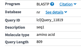
6.3.2.3.1 1. The header
This section is always shown first, and it contains information about how the search was done. This includes which BLAST program was used, the publication in which the BLAST algorithm was described, the name of the submitted query sequence and its length, and the database you searched. For an online search result, this section contains additional information, such as links to “Other reports” that includes things like a “Distance tree of results” and a “ multiple alignment”.
6.3.2.3.2 2. A summary of the results
This section is given in the tab called “Descriptions” in the online version: it provides a list of the database sequences that are most similar to the query sequence, ranked by the E-value for the corresponding pairwise alignment. At the NCBI’s online BLAST, the following columns are current listed (see also Figure 6.10):
Description: the ID and a brief description (if available) of the database sequence for which an alignment above a threshold (default: E-value of 10) was computed.
Max Score: the bit score for this alignment, computed as described above. Note: it is possible, especially for longer or multi-domain sequences, that different parts of the query sequence match different regions in the same database sequence. If these matching regions are distant and therefore not connected by gaps into a single alignment, both alignments are reported. In this column, only the bit score of of the best of these alignments is listed.
Total Score: in case of multiple alignments between the query and a database sequence, the combined bit score is given in this column. Otherwise same value as in the previous column is given.
Query Cover: the percentage of the total length of the query sequence that is included in the resulting alignment(s).
E value: the E-value, computed as described above.
Per. Ident: the identity in percentage of the sequence regions included in the alignment. Note: if only 5% of the query sequence is covered by the alignment but with a sequence identity of 98%, this is not a very good result...
Accession: The accession number of the database sequence.
In the text-only version of the result, this section is a table that consists only of three columns: the sequence IDs and/or descriptions, the bit score, and the E-value).
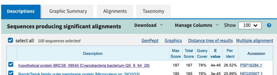
6.3.2.3.3 3. The graphic summary
This section is only available in the online version of the BLAST results; you’ll find it in the tab “Graphic Summary” right next to the “Descriptions” tab. Here, you can see in which regions of the query sequence there are good (or not so good) matches to it. The query sequence is represented by the solid red line, and each hit is represented by a line that is placed relative to the query sequence. The hits are color-coded based on the similarity of the hit to the query as represented by the bit score. Note: you might first have to select from the “Descriptions” tab the database sequences you’d like included in this graph.
6.3.2.3.4 4. The pairwise alignments
Pairwise alignments of the sequences listed in the summary table are given next, and these are the main results of a BLAST search that you should closely inspect. In the online version, you can view an alignment either by clicking on the description of a sequence from within the “Descriptions” tab, or you can click on the “Alignments” tab.
I’m going to discuss two of the many alignments that were returned, and here is the first one:
    BamA/TamA family outer membrane protein [Chroococcales cyanobacterium IPPAS B-1203]
    Sequence ID: WP_099699279.1  Length: 651  Number of Matches: 1

    Score           Expect   Method                 Identities    Positives     Gaps
    447 bits(1151)  4e-148   Comp matrix adjust.    255/596(43%)  366/596(61%)  43/596(7%)

    Query  113  SPELRDAVYEAASVEPGRTATRSQLQEDINAIFATGWFSNVRVEPEDTPLGVRITFVVEP  172
                S EL+     A     G   + SQLQ+D+ AI AT  F+N  V    T  G+ + F VEP
    Sbjct  87   SEELQQIARNAIKTRVGGETSESQLQQDVAAILATNLFNNATVSSNPTATGLNVVFQVEP  146

    Query  173  NPTLSDVQVQSLPAETEGRAVPPEVVDGIFEPLYGQRLNLSQLQKRIDKLNQWYKDNGYS  232
                    S +Q+         +A+P  V     +   G  ++ + L + ++++N+WY  NGY+
    Sbjct  147  VVVRS-LQL------ANAKALPQNVAIERIKLQIGNPISPTALSQSVEQINEWYAQNGYT  199

    Query  233  LAQVVG---SPQVSEDGTVTLRVAEGVVEDINVQF-------VNDKGESVEGETRKFIVK  282
                LA+V+    +PQ    G +TL VAEG++ D+  +F       V+D+G+ ++G T+   ++
    Sbjct  200  LARVIAIRPNPQ----GVLTLEVAEGLINDVKFRFSDEDGRFVDDQGKPIQGRTQPDFLR  255

    Query  283  REVELSSGDVFNRQMAQQDLRRVFGLGIFKDVRLAFDPGDNPQKVDVTLNVVEDRTGSLG  342
                RE+ +  G VF  +  +QDL++++ LG+F++VR+A + GD   KVDV  ++ E    +
    Sbjct  256  RELHVKPGQVFREETVKQDLQQLYQLGLFQNVRVALE-GD-ATKVDVIYDLTEAPARAAN  313

    Query  343  AGAGISSSTGFFGTASYREQNLGGNNQTLGAQLQVGTREILFDVSFSDPWIAGNPNRLGY  402
                 G G +  +G F T SY++ N  G N ++GA +Q+  R+I FD +F+ P+ A NP+R GY
    Sbjct  314  LGGGYNDDSGLFATVSYKDFNFSGVNDSIGADIQISRRDIQFDTNFTSPYRASNPDRFGY  373

    Query  403  RVNAFRQQSISLVFEEGPDESNVGVVDEDGIIVDPRVIRTGGGVTFSRPIAPDPYTDGKW  462
                +VNAFR++ IS  F+      +V + ++D     PR  + GG VT  RPI         W
    Sbjct  374  QVNAFRRRGISQTFD-----GDVSLPNDD----RPREGQFGGSVTLQRPI-------DDW  417

    Query  463  DVSAGFEYQRVAIKDGDSNVTPFDNQGNQLAFSQDGTDDLFMLELRATRDLRNNPQQPTD  522
                  S G  Y+R +I+D   N++P D  GN L  S  G DDL  +   ATRD RNN   PT+
    Sbjct  418  QASMGLNYKRTSIRDRAGNISPQDELGNPLTLSGTGIDDLTTISFTATRDFRNNLINPTE  477

    Query  523  GSRLSLSMDQSVPIGSGSILMNRLRASYSYFTPVEWLGSLDFLGDKGEALAFNVQGGTVL  582
                GS LSLS +QS+PIG G+I M+RLRA+YS + PV+ +GS        E  AFNVQGGT +
    Sbjct  478  GSVLSLSAEQSIPIGQGAISMSRLRANYSQYVPVDLVGS----DRDSEVFAFNVQGGTTI  533

    Query  583  GDLPPYEAFVLGGSDSVRGYDRGELGSGRSFFQATAEYRFPIVDPVSGALFFDYGTDLGS  642
                GDLPPYEAF LGG +SVRGY  GE+GSGRSF  A+AEYRFPI+D + G +F D+ +DLGS
    Sbjct  534  GDLPPYEAFNLGGLNSVRGYGIGEVGSGRSFVLASAEYRFPILDFLGGVVFADFASDLGS  593

    Query  643  ADSVIGNPAGVRGKPGSGFGYGAGVRVKTPVGPVRIDFGINDEGDNQIHFGIGERF  698
                 D+V+G PA VR KPG+GFGYGAGVRV +P+G +R DFG ND+G++++ FG G RF
    Sbjct  594  GDTVLGEPAVVRDKPGTGFGYGAGVRVNSPIGLIRADFGFNDQGESRVQFGFGHRF  649
There are three parts of this result you need to look at:
1. Two lines of information about the database sequence. A brief description of the bacterial database sequence that is aligned to the plant sequence is given, including its length.
2. Two lines that contain statistical and descriptive information of the alignment. The resulting alignment has a raw score of 1151 (in parentheses) and a bit score of 447; its E-value is given as “4e-148 ”. This stands for \(4\times10^{-148}\) and therefore a very small number! The alignment is 596 positions in length, and 255 of these are matches, 366 are matches or good mismatches with a positive score in the substitution matrix that was used for this search, and 43 are gaps. Percentages of these numbers are listed in parentheses.
3. The alignment. The alignment doesn’t cover the entire two sequences. Instead it starts at position 113 in the query sequence and 87 in the database sequence (‘Sbjct’); the N-terminal end of the two sequences are therefore unaligned. The alignment ends almost at the very end of the database sequence and about 100 amino acids before the end of the query sequence. Although this alignment is a local alignment, it covers a fairly large proportion of both sequences – despite one sequence coming from a plant and another from a eubacterium (there are millions of years of evolution between the two!).
So we could vaguely and superficially conclude that the E-value is low, the alignment looks good, and therefore there is a good match between our query and this particular database sequence. But we definitely can and have to do better than that, especially after just having gone through all the theory of BLAST in so much detail. This is how to statistically interpret this result:
An E-value of \(4\times10^{-148}\) means that, given comparable conditions of search space and amino acid composition, we can expect \(4\times10^{-148}\) alignments of equal or better quality even for random sequences – that’s a very very small number, and the alignment result is therefore significant.
And how should we biologically interpret this result?
Based on inspecting the alignment quality & length as well as the E-value, it is very unlikely that the similarity between the query and the database sequence is due to chance. This level of similarity is therefore likely due to shared ancestry, and consequently we conclude that the two sequences are homologous.
Here is a second example:
    ShlB/FhaC/HecB family hemolysin secretion/activation protein [Geminocystis sp. NIES-3708]
    Sequence ID: WP_066348474.1 Length: 556 Number of Matches: 1

    Score           Expect   Method                 Identities    Positives     Gaps
    32.7 bits(73)   5.6      Comp matrix adjust.    25/71(35%)    35/71(49%)    3/71(4%)

    Query  582  LGDLPPYEAFVLGGSDSVRGYDRGELGSGRSFFQATAEYRFPIVDPVSGALFFDYG--TD  639
                L  L P E FV+GG  SVRGY R  + +G + F+ + E R  ++        F      D
    Sbjct  430  LDPLLPSEQFVIGGGQSVRGY-RQNVRAGDNGFRFSIEDRITLIRNEEKFPIFQIAPFFD  488

    Query  640  LGSADSVIGNP  650
                +GS  +  GNP
    Sbjct  489  MGSVWNAQGNP  499
This alignment is much shorter: it covers only 71 amino acids, which is less than 10% of the entire carrot sequence. The relative number of identical and similar amino acids along this alignment length is also considerably smaller. Let’s do first the statistical and then the biological interpretation of this specific result:
An E-value of 5.6 means that, given comparable conditions of search space and amino acid composition, we can expect 5 or 6 alignments of equal or better quality even for random sequences. That’s not a very small number, and the result is not significant.
Based how little of the query sequence is covered in the alignment and based on the relatively high E-value, it is rather likely that the similarity between the query and the database sequence is due to chance. This level of similarity is therefore not due to shared ancestry, and consequently we conclude that the two sequences are not homologous – based on this BLAST analysis.
Note: For this second example, there is still a chance that with different methods or different parameters, we might get a longer and better alignment between the query and this database sequence. But without further analysis, we’ll have to conclude that these two sequences most likely are not homologous.
6.3.2.3.5 5. The parameters and statistical details
The final section of the BLAST output I’d like you to look at gives the search statistics of the BLAST search. Among other information, you find the substitution matrix and the gap penalty scheme that was used to score the alignments, two normalizing factors (\(\lambda\) and \(k\)) that are needed to compute the E-value, and the database size. This information is shown as a pop-up window under “Search Summary” at the very top of the online version. In a text-only result, it is shown at the very end, after the pairwise alignments.
Together with the raw alignment score for a given alignment, you could use the values from this section to compute the E-value by plugging the numbers into the equation \(E = kmne ^{-\lambda S}\). Unfortunately, the BLAST program available from NCBI for download and run online includes some other normalization and correction, and so the E-value you compute usually differs from the E-value returned by BLAST. However, we ignore the exact mathematics of computing NCBI’s E-values and use this as a useful approximation.
6.3.2.4 How low is ‘low enough’?
An E-value of zero and even the E-value of \(4\times10^{-148}\) above is definitely a low E-value that represents a good hit and implies homology. In contrast, 5.6 is a high E-value that represents a poor hit. But where do you draw the line? Is there a guideline for a threshold for E-values below which you consider a hit to be biologically meaningful and statistically significant? – This is a difficult question to answer! From the discussion of E-values above, it should have become clear that the same alignment can result in a different E-value, depending on the database size. Some articles or web sites recommend an absolute E-value threshold, but I find this problematic. Instead of giving you an absolute number, I advise you to look at the length and the overall quality of the pairwise alignments that are returned. It is also useful to look at a sharp drop in E-values of the hits in the summary table.
6.3.2.5 Which BLAST?
BLAST comes in a number of different versions, depending on whether you want to work with protein sequences or with DNA sequences. The following flavors are available:
| query | database | BLAST program |
|---|---|---|
| nucleotide | nucleotide | blastn |
| nucleotide (translated) | peptide | blastx |
| peptide | peptide | blastp |
| peptide | nucleotide (translated) | tblastn |
In addition, there are a number of specialized ways to run the BLAST algorithm. Among the more frequently used ones is PSI-BLAST, which finds more distantly related sequences than the standard BLAST.
In the online version of BLAST, you select the BLAST program you’d like to use by mouse-click. In the terminal version, you have to specify the corresponding program by name.
6.4 References
Selected references for the material in this chapter:
Altschul SF, Gish W, Miller W, Myers EW, Lipman DJ (1990) Basic local alignment search tool. Journal of Molecular Biology 215: 403-410.
BLAST documentation at NCBI, including links to video tutorials: https://blast.ncbi.nlm.nih.gov/Blast.cgi?CMD=Web&PAGE_TYPE=BlastDocs
Pearson WR. An introduction to sequence similarity (“homology”) searching. (2013) Curr Protoc Bioinformatics. Chapter 3:Unit3.1. https://doi.org/10.1002/0471250953.bi0301s42
7 Multiple sequence alignments
A multiple sequence alignment (MSA, see Figure 7.3) is the arrangement of homologous sequences such that residues within a column show maximal similarity, are positionally homologous, and/or are in equivalent positions in the corresponding 3D structures of the protein. MSAs are therefore hypotheses about the evolution of related sequences that can illustrate similarity (or dissimilarity) of multiple sequences. They have become a widely used tool for the design of PCR primers, to identify critical residues, characteristic motifs, or conserved regions. While a multiple sequence alignment is sometimes the final result, most often a multiple sequence alignment is just the starting point for further analyses.
Both biologically and computationally, it is not easy to identify the best alignment between a set of sequences. In this chapter, I’ll cover some of the challenges associated with collecting homologous sequences and with computing multiple sequence alignments. I’ll then cover the most frequently used algorithmic approach for computing a multiple sequence alignment, called progressive alignment.
When you have worked through this
chapter, you should be able to explain the following concepts.
Concepts: purpose & application of MSAs;
considerations for using BLAST to collect sequences for a MSA; computing
MSA: challenges; progressive alignment: steps, profiles, advantages,
disadvantages; iterative refinement; sum of pairs score; development
& evaluation of new MSA methods; algorithm vs. (software)
program
7.1 MSA is a difficult problem!
7.1.1 Challenge: collecting homologous sequences
If a multiple sequence alignment is the “arrangement of homologous sequences”, this implies that we need to already have collected homologous sequences. If non-homologous sequences are used as input, MSA programs will still complete and generate an alignment – but the result will not make any sense biologically. So how do we go about identifying homologous sequences before attempting to align them?
Most commonly used MSA programs (and the ones I’ll introduce here) compute global multiple sequence alignments, which means that the input sequences have to be not just homologous, but globally homologous (Figure 7.1). There are methods for computing multiple local sequence alignments, but these will not be covered here.
There are several approaches for identifying homologous sequences, and you already know one of them: BLAST. Starting with a given protein or nucleotide sequence, you could use BLAST to identify homologs in selected species or lineages. However, because good BLAST hits can be due to local as well as global similarity, a careful evaluation of BLAST results is required in this context. Take the alignment shown in Figure 7.2, for example: it represents an alignment between a query sequence “ABC” of length 809 amino acids and a database sequence “XYZ” of 816 amino acids. The alignment looks pretty good, with many identities over a fairly long sequence region, and the E-value is very low. Overall, the result suggests that this level of similarity is most likely due to shared ancestry. Nevertheless, the BLAST alignment covers only a little more than half of these sequences. If homology is indeed restricted to the C-terminal half of these two proteins, and if their N-terminal region contains a different domain in each protein, then these two should not be included together as input for the type of MSA programs I’ll cover next.
7.1.2 Challenge: criteria for biological accuracy of MSAs
Once we have collected a number of sequences that are globally homologous and thus can be aligned along their entire lengths, computing this multiple alignment is still not easy. One of the challenges is that the biological criterion for accuracy is not straightforward, especially when gaps are needed and/or more divergent sequences are to be aligned.
Alignments that don’t have many gaps, and in which the residues in many columns are identical or similar, are generally considered to be ‘good’. The alignment shown in Figure 7.3 A is an example of such a ‘good’ alignment. You may also have an intuitive idea that the alignment shown in Figure 7.3 B isn’t as good, but how would you improve it? – By sliding any one of the six sequences, or by inserting additional gaps? Which sequences would you slide, and by how much? Where would you insert additional gaps? These questions are not easy to answer, and they illustrate that multiple sequence alignment is a difficult task, both for you and also for the MSA programs.
Related to this is a second biological challenge: any MSA approach needs to reconcile multiple pairwise alignments into a single multiple sequence alignment, and the order in which this is done might have consequences for the final result. I’ll next use three ‘toy’ sequences (that are unrealistically short) to explain this in a little more detail.
For three short DNA sequences, the optimal pairwise alignments and two possible multiple alignments are shown in Figure 7.4. If we started with the optimal alignment of sequences 1 and 2, and then added sequence 3 as shown, the final multiple alignment would have to include a non-optimal alignment of sequences 1 and 3. In contrast, if we started with the optimal sequence alignment of sequences 1 and 3, and then added sequence 2 as shown, a non-optimal alignment of sequences 2 and 3 would have to be included. Moreover, the final result differs depending on which set of sequences (and their best pairwise alignment) we start out with. This is a very important observation, and one that forms the basis of the MSA algorithm I’ll cover in a moment.
7.2 Computing multiple sequence alignments
The final challenge for computing multiple sequence alignment is computational: if it was a difficult and time-consuming problem to align pairs of sequences, of course it also is for more sequences. The number of possible multiple sequence alignments for even relatively few and short sequences is too large for any computer to find the best one among them, and once again heuristics will have to be used.
A great number of programs for computing multiple sequences is available, and new software is being released on a regular basis (https://en.wikipedia.org/wiki/List_of_sequence_alignment_software). Different algorithmic approaches have been implemented, and the most frequently used approach of them is probably the one called “progressive alignment”. That’s the one I’ll cover here.
7.2.1 Progressive sequence alignment
Progressive multiple sequence alignment was first described more than 30 years ago, and it still forms the basis for many successful implementations. As with all heuristic methods, progressive alignment methods may not find the optimal alignment, but they usually generate good multiple sequence alignments in a reasonable amount of time. Here is how they work:
7.2.1.0.1 1. Compute a pairwise distance matrix
First, all possible pairwise alignments are generated and scored, for example using a BLOSUM matrix. These similarity scores are used to set up a matrix of pairwise distances (Figure 7.5 B): the more distant two sequences are, the higher the corresponding matrix entry.
7.2.1.0.2 2. Use the distance matrix to compute a guide tree
The distance values are used to compute a so-called ‘guide tree’ (Figure 7.5 C). This guide tree is a branching tree-like diagram. It is often constructed using a neighbor joining algorithm, which will be described in more detail next week. Important for the purpose of multiple sequence alignments is that the guide tree determines the order in which sequences will be aligned or added to the alignment. And that is really its only purpose! It is not a phylogeny that should be interpreted as the evolutionary relationships of the sequences. All it’s good for is to determine which sequences are to be aligned first.
7.2.1.0.3 3. Align closely related sequences, and progressively add more distantly related sequences
Recall the challenge of reconciling pairwise alignments into a multiple sequence alignment (Figure 7.4): which sequences we start with might have an effect on the final alignment. The idea here is to start with the most similar sequences, the ones that are presumably most straightforward to align. Only after these sequences have been aligned do we attempt to add the more divergent ones to the growing alignment.
So based on the guide tree, first the two most closely related sequences are aligned. Then progressively more distant sequences are added to the alignment (Figure 7.5 C. This could mean making a pairwise alignment (Figure 7.5 C, ), combining two alignments together (Figure 7.5 C, ), or aligning a sequence to an existing alignment (Figure 7.5 C, ).
But how does aligning alignments actually work? How can a new sequence best be aligned to an existing alignment? How can two alignments best be merged? The most common approach is to compute and use a profile that represents an existing alignment. This profile is a table of 21 rows, one for each amino acid and one for gaps. It has as many columns as the alignment has, and each column of the profile contains information about how conserved the corresponding alignment column is. This is illustrated in Figure 7.8, which shows a short alignment of four protein sequences and the corresponding profile. This profile shows the proportion of amino acids per alignment column, but other measures of conservation can be used instead. But the point is that a profile allows to evaluate how to best add a new sequence
to all sequences in the existing alignment, not just to individual sequences within it. It also allows to compare and merge two alignments.
The use of profiles is shown in Figure 7.7 for the same set of five sequences and their guide tree that were used as an example in Figure 7.5. The following steps are carried out by the alignment program:
align sequences 1 and 2, 3 and 4
compute profiles for the subalignments 1-2 and 3-4
align profile 1-2 to profile 3-4, then discard profiles; result: subalignment 1-2-3-4
compute profile for subalignment 1-2-3-4
align 5 to profile 1-2-3-4, then discard the profile
only report final alignment 1-2-3-4-5
7.2.2 Major weakness of progressive alignment
As mentioned above, sequences are aligned according to the topology of the guide tree. Once a set of sequences have been aligned, this (sub-)alignment is from then on considered fixed. If any gaps need to be introduced subsequently, they will be introduced at the same position in all already-aligned sequences. This is shown in Figure 7.5 and schematically illustrated in Figure 7.7.
This ‘freezing’ of sub-alignments is the reason for a major weakness of the progressive alignment algorithm: alignment errors cannot be corrected once they are introduced, because at each step alignment errors within the aligned subgroups are propagated throughout all subsequent steps. This is especially a problem for distantly related sequences: if the two most closely related sequences really are not really all that closely related and don’t align well, errors are going to be introduced that cannot be corrected in later steps.
It is important to keep in mind that for relatively easy alignments with relatively high pairwise sequence similarity and few gaps, the alignment generated by a purely progressive method can usually be used as the final alignment. In more difficult cases, an “improvement” of one or more steps of the progressive alignment or even an entirely different algorithmic approach can be used.
7.2.2.1 Iterative refinement
Refining the result of a purely progressive sequence alignment can substantially improve the final alignment, and many programs allow to do exactly that. They generate an initial alignment following the progressive alignment steps described above. Then they refine it through a series of cycles (iterations). Thus, they overcome one of the main problems of progressive alignments and allow gaps to be removed and positions to be shifted in each iteration. Of course, this can take much longer than a progressive approach without refinement.
Exactly how and at which step these refinements are done, differs. Some programs remove and realign individual sequences in the final alignment. Others modify the guide tree (e.g., swap or remove parts of it) and then follow this new guide tree. Regardless of the details, the score for the refined alignment is compared to the original progressive alignment, for example using a sum-of-pairs score, explained in Figure 7.9. If the score is better, the refined alignment is kept, otherwise it is discarded and the original alignment is kept. This process of re-aligning sequences and comparing the alignment score to the previously best alignment is repeated several times. When the alignment score doesn’t improve any more or when the maximum number of iterations has been computed, the last alignment is reported. Even if many iterations are run, only a tiny fraction of all possible alignments are evaluated; progressive-iterative methods are therefore also heuristic.
7.2.2.2 Other improvements
Iterative refinement is just one of several modifications and improvements of the basic progressive alignment algorithm. Some programs that can handle very large numbers of sequences, for example, use different approaches for computing a guide tree from the distance matrix. Other programs adjust scoring matrices or gaps during the computation of sub-alignments from the guide tree. I won’t cover these in any detail but just mention that progressive sequence alignment is still the basis for many multiple sequence alignments that are computed every day.
7.2.3 Algorithms and programs
What is an algorithm? – It can be defined as a sequence of instructions that must be carried out in order to solve a problem. In other words, an algorithm can be considered as a series of steps that convert a problem (the input) into a solution (the output). According to this definition, progressive sequence alignment clearly is an algorithm (Figure 7.10). Algorithms can be stated in English or German or any other natural language. They can also be stated in pseudocode, which is a much more precise language than English or German is, but which doesn’t depend on any computer programming language.
Algorithms can be implemented in different ways, in different programming languages, and on different kinds of computers or hardware architectures. A (software) program then is a specific implementation of an algorithm, a precise code for instructing a specific computer system to carry out the steps of the algorithm.
The progressive alignment algorithm has, for example, been implemented in the Clustal software programs ClustalW, ClustalX, and ClustalO (http://www.clustal.org/) that can be used online or downloaded and installed locally. ClustalW is a linux/unix terminal version, ClustalX is a version with a graphical user interface, and ClustalO is the most recent implementation that allows the efficient alignment of many sequences.
These are very popular programs that use profiles for the sequence-alignment and alignment-alignment steps and include iterative refinement steps. They also include the following modifications:
optional iterative refinement: groups of sequences are realigned
position-specific gap penalties: increased gap penalties in flanking regions of a gap and lower gap penalty in regions already containing a gap
residue-specific gap penalties: increased gap penalties in hydrophobic protein regions, for example
if alignment score for a sequence is low, it will be added later
use of four different substitution matrices
and many more
7.3 Final words
Any multiple sequence alignment program will simply compute a multiple sequence alignment from a set of input sequences, even if these input sequences are completely unrelated or random. The onus of identifying homologous sequences for the alignment is therefore on you.
In addition, as mentioned above, multiple sequence alignment is a hard problem, biologically and computationally, and no single program or parameter set works for all sequence families. It is therefore a good idea to try out different parameters and different software for a set of proteins to be aligned.
Finally, different sets of homologous sequences can have rather different properties: they may have unequal levels of sequence similarity or different lengths of insertions or deletions, they can have repeats, they can be very long, there can be lots of sequences, etc. Some of these sequence properties are more problematic for (some) alignment programs. Several sets of reference alignments have been published, and these contain families of sequences that are easy to align, as well as sequences that are, for one reason or the other, more difficult to correctly align. One such data set is the Balibase database that contains sequence families and corresponding high-quality (correct) multiple sequence alignments. It is available at http://www.lbgi.fr/balibase/. New approaches to multiple sequence alignments can be evaluated by testing how well they can align these reference sets.
7.4 References
Selected references for the material in this chapter:
Thompson JD, Higgins DG, Gibson TJ (1994) CLUSTAL W: improving the sensitivity of progressive multiple sequence alignment through sequence weighting, position-specific gap penalties and weight matrix choice. Nucleic Acids Research 2222: 4673-4680.
Chenna R, Sugawara H, Koike T, et al. Multiple sequence alignment with the Clustal series of programs. Nucleic Acids Res. 2003;31(13):3497-3500. https://doi.org/10.1093/nar/gkg500
Kumar S, Filipski A. Multiple sequence alignment: in pursuit of homologous DNA positions. Genome Res. 2007;17(2):127-135. https://doi.org/10.1101/gr.5232407 Note: this article covers more topics than I did in this chapter, but the first sections include a good review of computing MSAs.
8 Phylogenetic inference
With the aim of determining the function of genes or the relationships of organisms, homologous sequences are often compared. Pairwise and multiple alignments, as covered in previous chapters, are an important means to this end, but they often are only the first step. The next step often is to place the comparative sequence analysis in an evolutionary context and to use a multiple sequence alignment to compute (‘infer’) a phylogeny.
A phylogeny (or phylogenetic tree) is a hypothesis that depicts the historical relationships among entities in a branching diagram. These entities can be DNA or protein sequences, or they can be organisms from which the sequences were isolated. Phylogenetics, in the context of sequence analysis, is the modeling of the order and timing of changes among a set of sequences. It is the basis for understanding the relationships among organisms, genes, and proteins. Phylogenetics is also used to study the (functional) divergence of genes or proteins, or to identify selection at the molecular level.
When you have worked through this
chapter, you should be able to define the following terms and explain
the following concepts.
Terms: elements and anatomy of a phylogeny; rooted and
unrooted trees; gene tree and species tree; orthology; paralogy;
Concepts: main differences between distance-based and
character-based methods; why are multiple substitutions a problem for
phylogenetic inference?; principle of Neighbor Joining; principle of
Maximum Parsimony; bootstrap support: goal, procedure,
interpretation
8.1 Anatomy of a phylogeny
Before I talk about what phylogenies represent or even cover the different methods for computing phylogenies, it is important for you to become familiar with the general anatomy of a phylogenetic tree. The three most important elements of a phylogeny are the leaves or terminal nodes, the internal nodes, and the branches. These are shown in Figure 8.1 and further explained below.
- Leaves
-
generally represent extant sequences: entire genomes, parts of genomes, protein sequences, or DNA sequences that are sampled from the present, although sometimes they can also represent sequences from extinct organisms. These are represented by the labels A, B, and C in Figure 8.1, . Also called “tips” or “terminal nodes”.
- Internal nodes
-
represent the hypothetical ancestors that split into two (or more) lineages Figure 8.1, and . The trees that we are considering here are strictly bifurcating, which means that all the nodes have exactly two descendent lineages, not more.
- Branches
-
connect ancestral and descendent nodes, as indicated in Figure 8.1, . Sometimes branches are shown with lengths proportional to a certain distance measure such as time, or its commonly used proxy, the amount of sequence divergence between sequences/organisms. The branching patterns of a tree is referred to as its topology. Branches are also called “edges”.
Trees are drawn in a variety of styles: horizontally or vertically, with slanted or curved or rectangular branches. The three trees shown in Figure 8.1 are equivalent and depict the same relationships: sequences/organisms/taxa A and B are more closely related to each other than either is to C. If two taxa are each other’s most close relatives, they are said to be sister groups, or sisters. Two more terms are worth mentioning because you will probably hear them again: A clade is a group of sequences or organisms related by descent from a common ancestor. A group of sequences or taxa that contains their ancestor and all of its descendants is called a monophyletic group or monophyletic clade.
Trees may be rooted or unrooted. An unrooted tree specifies only the relationships between the terminal nodes but does not specify the order in which the branching events took place. In a rooted tree, in contrast, a particular node (called the root) is the common ancestor of all the leaves. This means that, traveling from the root to each leaf, you encounter the nodes in the same order in which they occurred evolutionarily. The trees shown in Figure 8.1 are rooted, and the internal node labeled is the root.
How do you know which node is the root of the phylogeny? One common way is to use an outgroup: a sequence that is already known to have diverged prior to the other sequences of interest. The branch that connects this leaf to the others then must contain the root. It is important to use an outgroup based on external or prior information about the sequences. If you’re unsure about an appropriate outgroup, it is best to leave a tree unrooted. For an outgroup-rooted tree, sequences other than the outgroup are usually referred to as the ingroup.
8.2 Gene trees and species tree
Phylogenies that you have encountered before (e.g., in botany or zoology classes) were probably species trees: a species tree describes the evolution of species, and the leaf nodes of such a tree represent species. How are these trees computed? – They can be derived from multiple and combined types of data, for example from morphological characters and/or molecular sequence data. However, despite decades worth of research, there are still some species relationships that we haven’t been able to resolve yet.
The Tree of Life (Fig. 8.2) is the ultimate species tree, it includes (at least in theory) the relationship of all species on earth. It is obviously too large to fit on any page or screen, but there are several online tools that allow an interactive view of parts of it; two examples worth exploring are https://www.onezoom.org/ and http://lifemap.univ-lyon1.fr/. At NCBI, you can use the “Common Tree” tool to display the currently accepted species tree of a set of species you specify (NCBI’s main page \(\rightarrow\) Taxonomy \(\rightarrow\) Taxonomy Common Tree; https://www.ncbi.nlm.nih.gov/Taxonomy/CommonTree/wwwcmt.cgi).
Here in this course we’ll use (gene) sequences to compute phylogenies, and the resulting trees are therefore always gene trees: phylogenetic trees of sequence data. A gene tree can be used to study the evolutionary and functional divergence of genes, for example. The gene tree may have a different topology (branching pattern) than the species tree. Sometimes, however, a gene tree does correspond to the species tree.
In Figure 8.3 A, for example the species tree of the plants peach, orange, and sunflower is shown: peach and orange plants are more closely related to each other than either is to a sunflower. This species tree might have been inferred from morphological and/or molecular data. Panel B shows a gene tree, specifically an rRNA gene tree: sequences for rRNA genes (encoding ribosomal RNA molecules of ribosomes) were used to compute this gene tree. The tree of the rRNA genes corresponds to the tree of the species from which these sequences were isolated; this is generally a property of rRNA genes. Figure 8.3 C also shows a gene tree, namely the gene tree for a gene involved in flowering. The evolution for these genes does not correspond to the species tree.
Why might a gene tree not have the same topology as the species tree of the corresponding species? Assuming that you have done the computation of the MSA and the phylogeny correctly, there are still a number of reasons for this discrepancy. Think about what types of processes gene sequences experience: Homologous gene sequences in different species may get duplicated or lost (or aren’t included in the data set!), or may diverge in sequence (and function). For the gene tree shown in Figure 8.3 C, this is what might have happened:
Assume that for the specific flower gene we’re looking at, all plants have (or had) two copies. In the common ancestor of plants, a single flower gene might have been duplicated, and the two copies might have evolved slightly different functions. As the plant lineages diversified, the two gene copies have evolved within the plants’ genomes, and their correct gene tree might look like the one shown in Figure 8.4 A: The two different copies are colored blue and teal in Figure 8.4, and they are indicated with “1” and “2”.
Let’s further assume that the gene tree shown in Figures 8.3 and 8.4 C didn’t include the full set of homologs. Maybe some plants lost one of the two copies. Maybe in some plants not all copies have already been sequenced. Or maybe we thought that randomly selecting one homolog for each plant was good enough. Whichever reason applies here, we get the gene tree shown in Figure 8.4 C, and this clearly is different from the species tree.
This is a good opportunity to point out the distinction between two different categories of homology: paralogy and orthology. Paralogous genes diverged initially through duplication, and so any gene 1 in blue font in Figure 8.4 is paralogous to any gene 2 shown in teal font. Orthologous genes diverged due to a speciation event, and so they must always be from different organisms. The blue flower gene 1 from peach, for example, is therefore orthologous to the blue flower gene 1 from sunflower.
If you have a difficult times with the concepts of gene trees vs. species trees, think of genes evolving within (the genomes of) organisms, as is shown in Figure 8.5. The thick gray lines represent the species, and you can see that species B and C are each other’s closest relatives. The common ancestor of A, B, and C had a one particular gene (shown as a sort black line) in its genome, which was duplicated at one point. The two copies diverged within that common ancestor into the one shown in red and the one shown in blue. When the lineages diverged, each new species also had the two gene copies. If we only look at these red and blue genes, disentangle their evolution such that no branches cross, we get the gene tree shown on the right: the two red genes, the only ones left in species A and B (or maybe just the only ones we sampled from these species) are each other’s closest relatives – despite the different species tree.
Figure 8.5 can also serve to illustrate the difference between orthology and paralogy once again: in the image that shows the genes as evolving within species, the last common ancestor of the blue gene in species C and any of the red genes in species A or B (i.e., the internal node where the branches ‘meet’), is a duplication node, and so these are paralogs. The most common recent ancestor of the red genes of species A and B is a speciation node, and so these two are orthologs.
8.3 Computing phylogenies
The important first step in generating a phylogeny is always to get the very best multiple alignment possible. The available sequence information in the alignment is then used to estimate the evolutionary history of the sequences. Once again, the number of possible solutions (here: phylogenies) is too large for the computer to evaluate exhaustively.
When there are three leaves, there are only three possible rooted trees, and one possible unrooted tree (Figure [rooted]). But the number of possible tree topologies increases exponentially with the number of leaves: For \(n\) leaves there are \(\frac{(2n-5)!}{2^{n-3}(n-3)!}\) possible unrooted trees and \(\frac{(2n-3)!} {2^{n-2}(n-2)!}\) possible rooted trees.
| sequences | unrooted trees | rooted trees |
|---|---|---|
| 3 | 1 | 3 |
| 4 | 3 | 15 |
| 5 | 15 | 105 |
| 6 | 105 | 945 |
| 7 | 945 | 10,395 |
| 8 | 10,395 | 135,135 |
| 9 | 135,135 | 2,027,025 |
| 10 | 2,027,025 | 34,459,425 |
As you can see in Table 8.1, this number quickly becomes astronomically large, quite literally: for 50 sequences, the number of possible tree topologies approaches the number of electrons in the visible universe. This huge number of different trees all represent evolutionary scenarios by which the sequences may have arisen. Molecular phylogenetics is, in part, about choosing among these many possibilities the one tree that best explains the molecular sequence data.
Heuristic search methods play a very important role in phylogenetic reconstruction: they generally find a very good tree in a reasonable amount of time, without looking at all possible trees, but also without a guarantee that this is really the best tree overall. Heuristic tree searching methods are beyond the scope of this book. Instead I will focus on the different approaches for computing trees that use different criteria for defining a phylogeny as the best phylogeny. Similar to what you already encountered for pairwise and multiple sequence alignment, the “best” phylogeny for a given set of sequences might be a different one if we use different criteria!
There are two main categories of tree-building methods: distance methods, and character-based methods, schematically shown in Figure 8.6. I’ll first give a brief overview of how these work, then I’ll introduce some of the methods in more detail.
8.3.0.0.1 Distance methods
first convert the information within a multiple sequence alignment of \(n\) sequences into an \(n \times n\) matrix of pairwise distances. This matrix is then used to compute a tree. These methods are strictly algorithmic in that they consist of a set of rules to compute one single unrooted tree. Neighbor Joining is the most frequently used distance method. It clusters sequences based on sequence similarity. This often works very well, but similarity is not necessarily always a measure of evolutionary relationship, and so this method may not give a correct evolutionary tree. Distance-based methods apparently use an extra step, the computation of a distance matrix. However, this doesn’t mean that they’re slower. In fact, they're generally faster than character-based methods.'
8.3.0.0.2 Character-based methods
directly use the pattern of substitution in each column of the multiple sequence alignment to determine the most likely relationships of the sequences. Maximum parsimony and maximum likelihood are examples of two such methods. These methods are based on an optimality criterion: they evaluate many of the possible trees and chose best one. However, they define the ‘best tree’ based on rather different criteria. Character-based methods are able to compute rooted trees, provided an outgroup sequence is included and specified as such.
8.3.1 Neighbor Joining
Neighbor-joining (NJ) is a frequently used distance method and can compute a phylogeny very fast, compared to the character-based methods. In fact, for analyses with very large numbers of sequences, a distance method such as neighbor-joining is sometimes the only method that is computationally feasible. NJ is also used by some of the multiple sequence alignment methods to generate a guide tree.
8.3.1.1 From MSA to distance matrix
The distance matrix for protein sequences is generally computed based on (appropriate!) models of amino acid replacement, this includes PAM and BLOSUM series of substitution matrices, but several others also exist and are often used.
For DNA sequences, with only four different states, models that correct for multiple or hidden substitutions are generally used. Consider an ancestral DNA sequence, represented by the bottom sequence in Figure 8.7 A in black. After a duplication or speciation event and some time of evolutionary divergence, we isolate, sequence, and align these two homologous sequences today (Figure 8.7 B). This alignment shows that the two sequences have accumulated a number of substitutions.
The problem is that usually we don’t have the ancestral information. We don’t have a time machine to check the sequences every few thousand years to see which substitutions they accumulate. We only see that today’s DNA sequence at a given position is either the same in two sequences or not (Figure 8.7 B), but we don’t know how many changes have really happened. Figure 8.8 further illustrates this problem:
It is possible that there is one apparent change when in fact one or more mutations have occurred:
a single substitution: what you see is what happened (Figure 8.8 )
multiple substitutions in one or more sequences look like just one substitution has occurred (Figure 8.8 )
a coincidental substitution means that at least one substitution has occurred in both sequences, but it adds up to just one apparent change between the two (Figure 8.8 )
It is also possible that no apparent change is observed when in fact one or multiple mutations have happened:
There are several models that try to correct for multiple, or hidden, substitutions. These substitution models are not just used for computing distances for NJ trees, but they are also used for other (but not for all) tree-building methods.
8.3.1.2 From distance matrix to phylogeny
Whether DNA or protein data, whether short or long sequences, we now have reduced the information in the multiple sequence alignment to a pairwise distance matrix. The next step is to generate a tree such that the tree branches separating any two sequences reflect their corresponding pairwise distance values.
The individual pairwise distances correspond, however, only very rarely exactly to branch lengths in the phylogenetic tree, and so the branch lengths of the NJ tree will have to be approximated as best as possible. This is illustrated in Figure 8.9: distances of the initial distance matrix \(d_I\) that was computed from the sequence alignment do not exactly fit onto a tree. (Try it!) The aim therefore is to find a tree topology and branch lengths for which the discrepancy between the initial distances and the distances that exactly correspond to the tree (\(d_T\)) is minimized.
For completeness sake, I mention that this discrepancy is measured using the least squares function, which is computed as \(E = \sum_{i,j} w_{ij} (d_{Ii,j} - d_{Ti,j})^2\). However, the more important aspect for you to remember is that some adjustment is generally necessary, not the details of how this is done.
Neighbor joining is a heuristic for the least-squares objective function. It finds the correct tree if distances fit a tree, and it finds a good tree if they do not. The mathematical details of the algorithm will not be covered here. In summary, a (completely unresolved) star-tree is the starting point for the algorithm (Figure 8.10). Nodes are progressively added until the tree is fully resolved: The sequences that are closest, according to the distance matrix, are joined first, and the node of their immediate ancestor is added to the tree. The (adjusted) branch lengths are computed and added. This continues until only two nodes remain.
8.3.2 Maximum parsimony
Maximum parsimony is a character-based method that uses the information present in the columns of an alignment. Remember that changes in the columns correspond to mutations in one or more of the sequences that are being aligned. The general idea of maximum parsimony (parsimonious meaning ‘frugal’) is that the best phylogeny is defined as the one that requires the fewest changes, or mutations, along the branches. For example, consider the rather short alignment below:
\textcolor{gray}{1 2 3 4 5 6 7 8 9}
       seqA   G T C G A C T C C
       seqB   G T A G A C T A C
       seqC   G C G G C C A T C
       seqD   G C T G C C A G C
The alignment consists of three sequences A, B, and C and one outgroup sequence D. Each sequence is 9 nucleotides in length, and the indices of the alignment columns are listed above the alignment in gray. There are three possible rooted trees for three ingroup sequences, and their topologies are shown in the first row (topologies) in Figure 8.11.
For each column of the alignment, the Maximum Parsimony algorithm determines how many changes would be required for each of the three tree possible topologies:
The first column is not informative, because all three sequences contain the same nucleotide. It will therefore not allow to discriminate between alternative trees. So we skip to column 2.
The data in the second alignment column is mapped onto each of the three tree topologies: seqA and seqB have a T, the other two have a C. Having done this, The first tree would require just one change, while the other two would require each two changes.
This is also done with all remaining columns.
Finally, the number of changes the alignment requires for each of the three trees is added up. In the last row of Figure 8.11 you can see that the first tree is the one that requires the least amount of changes: 9 (vs. 12). This tree is therefore the most parsimonious tree, and by definition the best tree under the Maximum Parsimony criterion. It will be saved as the final output.
What if two trees are equally parsimonious? – They will both be reported, and it is up to the researcher to decide whether other data would favor one over the other.
In the simple case of three sequences, an exhaustive search as described above (one that looks at every possible tree), can be used. Because of the great number of possible tree topologies for a given number of sequences, heuristic search methods are used for more than 9 or so sequences. Again, these are not covered here.
The example above illustrates that in Maximum Parsimony tree inference, we’re really just counting substitutions. No real model of evolution is used, and there is no consideration of or correction for multiple substitutions. This means that for fast-evolving and/or divergent sequences, MP might not be the best approach. Furthermore, because it is not a probabilistic method, it is difficult to evaluate the results in a statistical framework: the best tree for the sample data set required only 9 mutations – but how much better than the 12 mutations of the next best tree is this?
8.3.3 Maximum Likelihood
The second character-based method I’ll briefly mention is the Maximum Likelihood method. Similar to Maximum Parsimony, the information present in each column of a multiple sequence alignment is used to determine the most likely relationships of the sequences. This, however, is pretty much where the similarities end.
Maximum likelihood (ML) estimation is a widely used statistical method that aims to find the tree that is most likely to have generated our alignment. Mathematically, we say that we search for the parameter values that make the observed data most likely. The parameter values to be estimated here are the best tree topology and the branch lengths of that tree. The data have already been collected: this is the alignment and represents the amino acids or nucleotides at the tips of the tree. We now want to find the tree that is most likely to have generated this data. To be able to do so, a model of sequence evolution that allows us to compute the changes of nucleotides or amino acids along the branches of a tree is needed. Once again, we have to select an appropriate substitution model for our data. For protein data, a PAM, BLOSUM, or other substitution matrices can be used. For DNA data, a model that corrects for multiple substitutions as described above is used.
Maximum Likelihood is a powerful and frequently used method for estimating phylogenies. However, I will not go into any mathematical details of this approach here.
8.4 How confident are you?
So now you have identified homologous sequences, aligned them, and computed a phylogenetic tree using any of the methods described here. Now what? – The next and very important part of phylogenetics is to statistically test how good that tree is. Bootstrapping is a general statistical technique that allows to test the variability of a dataset. In phylogenetics, bootstrapping is frequently used to evaluate the confidence of different groups on a computed phylogeny. Here is how it is done:
We compute a multiple sequence alignment, and from this we compute a phylogeny. These will be referred to as the “original” alignment and “original” tree.
We create a bootstrap dataset, or a ‘pseudosample’ (Figure 8.12): we randomly take one column after the other – with replacement! – from the original alignment. This means that some columns will be sampled more than once while others may not make it into the pseudosample at all. We collect as many columns as there are in the original alignment. The assumption we are making here is that all columns in an alignment (= all sites of a sequence) are independent and have the same stochastic properties.
We use the same method (e.g., neighbor joining or maximum likelihood) that was already used to construct the original tree, and we use it to compute a phylogeny from the pseudosample. This tree may or may not be the same as the tree we obtained with the original alignment.
We repeat the bootstrap sampling many times, to get 500 or even 1,000 pseudosamples and as many corresponding bootstrap phylogenies. These bootstrap trees are often used to compute a tree that is a consensus among them, also called a ‘consensus tree’.
The result of these analyses are presented as numbers on the branches of the original tree. These numbers represent the percentage of bootstrap phylogenies that showed the same groupings for the set of sequences to the right of that number (if the tree is shown with the tips on the right and the root on the left).
For example, Figure 8.12 shows a branch with a bootstrap support value of 100. This means that 100% of all bootstrap trees clustered the three sequences to the right of this number together. Other sequences clustered only in 76% or 89% of the bootstrap trees together. Bootstrap support above 80 is generally considered to be well supported, and bootstrap values below 60 indicate no support and are usually not even reported.
I would like to emphasize at this point that the bootstrap values provide information about how well the data supports a particular branch or group of sequences of the original phylogeny. It does not provide information about how “correct” this branch or even the entire tree is. It is entirely possible to get very good bootstrap support for incorrect branches, for example when there is non-phylogenetic signal in the data, or when the wrong model of sequence evolution was used for the analysis.
Note that commonly used phylogeny programs allow the computation of bootstrap values: you will not have to do the re-sampling of alignment columns many times, or the independent computation of 1,000 trees. With the appropriate parameter setting specified, the program will do all of this for you.
8.5 Do it, but do it right!
I summary, obtaining a phylogeny requires carrying out multiple steps. For each step there are different algorithmic approaches and different software programs to choose from, and all of these programs can be run with different parameters. Checking the quality of your data as well as the appropriateness of the programs and their parameter settings is therefore an important part of the analysis! Remember that most bioinformatics programs will give you an output, even if unsuitable or nonsensical input was used – garbage in, garbage out!
8.6 References
Selected references for the material in this chapter:
Baum, D. (2008) Reading a Phylogenetic Tree: The Meaning of Monophyletic Groups. Nature Education 1(1):190. https://www.nature.com/scitable/topicpage/reading-a-phylogenetic-tree-the-meaning-of-41956/
NJ Barton et al. (2007) Chapter 27: Phylogenetic Reconstruction. Evolution Textbook http://www.evolution-textbook.org/content/free/contents/ch27.html (Note: free online chapter, but very detailed. You will have to select relevant content for reading.)
Baldauf SL (2003) Phylogeny for the faint of heart: a tutorial. Trends Genet 19: 345-351. (Note: PDF available via researchgate)
9 Analysis of genome-scale data
We’re a few weeks into the semester, and by now you have learned to find and obtain publicly available sequence data, to do online database searches and identify homologs using this approach, and to compute multiple sequence alignments and phylogenetic trees from sets of homologs. The focus has been on methods or algorithms to solve these problems, and as an example I used globins as a selected gene family. (A gene family is a set of homologous genes or proteins that has evolved through speciation, duplication, loss, and divergence from a common ancestral sequence.)
This and next week/chapter, the focus will be on applying some of the methods you have learned not just to a single gene family, but to genome-scale data. In this chapter I first describe how sequence reads are processed by assembly or mapping approaches before they can be used to answer biological questions. I will not cover a lot of algorithmic details of these methods. Instead, the focus will be on applying this processed data to questions in biology.
When you have worked through this
chapter, you should be able to define the following terms and explain
the following concepts.
Terms: genome, coverage, haplogroup, SNP; functional
genomics, convergent evolution, aDNA
Concepts: mitochondrial vs. nuclear DNA; (de novo)
assembly vs re-sequencing/mapping: principles, when to use each,
challenges; application of large-scale gene family analysis: examples;
human populations & past migrations: general approach, opportunities
for aDNA
9.1 Genome data
9.1.1 Mitochondrial genomes
All eukaryotes have a mitochondrial genome, which is maternally inherited. The mitochondrial genome in animals is about 16,000 bp in length and in most cases contains the same 37 genes. Because the mitochondrial genome generally does not recombine, it is inherited effectively as a single locus. Mitochondria, and therefore their genomes, are abundant, with hundreds or thousands of copies per cell.
Protein-coding sequences of animal mitochondrial DNA (“mtDNA”) are often used for taxonomic analysis and assignment, and non-coding mtDNA regions as well as entire mtDNA genomes have been used extensively to study the evolution of populations or closely related species, and to trace their past migration patterns. However, it is important to understand that mtDNA represents only the maternal lineage and therefore might not tell the entire story about the relationships of populations or species.
Individual mitochondrial gene sequences can be obtained as described before: PCR-amplification, followed by sequencing. Although mitochondrial genomes are much (much!) smaller than nuclear genomes, they require the assembly of sequence reads with similar approaches as are described below for the assembly of nuclear genomes – except it’s easier, cheaper, and faster.
I’ll come back to mtDNA for a case study, and also for this week’s computer exercise. And for completeness sake, I mention that photosynthesizing eukaryotes also have a second organellar genome: the plastid (chloroplast), which has its own genome. But of course you already knew this. Chloroplast DNA (cpDNA) is often used for plants much like mtDNA is used for animals, namely for the taxonomic analysis and assignment of plant samples.
9.1.2 Nuclear genomes
Nuclear genomes are large! A single (haploid) human genome contains about 3,000,000,000 base pairs on 23 pairs of chromosomes that are between 50,000 and 250,000 bp in length. Any way you look at it, that’s a lot of DNA! Considering that many studies use data from tens or hundreds (some even from thousands) of genomes, it is clear that massive amounts of data need to be handled.
I assume that you know at least a little bit about currently used sequencing technologies, and how genes and genomes are sequenced. If that is not the case, it’s a good idea to go back to the relevant section in chapter 0 now, or to look up this information elsewhere. Either way, an important point is that sequence reads generated by Sanger and short-read NGS technologies are much shorter than genes or even chromosomes.
The millions of sequencing reads from a genome sequencing experiment are almost useless, unless they are further processed. There are two main categories of processing sequence reads, both are illustrated in Figure 9.1 and further explained below: 1. de novo assembly, and 2. re-sequencing or mapping.
9.1.2.1 De novo assembly
One approach to obtain a genome sequence from sequence data is to do a de novo assembly (sometimes just called “assembly”). This means that the most likely sequence of the original DNA molecule is determined, using only the overlap of sequence reads (plus, if available, information about the physical distance between paired reads). This is shown on the left side in Figure 9.1 above, and also in a couple of figures in chapter 0. However, these images only show relatively small numbers of sequence reads, when in reality there are millions of them!
For the assembly process to work successfully, each base in the genome has to be covered by different reads multiple times, usually between 30 and 100 times! The term for this is “coverage” , which is the average number of times a base is covered by independent reads. As Figure 9.2 illustrates schematically, the coverage really is just an average, with (sometimes large) deviations across the genome.
The basic assumption of de novo assembly approaches is that identical overlaps of sequence reads come from the same genomic location. In practice, this assumption is often violated, and this makes the assembly process a very difficult problem, both biologically and computationally. Most commonly, algorithms for de novo assembly use graph-theoretic approaches, which will be covered later in the semester, and so I won’t go into any details now. More important for our purposes here is that the output consists of assembled fragments that are far from perfect.
Some of the challenges for de novo genome assembly are shown in Figure 9.3. For example, when a region is covered by an insufficient number of reads (A), the assembly in this region might not be all that reliable. If a region isn’t covered at all (B), of course it is not part of the assembly, resulting in separate fragments rather than contiguously assembled genomic regions. Sequencing errors (C) complicate matters, because they violate the basic assumption of assembly algorithms: now we’ve got non-identical sequences that nevertheless come from the same genomic location. However, by far the greatest challenge for sequence assembly are duplicated regions in the genome (D). Here, the problem is that there might be identical (or near-identical) segments that come from different genomic locations. Eukaryotic genomes are chock-full of repeats such as mobile/transposable elements and small- and large-scale duplications, and this results in fragmented and incorrect assemblies, especially when short-reads are used that are shorter than the repeats. Finally, and as mentioned above, genome projects generate and need to handle immense data volumes, and so once again all algorithms are heuristic and thus cannot guarantee an optimal (correct) assembly.
As a consequence of problematic input data as just described, huge data volumes, and heuristic algorithms, most assembly programs cannot assemble entire chromosomes. Instead, they output thousands of unordered contigs (contiguous assembled fragments) and scaffolds (contigs that are linked by gaps, using paired-read information), in which parts of the genome (or transcriptome) might be missing or misassembled (Table 9.1). Just recently, emerging long-read sequencing technologies and/or genome-wide chromosome conformation capture (Hi-C) has been used in combination with NGS technology to generate assemblies of higher quality and contiguity.
| human (2001) | panda (2009) | lanternfly (2018) | |
|---|---|---|---|
| genome size | 3 Gbp | 2.4 Gbp | 2.3 Gbp |
| technology | Sanger | Illumina | Pacific Biosciences |
| average read length | 500 bp | 50 bp | 11,000 bp |
| coverage | 5x | 73x | 36x |
| number of scaffolds | 54,000 | 81,500 | 4,000 |
After a genome has been assembled, an important next step is the annotation of this genome, which means that the location and the function of protein-coding genes are computationally predicted. This was briefly discussed in chapter 0. The gene and genome data can then be used to address many questions about the organism’s biology and evolution.
9.1.2.2 Re-sequencing or mapping
For some studies, more than one genome sequence from the same species is required. Depending on the research question, additional genomes may be sequenced from individuals that are healthy and diseased, or from people that come from different geographic locations, for example. I’ll discuss some case studies in a moment. But first let’s talk about how the data analysis is different when one high-quality genome from a species is already available.
As illustrated above (Figure 9.1), a high-quality genome can serve as a reference for additional genomes from the same species. In this case, the input therefore consists not just of the sequence reads, but also of a suitable reference genome. This approach doesn’t require a coverage that is quite as high as the one for de novo assembly, and consequently less data has to be generated, making re-sequencing projects cheaper than de novo projects. The principle of re-sequencing then is to best align or map each read to the reference. Of course, some reads might map to two or more places in the reference genome equally well, and genomic regions not present in the reference cannot be mapped at all, to mention just two of the challenges for mapping programs. This means that some reads will be mapped to the reference incorrectly and some not at all.
In a next step of a re-sequencing project, information about mapped reads is used to infer the entire genome of the new sample. Alternatively, and depending on the project goals, only those positions for which reference and sample differ are returned and further analyzed. Other uses of mapping information are possible, indicated with an arrow to the ellipsis in Figure 9.1.
Regardless of the output format, when multiple genomes from the same species have been sequenced or downloaded from public repositories, usually researchers are interested in the parts that differ between samples. For humans, this means investigating variation that is present in healthy vs. diseased individuals; or genotypes that are present in people that have adapted to a particular diet or climatic condition; or genomic positions that are diagnostic from people from different geographic locations. I’m sure you can think of other questions that can be addressed – and the corresponding sampling strategy.
The type of variation most frequently investigated are Single Nucleotide Polymorphisms (SNPs), which are positions in the genome where a single nucleotide is different between different samples. Technically, SNPs refer only to variant positions with at most two alleles and with a frequency of at least 1% in the population. More rare variants are called just that: rare variants. In practice, however, the term “SNP” is often used for any position with a single nucleotide substitution. Other types of variation are frequently observed and investigated, these include insertions and deletions, referred to as “indels” or larger structural variations, both illustrated in Figure 9.4.
9.2 Genome-scale analyses: functional genomics
Combining phenotypic information with the species tree of the organisms under study can help to determine the direction and the (relative) timing of evolutionary change. For the example of six fish species (or populations) shown in Figure 9.5, we observe two different color phenotypes. By combining this information with the evolutionary relationships of these fishes, we can learn something about the evolution of the different color phenotypes: If the species tree on the left is the correct one, we have to conclude that red is the ancestral phenotype, and that blue evolved only once, namely in the common ancestor of the two blue fish lineages. If, however, the species tree on the right is the correct one, our conclusion is that blue evolved multiple times independently, since the two blue fish lineages are not sister taxa. In this case, we might next want to investigate if the molecular basis for the blue phenotype is the same or a different one in the two lineages.
If in addition to the phenotypes and the species tree we also have (genome-scale) gene family data, we just might be able to also determine the genotypes involved in the phenotypic change. This type of study is called “functional genomics”, where the goal is to identify the genetic basis for phenotypes (traits).
9.2.1 Case studies: biological aging and longevity
Biological aging could be (very simplified!) defined as the processes that lead to an increased probability of dying. Even if we focus only on mammals, there is great variation in the longevity and (maximum) lifespan, and thus in how fast or slowly some mammal species age biologically, on average. Some examples of long-lived species include elephants and bowhead whales, which can reach a maximum lifespan of 70 and 210 years, respectively. For both of these species, studies were able to correlate some molecular genetic features with the longevity of these animals. The genomes of elephants were shown to harbor increased copy numbers of the tumor suppressor gene TP53, which results in increased cancer resistance. For bowhead whales, an independent study showed that species-specific changes in DNA repair, cell cycle, and aging genes might contribute to the remarkable longevity of these animals.
These are examples of genetic analysis of a few selected lineages with increased maximum lifespan. Next I’ll describe in a little more detail two other examples that use comparative approaches and broader species representation. The general strategy for these studies is outlined in Figure 9.6, and the references are listed at the end of this chapter.
9.2.1.1 Longevity in primates
In this first study, the authors worked with 17 primate species. They had data on the maximum lifespan for each of the species, and three of them showed an increased life span: Homo sapiens, Macaca mulatta, and Macaca fascicularis. The authors didn’t generate their own sequence data for their analysis, and instead they downloaded publicly available gene sequences (DNA and protein data) for all primates in their study.
I’ll skip over a lot of details and some statistical tests here, but the authors next identified sets of orthologs for all gene sequences. They used a combination of approaches for this, among them also the BLAST program that you are already familiar with – except they used a locally installed version. For each set of orthologs, they then computed a sequence alignment. They used a different MSA program than you did, but one that is also based on the progressive alignment algorithm. At each step the authors checked if the quality of the data and the alignment was sufficient, and that enough species were represented in each of the gene families. After applying their filtering criteria, they had about 17,000 alignments, each representing a different set of orthologous genes with different biological functions.
Finally, the authors checked all alignment columns of all alignments to look for parallel amino acid changes in the long-lived species. Essentially, they identified alignment columns in which all three long-lived species had one amino acid, and the other species had a different amino acid. This is schematically shown in Figure 9.7.
Let’s think about this for a minute. They had 17,000 alignments. If we assume that a gene is, on average, 500 amino acids in length, then the authors had at least 8,500,000 alignments columns to scan! Obviously, this cannot be done manually: it would be far too tedious, far too time-consuming, and far too error-prone. You will not be expected to learn how to program in this course, but the kind of task I just described is only possible with some programming expertise. In sequence bioinformatics, scripting languages such as Perl (https://www.perl.org/) or Phyton (https://www.python.org/) are frequently used.
Back to the case study: what did they find? They discovered 25 substitutions in 25 different genes that were shared by all three long-lived species and absent in all others. Of course, the authors next looked up the functions of these genes and found that these were involved in processes such as wound healing, hemostasis, blood coagulation, clot formation, and cardiovascular pathways. Three of the genes had been identified as “anti-aging” genes in previous studies.
This study used one single human genome as a representative for our species. But since thousands of publicly available human genomes are available, the authors also checked whether the 25 substitutions they identified occur in many or even all other human genomes as well. And although human genomes are quite variable, with millions of positions across the entire genome changed in one or a few or lots of individuals – these 25 substitutions were fixed in all human genomes they looked at: at these positions, they did not find any variation among humans from all over the world.
In summary, the authors of this study took publicly available data, used bioinformatic methods you already know to do (plus a few others), and generated interesting results regarding changes at the molecular level that are putatively associated with longevity. Yay for bioinformatics!
9.2.1.2 Longevity in mammals
I’ll briefly introduce a second case study that also investigated molecular genetic changes involved in longevity. The authors of this study used a larger set of 61 (publicly available) mammal genomes and a slightly different approach. They followed the general strategy outlined in Figure 9.5 and didn’t stop after computing alignments for each set of orthologs, but they also computed phylogenies. The final data set was of similar size as the one described above: for the thousands of predicted gene sequences from 61 genomes, the authors inferred approximately 19,000 sets of orthologs across the species, 19,000 multiple sequence alignments, and 19,000 phylogenies. That’s genome-scale application of bioinformatics tools!
For the subsequent analysis of their thousands of phylogenies, the authors took advantage of the following observation: I’m glossing over some details and caveats here, but on average, loci (genes) with important functions are selectively constrained. This means that these loci harbor fewer substitutions because random mutations are purged by natural selection. These loci evolve more slowly and are said to evolve under purifying selection. Many researchers therefore use relative levels of sequence conservation and evolutionary rates at different positions across genomes to learn about the evolution of genotypes and phenotypes.
Identifying genes that evolve more slowly might point to genes under purifying selection. Consequently, identifying genes that evolve more slowly only in long-lived mammals might point to genes under purifying selection in these lineages that are possibly involved in longevity. This is exactly what the authors of this second study used their phylogenies for. They used statistical tests to associate evolutionary rates with convergent traits of longevity. I won’t discuss these statistical tests, but I do want to point out that they were done in R, a statistical package you will use towards the end of the semester.
Back to the study results: Genes that evolve more slowly in long-lived mammals were found to be involved in pathways related to early stages of cancer control. This included genes participating in the cell cycle, DNA repair, cell death, and immunity.
Taken together, applying bioinformatics tools to public sequence data showed in these and other studies that different long-lived species have independently experienced genetic changes in the same pathways and processes. Especially cancer control seems to be an important factor for the evolution of longevity in different taxonomic lineages. This phenomenon of independent evolution of similar traits in species that are not closely related is termed convergent evolution.
9.3 Genome-scale analyses: relationships of populations
9.3.1 Studies of populations vs. species
Genomes are very dynamic, with rearrangements and duplications of small and large chromosomal regions happening all the time, and even the fusion and fission of entire chromosomes isn’t all that rare. Different species, i.e., groups of organisms that are not able to interbreed and produce viable and fertile offspring, therefore not only diverge with respect to their morphology and ecology, for example, but also on the molecular and genomic levels. Figure 9.9 shows that most genomic pieces of a human genome can also be found in a mouse genome – but the order and chromosomal location of these homologous genomic regions is very different in these two species. Nevertheless, their genome content, including their protein-coding genes, is very similar.
Based on Figure 9.9 it should be clear that a mouse and a human genome cannot serve as each other’s reference, and each one would have to be assembled de novo. More generally, unless two species are very closely related and have not yet diverged much on the sequence and the genomic level, a separate de novo assembly is required.
For the studies on functional genomics described above, the genome data came from representatives of different species that diverged millions of years ago. This means that independent assemblies and annotations had to be done for these genomes. The different species’ gene sequences then had to be assigned to families of homologs and orthologs. For the studies and analyses described next, however, data from human populations, were used. In other words, all samples were of the same species, Homo sapiens. As a consequence, independent genome assemblies generally were not necessary: population studies can use the cheaper and somewhat easier re-sequencing approach. Moreover, if all samples are mapped (i.e., aligned!) to the same reference, then an alignment of all samples plus reference has already been computed (Figure 9.10), and homologous positions are already aligned. All that needs to be done is to identify and analyze the variable sites.
Furthermore, while the previous examples specifically analyzed genetic differences that lead to functional changes, this next set of studies uses predominantly SNPs that are neutral and thus without any functional effects. Neutral changes are abundant and very useful markers for studies that can investigate genetic variation within and between human populations, or the routes and timing of ancestral migrations, for example.
9.3.2 The peopling of the world
Genetic data from thousands of individuals that come from all over the world have been used in hundreds of studies. Different types of analyses were first done with mtDNA segments, then with entire mitochondrial genomes, and finally with variation from across the entire nuclear genome. Results from these analyses have consistently shown that for humans, the highest genetic diversity is found within Africans and declines in populations with increasing distance from Africa (Figure 9.11 A). Accordingly, phylogenetic analysis shows that African populations branch off towards the root of the tree (Figure 9.11 B). You have probably already learned about these findings and their implication that Homo sapiens originated in Africa. This is commonly referred to as the “Out of Africa” origin of modern humans.
Taken together, studies on human genetic diversity have been able to piece together past human migration patterns and times. About 60,000 years ago, anatomically modern human populations migrated out of Africa and had spread to every continent by 14,000 years ago. You can find many illustrations of human migration routes online (e.g., https://www.nationalgeographic.org/media/global-human-journey/). Frequently, these maps show only mtDNA (maternal) or Y-chromosomes (paternal) lineages that are based on so-called haplogroups. You might have heard about these before: haplogroups are closely related haplotypes (sets of alleles that are inherited together) that are used to represent major groups on a phylogeny of mtDNA or Y-chromosomal markers. Here is a map of human migration routes that shows mtDNA haplogroups and Y-chromosome haplogroups: https://www.nationalgeographic.org/photo/human-migration/.
9.3.2.1 Molecular time travel

Some open questions remain, for example about detailed routes and admixture (genetic exchange between established populations). This includes the peopling of the Americas, which is currently an active area of research. A number of recent publications describe investigating how many independent waves of human migrations into North and South America there were, and how these early settlers spread to colonize the new continents. Why is it so difficult to find an answer for these questions? In part, this has to do with migration, admixture, and population replacement during the last centuries: the genetic structure of today’s inhabitants of North and South America does not correspond to the genetic structure of the people who lived there thousands of years ago. In fact, this is the case all over the world. African and Arab slave trades, European colonization of the Americas and Australia, and large European population movements after the Second World War, and of course today’s globalization have all contributed to the mixing of genetic ancestries, and in some cases also to the replacement of ancient populations.
If we’re interested in reconstructing the movement and composition of human populations as they existed in the past, there is no way around “ancient DNA” (aDNA), which is the term for genetic material isolated from organisms that have lived hundreds or thousands of years ago. Specific laboratory procedures and analysis methods have been developed that allow the use of DNA from the remains of animal (and plant) material that can be up to several hundreds of thousands of years old. The use of aDNA is sometimes referred to as “molecular time travel”.
Some archaic humans (most famously the Neanderthals) that are now extinct have temporally and spatially overlapped with modern humans, and for a long time it was not clear whether these two hominin groups interbred. This question has since been answered with ancient DNA, and we now know that modern humans did interbreed with now extinct hominin groups, such as the Neanderthals and Denisovans. Although both Neanderthals and Denisovans are now extinct, admixture between modern humans and these groups has left traces of their genomes in present-day humans. The timing and location of these admixture events results in slightly different amounts of archaic DNA in different populations today. For example, all modern non-African genomes are estimated to carry up to 2% ancestry from Neanderthals, with East Asians carrying the most Neanderthal DNA. Melanesians carry an additional 2-5% of DNA from Denisovans.
9.3.2.2 Case study: ancient genomes from Central & South America
As mentioned above, the migrations into North and especially into South America have been difficult to reconstruct with data from present-day populations alone. Native Americans have mixed with people from Europe and Africa, resulting complex genetic ancestries. In addition, some populations have been replaced and have left no direct descendants and no physical remains that set them apart.
Just recently, a number of studies described the analysis of DNA extracted from the remains of South Americans who lived a few thousand years ago. In combination with DNA from individuals currently living in South America, a more complex picture of early settlements in South America has emerged. Of course, the age and location of the samples used for any one of these studies determines what can be learned and discovered, and therefore it’s really the combination of studies that tells the entire story as we currently know it.
For illustration purposes, I’ll mention only a single of these studies from 2018, and I’ll only very superficially describe their methods and their findings (the reference is given at the end of the chapter). The authors of this study obtained skeletal material from 49 samples from Argentina, Belize, Brazil, Chile, and Peru that were up to 11,000 years old. These samples were all mapped to the same human reference sequence to obtain autosomal DNA data. This was combined with data from over 500 present-day Native Americans from North and South America. A total of about 1.2 Million SNPs were analyzed using evolutionary and statistical methods that I won’t describe here. The authors also sequenced the mitochondrial genomes of the ancient samples and computed a phylogeny based on an alignment of the obtained mtDNA.

The researchers summarized their main findings in Figure 9.12: They found evidence for multiple migrations into South America, including two that had previously not been detected. The authors also found evidence for a population replacement in South America that began about 9,000 years ago: the population represented by the blue lines in Figure 9.12 were replaced by a population represented by the green lines.
The analyses leading to these results are described in great detail in the article, but you are not required to read and know any of of these details. I used this as an example for a population study that includes aDNA, and I selected it because although the authors did some field work and some lab work, a very large part of their analysis was done on a computer with bioinformatics tools, some of which you already have learned about (re-sequencing, multiple sequence alignment, phylogenetic inference, etc). The researchers had some interesting samples, and they wanted to use them to answer open questions in human population biology. In order to accomplish this, they had to apply bioinformatics tools. This last study, as well as the two studies on functional genomics described above, demonstrates that (almost) every biologist seems to be a bioinformaticist these days!
9.4 References
Selected references for the material in this chapter:
Flicek P, Birney E. Sense from sequence reads: methods for alignment and assembly. Nat Methods. 2009;6(11 Suppl):S6-S12. http://dx.doi.org/10.1038/nmeth.1376
Muntane G, Farre X, Rodriguez JA, et al. Biological Processes Modulating Longevity across Primates: A Phylogenetic Genome-Phenome Analysis. Mol Biol Evol. 2018;35(8):1990-2004. http://dx.doi.org/10.1093/molbev/msy105
Kowalczyk A, Partha R, Clark NL, Chikina M. Pan-mammalian analysis of molecular constraints underlying extended lifespan. Elife. 2020;9:e51089. http://dx.doi.org/10.7554/eLife.51089
Posth C, Nakatsuka N, Lazaridis I, et al. Reconstructing the Deep Population History of Central and South America. Cell. 2018;175(5):1185-1197.e22. http://dx.doi.org/10.1016/j.cell.2018.10.027
Krause J, Pääbo S. Genetic Time Travel. Genetics. 2016;203(1):9-12. http://10.1534/genetics.116.187856
10 Metagenomics
Before NGS technology was developed, sequencing and assembling a genome was more expensive and a lot more time-consuming, but it was nevertheless possible. Some topics of this chapter, in contrast, only became possible with the development of NGS technologies: the simultaneous sequencing of genetic material from multiple microbial individuals from different species, and without even knowing which species are present, or in which proportions! This is is the topic of metagenomics.
Metagenomics is the inventory and taxonomic and/or functional analysis of (almost) all microbes in a habitat, based on sequence data alone. The microbes in the soil, in water, or in your gut, for example, play important roles that we are just now beginning to understand. Of course, bioinformatics tools are absolutely essential for metagenomics research. In this chapter, I will cover some basic analysis strategies, and I will include applications of these tools to study the human microbiome.
When you have worked through this
chapter, you should be able to define the following terms and explain
the following concepts.
Terms: metagenome, metagenomics, microbiome,
phylotyping, OTU-based analysis
Concepts: difficulties of species definitions for
prokaryotes; metagenomics approaches for taxonomic inventory vs.
functional capabilities; how are metagenomic projects different from
single-genome sequencing projects?; main findings of human
gastrointestinal microbiome: variation? affected by? medical
implications?; bioinformatics components of a metagenomic
project?
“Microbes” is a term for the living things that are invisible to the human eye and predominantly refers to the prokaryotes, Eubacteria and Archaea. But also bacteriophages, viruses, and small and generally single-celled eukaryotes such as fungi are included. Microbes live in every conceivable habitat on earth, and even extreme environments with respect to temperature or pH do not pose a problem for some microbes. All microbes that live in a given habitat or environment are called the microbiome.
Microbes interact with each other and with the animals and plants they come in contact with. They take on extremely important roles in a variety metabolic processes and convert key elements into accessible forms for other organisms. For us humans, for example, the microbes that live on and within us make nutrients and vitamins available for us, they help us to digest food and break down toxins, and they play important roles in our health or disease status.
10.1 Then: culturing microbes
Even before NGS, we knew about different microbes and studied them, and this was done for decades by first culturing them. Single microbes were isolated, for example by streaking them onto a petri dish, a method you might have learned how to do in your microbiology course. Descendants of a single microbe then were grown (cultured) on petri dishes or in culture flasks to high abundance, so that they could be analyzed using microscopy or biochemical tests.
Although this practice is useful and taught us much about microbes, it is not without challenges. Studying the taxonomy of bacteria, for example, is very difficult if it’s just based on growth properties and morphology: there just aren’t that many characteristics, and some are not indicative of evolutionary relationships. Also, the study of isolated microbes under laboratory conditions is just that, and the appearance, behavior, and metabolism might differ in the microbe’s native habitat. However, the greatest challenge by far is that the vast majority of microbes remain uncultured and are most likely entirely “unculturable”:
For many microbes, their growth conditions might be unknown, and the habitat and nutrients that allow them to survive in culture have not yet been identified.
Some microbes in their native habitat are not free-living. Think of the obligate intracellular symbionts of plants and animals, for example. They often strictly depend on their host or on other co-symbionts metabolically, and an environment for them to survive simply cannot be created in a laboratory setting.
Finally, there is an overwhelming abundance of microbes. To obtain the less abundant microbes, deep sampling would be necessary, and millions of colonies would have to be picked. All microbiology labs in the world put together probably wouldn’t have the resources to culture every microbe on this planet.
10.2 Now: sequencing microbes
One of the properties of next-generation sequencing technologies, in comparison to Sanger sequencing, is that these are very sensitive and require only very small amounts of input DNA. Furthermore, a single sequencing reaction can sequence many different genomic fragments simultaneously. This allows for the analysis of microbial DNA independent of prior culturing under laboratory conditions. The two most common strategies for sequencing microbes from environmental samples, without culturing, are shown in Figure 10.1 and further described below.
10.2.1 Who is there?
As shown in Figure 10.1, one common approach is to amplify and sequence a selected marker gene that is present in all microbes in the sample. In subsequent steps, these marker genes are evaluated with methods that allow the assignment of sequence reads to a microbial lineage or species; these methods are further described below. Essentially, this strategy answers the question of which microbes live in that habitat (“Who is there?”). However, the vast majority of studies of this kind is only interested in the prokaryotes (Eubacteria and Archaea) in a microbiome, although recently more analyses have also described the investigation of other microbial organisms.
Remember the difference between gene trees and species trees, and that a gene tree does not necessarily reflect the relationships of the species from which the gene sequences were isolated and sequenced? I have already mentioned that the ribosomal RNA (rRNA) genes are an exception: a gene tree computed from rRNA sequences always has the same topology as the corresponding species tree. We can therefore use a rRNA gene tree as a proxy (substitute) for the species tree.
For the taxonomic assignment of prokaryotes, rRNA is generally selected as the marker to be amplified and sequenced. Just a quick reminder: rRNA is part of the ribosomes (Figure 10.2), which are required for protein synthesis. rRNA is therefore essential and universally present in all organisms.
The 16S gene of prokaryotes has no intron and consists of both variable (yellow) and highly conserved (gray) regions (Figure 10.2). The conserved regions can be used as PCR-primers to amplify the more variable regions; the variable regions can then be used for taxonomic assignment. Eukaryotes of course also have ribosomes, but these are larger, and the rRNA sequences have diverged; their three rRNA genes are the 28S and 5.8S rRNA genes of the large ribosomal subunit, and the 18S rRNA gene for the small subunit. Amplifying 16S rRNA therefore will automatically exclude all non-prokaryotic organisms and only select prokaryotic DNA for further analysis.
As mentioned above, the prokaryotic species definition and assignment has been difficult. Initially it was done based on phenotype and chemotaxonomy. After sequencing data became available, researchers found that prokaryotes with at least 98% sequence identity of their 16S rRNA gene belong to the same species. Although this specific threshold is not always used any more, 16S rRNA sequence similarity/identity is still used to taxonomically assign prokaryotes. Two approaches for this are often used, and these are described next.
10.2.1.1 Phylotyping
One approach for taxonomically assigning sequence reads is called phylotyping. It relies on a set of 16S rRNA sequences for which the corresponding species is already known. Let’s call these “reference sequences”, although they are different reference sequences than were described in the previous chapter, and they are used differently, too. All reference 16S rRNA sequences can be made into a BLAST database, and each sample read can then be compared to this database. Finally, sample reads are assigned to the species of the most similar reference sequence.
This is illustrated in Figure 10.3 A: The species tree of the reference microbes \(a-i\) is shown in black. A BLAST search showed that a sample 16S rRNA sequence (\(x\), shown in teal color) is most similar to the 16S rRNA sequence of species \(b\). The sample sequence is therefore assigned to species \(b\). Sounds fairly straightforward, right? Here are some challenges that need to be dealt with:
10.2.1.1.1 What if there isn’t a single most similar reference sequence?
Figure 10.3 B schematically shows that there isn’t just one single best BLAST hit to sample sequence \(x\): 16S rRNA sequences from species \(a\), \(b\), \(c\), and \(d\) are equally similar to the 16S rRNA sequence \(x\) from an environmental sample. Maybe this is because the rRNA fragment that was amplified is short and/or from a region that is too conserved to assign the sample read to a specific species with confidence. In this case, the sample read \(x\) is assigned to the lineage that represents the last common ancestor of \(a-d\), indicated by the red circle.
10.2.1.1.2 What if the true species isn’t represented in the database?
The reference database only corresponds to species that have already been encountered, for which a 16S rRNA sequence is available, and which have been taxonomically assigned. But maybe you have just sampled the microbiome from a habitat that nobody has ever sampled before, and which contains microbes that nobody has ever sequenced and analyzed before. In this case you will not be able to find a best BLAST hit that corresponds to the species you have sampled. Figure 10.3 C illustrates this problem: the sample sequence \(x\) in reality is from species \(a\). However, species \(a\) isn’t represented in the database, and its closest relative is species \(b\). The read is assigned to species \(b\) – erroneously, and without you even realizing this error.
10.2.1.1.3 Will you have to look at millions of trees?
Sampling a microbiome, extracting DNA, and amplifying 16S rRNA often generates millions or even billions of sequence reads. If the taxonomic assignment of these reads is done using a phylogeny of reference species, does that mean you will have to look at and evaluate millions or billions of phylogenetic trees? – Absolutely not! The answer to the question of “Who is there?” generally is presented as a summary, and some options for displaying this summary are shown in Figure 10.4.
10.2.1.2 (OTU-based) clustering
Currently, more than 9 million small subunit rRNA sequences of prokaryotic ribosomes are publicly available at SILVA, a database of rRNA sequences for all three domains of life (https://www.arb-silva.de/). However, many of these are just short fragments and of low quality, and the database lists 500,000 of these sequences as non-redundant and of high-quality. Although this seems like a large dataset, some researchers estimate that the number of prokaryotes on Earth is much larger than currently available unique 16S sequences or even prokaryotic genome projects. As mentioned above, the true sample species (or even a very close relative) might therefore not be represented in the reference database, and so the corresponding reads cannot be assigned correctly to a species or lineage.
An alternative strategy for the analysis of sequencing data obtained from an environmental sample that does not rely on reference sequence of known taxonomy is a clustering approach, also called OTU-based clustering or processing. Here are explanations for the two terms in that last sentence that you might have stumbled over:
- OTU
-
stands for Operational Taxonomic Unit. This refers to a set of sequences that belong to the same group, to the same “taxonomic unit” – but without specifying a species or genus. In microbiome studies, an OTU is often defined by a varying threshold of sequence identity.
- Clustering
-
is a term for grouping (clustering) data into groups (clusters) of similar characteristics. Different types of such characteristics are used for different types of data; here, sequence identities between rRNA fragments among the sample sequences is used as a criterion for grouping sequences. In the chapter after next, I’ll talk in more detail about clustering approaches, but the general idea is illustrated in Figure 10.5 and described below.
When input rRNA sequences are clustered, panels A and B in Figure 10.5 could represent the results of clustering with different identity thresholds: by clustering sequences with at least 99% identity (maybe to separate reads at approximately the species level), fewer but smaller clusters might result, as shown in panel A. If the same data set is clustered with a lower identity threshold, for example 97%, the data is grouped into fewer but larger clusters and might approximate a separation at the genus level. Either way, the results tell us something about the the level of diversity within the sample.
Alternatively, panels A and B in Figure 10.5 might be the result of clustering two different data sets. Even without assigning these OTU to any specific lineage, we would draw the conclusion that sample A contains a greater diversity of prokaryotes than sample B does.
10.2.2 What are they doing?
The metagenome is defined as the collection of all genetic elements or genomes of a microbiome. By only sequencing and analyzing a very tiny portion of each genome in the sample (the marker gene), we can’t technically call what I’ve just described in the previous section as “metagenomics”. The correct term for this is “amplicon sequencing” or “metabarcoding”, but online and in the literature you might also find the term metagenomics for this type of analysis.
Metagenomics, according to most sources, is the sequencing and analysis of most or all of the genomes that are present in an environmental sample (Figure 10.1). In theory, the result would consist of entire assembled genomes of each individual or species represented in the sample. In practice, however, this is not feasible. Here are some of the problems of metagenomics genome assembly:
After extracting and sequencing DNA present in the sample, it is not known which set of reads come from which species.
Unless enormous data volumes are generated, the coverage for any individual or even species is usually lower than is required for a high-quality genome assembly.
The data set contains uneven coverage per genome and per species.
Any microbial sample will contain many individuals from the same species. Because their genome sequences might differ slightly, a the assembly algorithm might not be able to generate a consensus genome sequence for them.
For some of the assembled contigs, it might not be possible to determine to which species or lineage they belong.
As a consequence, the resulting genomes are very fragmented and generally do not cover all regions of the genomes in the sample. This is schematically shown in Figure [metagenomAssmb]. If the assembled contigs, however, are long enough to contain open reading frames, the data set can be used to answer the question of “What are they doing?” In other words, by determining which protein-coding sequences are collectively present in the microbial sample, it is possible to predict their functional capabilities.
We have extensive information about metabolic pathways of prokaryotes and eukaryotes (e.g., http://biochemical-pathways.com/#/map/1). If we predict from the assembled metagenomics contigs which genes for which enzymes are present in the sample, we have an idea which metabolic pathways can be carried out. It might not matter so much to know exactly which species can synthesize or break down a given compound, as long as we know that someone in there can do it.
10.3 The human microbiome
Microbes run the world! There are microbes in the ocean water, in the permafrost, in our homes, on the university campus, in the soil, and just in just about every other imaginable environment. There are microbes on plants. Animals, from caterpillars and honeybees to cows and humans, are colonized by microbes. There are microbes in our mouths and belly buttons and intestines. The list of places and organisms that are colonized by microbes is endless.
Early microbiology studies have often focused on bacteria that cause infections. Only in the last 20 years or so have we begun to learn and appreciate that many of the bacteria in our microbiome greatly benefit us. They help us digest our food, they produce vitamins, they regulate our immune system, and they protect us against disease-causing bacteria, for example.
The surface and insides of our bodies are teeming with bacteria and other microbes, and the entirety of “our” microbes is called the human microbiome. The vast majority of them are found within our in the colon, in our gastrointestinal tract (short: “GI” or “gut”). Figure 10.6 summarizes results from studies that found an increase in bacterial cells from stomach to colon. Within the colon, there is an increase in cells from the epithelium to the feces. A recent study estimated that each of us has about \(10^{13}\) human cells and also approximately the same amount of bacterial cells. These microbes collectively are likely to have a larger gene repertoire than our own genome has.
The human gut microbiome has been studied extensively since the advent of NGS technologies. Although in some cases endoscopic biopsies were done, the majority of studies analyzed the microbes in fecal samples as a representative of those in the colon and remaining GI-tract. These studies mostly focused on the prokaryotes and applied 16S rRNA amplicon sequencing and/or a shotgun approach. Highly interdisciplinary teams are generally necessary for studies of the gut microbiome, with different co-authors contributing their expertise as microbial ecologists, clinicians, immunologists, physiologists, molecular biologists, nutritionists, and, of course bioinformaticists. I will next very briefly discuss some findings from selected case studies.
10.3.1 The human gut microbiome: who is there?
A very large number of studies have inventoried human intestinal microbes from a huge number of individuals. Here are some examples:
- Snapshots
-
Early studies provided snapshots, often across individuals from different regions or cultural backgrounds. One of these studies combined data from 35 adults from Europe, Japan, and the US and concluded that the dominant bacterial phyla are Bacteroidetes, Firmicutes, Actinobacteria, and Proteobacteria. However, it soon became clear that great microbial variation between individuals exists, and that the diversity and complexity of the intestinal microbiome is extensive. (https://doi.org/10.1038/nature09944)
- Impact of diet
-
What we eat greatly affects our microbiome, as a number of different studies have reported. One study, for example, compared the intestinal microbiome from healthy children in two very different environments: Children in a rural African village who follow a predominantly vegetarian diet of starch, fiber, and plant polysaccharides had a microbiome that was dominated by Bacteroidetes genera, shown in green in Figure 10.7 A. Children from Florence in Italy, in contrast, follow a typical western diet that is low in fiber and high in animal protein, sugar, starch, and fat. Their microbiome is dominated by Firmicutes, shown in red in Figure 10.7 B. (https://doi.org/10.1073/pnas.1005963107)
- Stability over several months
-
Samples that were collected daily from a healthy male for one year showed remarkable stability of his intestinal microbiome. Other factors were recorded as well, such as diet, exercise, sleep, illness, and travel, allowing to correlate these with changes in the microbiome. (https://doi.org/10.1186/gb-2014-15-7-r89)
- Variability during a person’s lifespan
-
Multiple studies have shown that the microbiome fluctuates considerably over a person’s life span. Factors that influence the composition and diversity of our gut microbiome include the mode of birth, infant feeding, diet and exercise, and medication, to name just a few. A summary of major transition times are shown in Figure 10.9 (https://dx.doi.org/10.3233%2FNHA-170030). As a general trend, it seems that we gradually gain disease-associated gut microbes as we age, and at the same time we lose intestinal microbes generally found in healthy guts. These findings are, however, results of snapshots, and more short-term and long-term time series that investigate the dynamics of our microbiome are required.
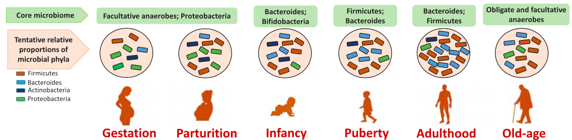
- Dysbiosis
-
The term “dysbiosis” refers to an imbalance or perturbation of the intestinal microbial community that is associated with disease. The list of diseases that have been associated with a shift in microbiome composition is growing, and it does not only include diseases that are directly linked to our GI-tract, such as irritable bowel syndrome or antibiotic-associated diarrhea. This list also includes allergies, obesity, heart disease, diabetes, depression, rheumatoid arthritis, autism, and many more. Just to list one example, cardio-metabolic disease was found to be correlated with a decrease in bacteria such as Enterobacter aerogenes and Escherichia coli and with an increase in Faecalibacterium prausnitzii, Klebsiella spp., Ruminococcus gnavus, and Streptococcus spp.
10.3.2 The human gut microbiome: what are they doing?
Research on our gut microbiome so far has made it clear that a core microbiome is essential for our health. However, despite some of the general trends described above, the exact composition of every human’s intestinal gut microbiome is unique and dependent on a rather long list of factors that include age, sanitation, exposure to pathogens, medication, environmental factors, diet, and host genetics. The precise taxonomic makeup of a “healthy gut” is therefore very difficult to define.
If the microbes in our intestines are so important for our health, of course we need to find out what they are doing there! Analysis of the metabolic functions of our gut microbiome was done as briefly described above: sometimes even without knowing which prokaryotic species carries out a particular metabolic function, we can compile a list of proteins the microbes’ genomes can make, and from that we can infer what they are capable of synthesizing or breaking down. Summarizing results from many studies, we know that our microbiome are involved in the following functions:
they need to be able to maintain themselves and need to have all the standard required housekeeping functions for prokaryotes. This includes genes for information processing (replication, transcription, translation) and the main metabolic pathways
our microbiome is involved in the biodegradation & fermentation of polysaccharides we can’t digest on our own
they synthesize essential vitamins for us
many microbes metabolize foreign compounds such as medications or food supplements
if those functions aren’t beneficial enough, some of our intestinal microbes are important in protecting us from pathogens, for example by stimulating the immune system or killing/inhibiting invading pathogens
Table 10.1 list in a little more detail three specific examples of metabolites that some of the bacteria in our guts can synthesize for us.
| Metabolites | Bacteria | Biological functions |
|---|---|---|
| Short-chain fatty acids (e.g. acetate, propionate, butyrate) | Firmicutes, including species of Eubacterium, Roseburia, Faecalibacterium, and Coprococcus | inhibit the growth of pathogens; provide energy to the colonic epithelial cells, implicated in human obesity, insulin resistance and type 2 diabetes, colorectal cancer. |
| Bile acids | Lactobacillus, Bifidobacteria, Enterobacter, Bacteroides, Clostridium | absorb dietary fats, facilitate lipid absorption maintain intestinal barrier function, signal systemic endocrine functions to regulate triglycerides, cholesterol, glucose and energy homeostasis. |
| Vitamins (K, B12, biotin, folate, thiamine, riboflavin) | Bifidobacterium | provide complementary endogenous sources of vitamins, strengthen immune function, exert epigenetic effects to regulate cell proliferation. |
From these descriptions it should be clear that the gut microbiome is not just involved in functions directly related to the intestines. Instead, it is involved in diverse functions that include general metabolism, physiology, immune system, organ development, cell proliferation, bone mass, adiposity, neurobiology, and many more. It’s no wonder at all that an imbalance in gut microbes can result in a number of diseases.
10.3.3 Microbiome therapeutics?
Putting all of the above results together, a logical next goal would be to influence or change the gut microbiome to cure diseases, alleviate pain and discomfort, and prevent illness. What are some of the options to possibly achieve this?
10.3.3.1 Recolonization
The GI tract shown in Figure 10.6 includes the appendix, which is sometimes considered to be no more than a useless evolutionary vestige. There is, however, evidence for a role of the appendix in immune functions, and some authors hypothesize the appendix to be a natural reservoir of beneficial bacteria. After a serious (e.g., cholera) infection and purging of the microbiome due to severe diarrhea, the appendix could serve to restore the intestinal microbiota. According to this hypothesis, individuals with an appendix should be more likely to recover from severe gut infections. Although the methods described above have been used to study the bacterial composition of the appendix in healthy individuals, it is difficult to test the hypothesis of the appendix’ function as a source for beneficial bacteria after pathogen infection. (Anyone volunteering for a cholera infection...?)
However, the potential benefits of recolonizing the gut microbiome has been tested in a different context. Clostridium difficile (also Clostridioides difficile or C. diff) is a pathogen that can cause potentially life-threatening inflammation of the colon. C. diff is antibiotic resistant, and it often spreads when the normal gut bacteria have been depleted after antibiotic treatment. Some studies have reported that bacteriotheraphy has led to rapid and complete recovery after fecal microbiota transplantation, and results of microbiome analysis before and after treatment showed that the C. diff infection disappeared. This kind of treatment is also called “transfaunation” and is frequently used in veterinary medicine to re-establish the normal intestinal flora of animals such as horses and cattle.
10.3.3.2 Diet
Severe diseases call for drastic measures, but can milder symptoms or diseases also successfully be treated with bacteria, and can a microbiome-friendly diet improve our well-being? Some studies have shown that the amount and types of fats and polysaccharides we consume have an effect on our microbiota, which in turn has consequences for our metabolic health. You might also have heard about prebiotics and probiotics in this context.
Prebiotics are non-living food ingredients that are resistant to gastric acidity, hydrolysis by host enzymes, or absorption by the upper intestine. They are fermented by the gut microbiota and stimulate growth or activity of of microbial species beneficial to the host’s health. Examples of food containing prebiotics are found include onions, asparagus, and whole wheat, for example.
Probiotics are live microorganisms that can confer a health benefit by (transiently) improving the intestinal microbiome balance. Probiotic yoghurt drinks have become a multi-million industry but are just one example of probiotics. Just about any fermented food falls into this category, such as sauerkraut, kimchi, kefir, kombucha. However, it is important to note that many of these foods, when store-bought, have been processed using heat or acidity and do not contain live microorganisms. Home-made fermented foods, in contrast, can contain up to \(10^6\) - \(10^9\) viable cells per gram or milliliter.
Do prebiotics and probiotics really work? Here is a study (https://doi.org/10.1038/srep06328) that attempted to alleviate the symptoms of patients with Irritable Bowel Syndrome, IBD, a functional disorder of the intestine that is associated with an altered gut microbiome. Firmicutes, Bacteroidetes, and other beneficial microbes that produce butryrate and vitamins decrease in IBD patients. Other microbes, such as pathogenic proteobacteria and fungi, increase. Researchers asked 13 IBD patients to consume a probiotic yoghurt drink for 4 weeks, twice per day. The patients’ microbiome was investigated before and after this treatment:
10.3.3.2.1 Who is there?
Figure 10.10 shows the relative abundances of bacteria in the patient’s stool samples before the yoghurt consumption in light blue; values for afterwards are shown in dark teal. The exact species names don’t matter here, but bacteria plotted in panel A are those that are in the probiotic yoghurt. Not surprisingly, their abundances increased. More surprising is that the relative abundances of other bacteria, which were not in the yoghurt, also changed as a consequence of the yoghurt consumption. For example, levels of the pathogen Bilophila wadsworthia were lower in post-treatment stools. This is shown in panel C, which plots abundances of non-yoghurt bacteria.
10.3.3.2.2 What are they doing?
The researchers determined which genes were present in the patients’ samples before and after they consumed probiotic yoghurt. In summary, the authors assembled the microbiome’s genes and then compared these sequences to a catalog of 3.3 million non-redundant human gut microbial genes. Although the researchers could only assign about half of the assembled genes to a specific species, they were able to determine the genes’ function. And this showed that the production of butyrate and other short chain fatty acids was increased as a result of yoghurt consumption. Simultaneously, the patients reported an improvement of their symptoms.
10.3.3.3 Final thoughts
Microbiology is one of the disciplines that has experienced an incredible transformation since the development of NGS technologies. Today we can find answers to questions that nobody even asked 20 years ago! However, most studies so far provide just snapshots, anecdotal evidence, and are often done with small and/or specific cohorts. Although studies like the one for C. diff or IBD patients seem promising, much more work is needed before we can reach general conclusions, make general recommendations for personal health and well-being, or even develop therapies. The application of existing bioinformatics tools as well as the development of new analysis approaches will play an important role in this area in the future.
10.4 References
Selected references for the material in this chapter:
Liu YX, Qin Y, Chen T, et al. A practical guide to amplicon and metagenomic analysis of microbiome data. Protein Cell. 2020;10.1007/s13238-020-00724-8. http://dx.doi.org/10.1007/s13238-020-00724-8
Fan Y, Pedersen O. Gut microbiota in human metabolic health and disease. Nat Rev Microbiol. 2020;10.1038/s41579-020-0433-9. http://dx.doi.org/10.1038/s41579-020-0433-9
Sender R, Fuchs S, Milo R. Revised Estimates for the Number of Human and Bacteria Cells in the Body. PLoS Biol. 2016;14(8):e1002533. http://dx.doi.org/10.1371/journal.pbio.1002533
Veiga P, Pons N, Agrawal A, et al. Changes of the human gut microbiome induced by a fermented milk product. Sci Rep. 2014;4:6328. http://dx.doi.org/10.1038/srep06328
Moran NA, Ochman H, Hammer TJ. Evolutionary and ecological consequences of gut microbial communities. Annu Rev Ecol Evol Syst. 2019;50(1):451-475. http://dx.doi.org/10.1146/annurev-ecolsys-110617-062453
11 Protein structure prediction
Analyses of DNA, RNA, and protein sequences described so far have focused on the primary structure of these molecules, i.e., on the linear arrangement of nucleotides, ribonucleotides, or amino acids. Functional molecules, however, fold into complex three-dimensional (3D) structures. The two DNA strands in our genome fold into a double helix, entire genomes fold into higher order structures, and each gene product of course folds into a structure that determines and enables its specific function (Figure 11.1). In this chapter, I focus on the structure of proteins and on the prediction of protein structure.
Information about the structure of a protein is very important for helping to understand and assign its function. It can also help explain binding specificity and antigenic property, or to design new proteins for applications in medicine and industry, for example. However, solving a protein structure is far from easy! X-ray crystallography and NMR-spectroscopy methods, and recently also electron microscopy, are used to experimentally obtain 3D protein information. These methods are expensive and time consuming and are not nearly able to keep up with the sequencing technologies: as of January 2022, more than 225,000,000 protein sequences were available in UniProt, but only about 185,000 solved protein structures in PDB.
For a long time, bioinformaticists have therefore attempted to computationally predict protein structure, and this is in fact one of the classical areas of bioinformatics. With recent advances in high-throughput sequencing technologies and analysis approaches, prediction accuracies have greatly improved. I will provide a broad overview of structure prediction, and I will illustrate that many of the sequence-based analysis approaches you have already learned also play an important role for the analysis and prediction of protein structure.
When you have worked through this
chapter, you should be able to define the following terms and explain
the following concepts.
Terms: fold, super-secondary structure, CATH, fold
recognition / threading, ab initio prediction, correlated mutations,
template-based vs. template-free prediction
Concepts: secondary structure elements of proteins;
relative number of sequences vs. structures; main approaches to predict
3D protein structure: principles and main steps, assumptions,
applications, limitations: homology modeling, fold recognition /
threading, ab initio prediction; use of sequence comparison approaches
(MSA, correlated mutations)
11.1 Structure of proteins
You already know that during transcription, RNA is made from a DNA template. During subsequent translation of protein-coding genes, triplets of nucleotides in the RNA template determine the specific chain of amino acids that is synthesized at the ribosomes. A functional protein, however, is much more than just a long chain of amino acids: It folds into a highly compact three-dimensional (3D) structure.
The amino acid sequence of a protein determines its structure, and the structure of a protein in turn determines its function. Although the diversity of protein sequence, structure, and function is enormous, highly similar sequences will fold into similar structures and generally have similar functions. Some protein structures are, for example, particularly well adapted to carry out structural, transport, or specific enzymatic functions. Despite the diversity of protein structures that exist in our cells, these 3D structures are made up of a common set of structural elements.
11.1.1 Levels of protein structure
There is a hierarchy of structures that make up a functional protein, shown in Figure 11.2 and described next.
11.1.1.1 Primary structure
The primary structure of a protein is the string of amino acids produced during translation of RNA into protein; they are connected by peptide bonds. Twenty different amino acids make up our protein universe, and these differ with respect to the side chain or rest group. The rest groups have different properties and sizes and play an important role in the protein’s 3D structure.
11.1.1.2 Secondary structure
Secondary structure elements are the basic components that form the backbone of a protein’s 3D structure (Figure 11.2 B). There are three main types of secondary structure elements, which I’ll only briefly describe below. Any biochemistry textbook will provide more information:
The \(\alpha\)-helix is one of the two major secondary structure elements. It is formed between 4 to 40 consecutive amino acids of a polypeptide (Figure 11.2 B, red). Hydrogen bonds form between the N and O atoms of the backbone. The \(\alpha\) helix has 3.6 residues per turn and is the most common helix.
The \(\beta\)-strand is the second major secondary structure element found in proteins. Two or more \(\beta\)-strands make up a \(\beta\)-sheet. In contrast to the \(\alpha\)-helix, a \(\beta\)-sheet is not necessarily formed between consecutive amino acids, but between different regions of a polypeptide that are aligned next to each other (Figure 11.2 B, blue). There are \(\beta\)-sheets in which the backbones run in antiparallel direction (N’-to-C’ next to C’-to-N’) and in which the backbones run in the same direction. These are called antiparallel and parallel \(\beta\)-sheets, respectively.
Loops The \(\alpha\)-helices and \(\beta\)-strands are generally connected by loops. These are often highly irregular and can be of variable length. In some texts, the loops are divided into turns and coils.
11.1.1.2.1 Supersecondary structures
Two or more secondary structure elements may form supersecondary structures: these are specific and recurring combinations of \(\alpha\)-helices and \(\beta\)-sheets with particular geometric arrangements that are found in many different proteins. The number and orientation of secondary structure elements within a supersecondary structure (or within an entire protein structure) is often shown in a topology diagram (Figure 11.3).
11.1.1.2.2 Folds
The general arrangement and connectivity of secondary structure elements found in a protein is also referred to as a ‘fold’. The folds in Figure 11.3 B and C both have four \(\alpha\)-helices, but they are connected differently. Protein folds are often used to broadly classify structures: there are proteins that have only \(\alpha\)-helices (all \(\alpha\)) or only \(\beta\)-sheets (all \(\beta\)). Proteins that contain both of these elements either have distinct \(\alpha\) and \(\beta\) regions (\(\alpha\)+\(\beta\)), or they contain \(\beta\)-\(\alpha\)-\(\beta\) supersecondary motifs (\(\alpha\)/\(\beta\)).
11.1.1.3 Tertiary structure
The secondary structure elements fold into three-dimensional or tertiary structures (Figure 11.2 C), usually just referred to as 3D structure. Amino acids that are physically distant from each other in the primary polypeptide can be brought into close proximity by the folding into a 3D structure.
11.1.1.4 Quarternary structure
While many proteins function as a tertiary structure that is made up of a single polypeptide chain, there are also proteins that, in order to be functional, require the assembly of two or more separate tertiary structures into a quaternary structure (Figure 11.2 D).
11.1.1.5 Domains
Domains are structural and/or functional units of proteins. Depending on the context, they carry out certain functions and have a conserved amino acid sequence (e.g., Pfam), and can be considered as somewhat independent structural units (e.g., CATH). Recall from the chapter on online databases that protein structures from PDB are split up into domains and then grouped into different hierarchical levels in the secondary database of structures, CATH.
11.2 Prediction of protein secondary structure
As just mentioned, despite the impressive diversity of three-dimensional protein structures, they consist of varying lengths and arrangements of the same secondary structure elements: \(\alpha\)-helices, \(\beta\)-strands, and loops. The organization of secondary structure elements of a protein describes its backbone structure and is therefore important for protein structure description and classification. Secondary protein structure was used for classifying and comparing proteins in the CATH database, for example.
The prediction of protein secondary structure can provide important information about a protein, and it is also part of some 3D prediction approaches. Note that “prediction” actually means the computational prediction of the secondary structure based on sequence information alone, i.e., of a protein for which no 3D structure is available. In other words, we are interested in predicting fragments of consecutive amino acids as \(\alpha\)-helix (H), extended \(\beta\)-strand (E), or coil (C). Please note that this is different from the assignment of secondary structure for a solved 3D structure (Figure 11.4), which used to be done by hand but is nowadays done automatically, using software.
For predicting secondary structure from sequence alone, a general assumption is that different amino acids have different preferences (propensities) to occur in the various secondary structure states. And these preferences are obtained and “learned” from known protein structures. More solved structures and thus more data about these preference means better prediction results. This principle has remained over the years, but newer methods also include additional information:
11.2.0.0.1 The first generation
of secondary structure prediction (on the very left in Figure 11.5) used statistical methods to compute the propensities of single amino acid residues within proteins. I’m leaving out some details, but based on the compiled propensities, the algorithm essentially predicted for each individual amino acid along a protein sequence its most likely secondary structure state. The sequence context in which a given amino acid occurs was disregarded. These methods were only used during about the early 1970s or so, and they were not based on a whole lot of training data.
11.2.0.0.2 The second generation
of prediction methods also use solved 3D structures to compute how frequently each of the 20 amino acids is found within the elements \(\alpha\)-helix, \(\beta\)-strand, and loop. In addition, and this was a small improvement over the first-generation algorithm, they also incorporate information about 16 adjacent amino acids. This is illustrated in the center of Figure 11.5, and I’ll again skip over the mathematical details.
11.2.0.0.3 Third generation approaches
of secondary structure prediction became available in the 1980s. These methods first began to incorporate evolutionary information obtained from alignments of homologous sequences. In addition, they use a different algorithmic approach: supervised machine learning, which I will briefly cover in a later chapter. Briefly, supervised learning is a machine learning approach in which training data is used to learn a function for a set of outcomes. Once the method has been trained using appropriate training data (here: solved 3D protein structures), it can be used to predict features of novel data (here: secondary structures of proteins of unknown structure).
Although the exact borders between different secondary structure elements within a protein are still more difficult to predict, the overall accuracy of secondary structure prediction using these methods have reached about 82%, on average. In other words, a secondary structure prediction for about 82% of the amino acids in a typical globular protein can be done correctly.
11.3 Prediction of protein 3D structure: an overview of methods
Different approaches to the problem of predicting protein structure have been developed and will be described below. Which of these methods is appropriate for a given protein sequence depends on whether an appropriate structural “template”, on which to base the prediction, can be identified. The general strategy for protein structure prediction is illustrated in the flowchart shown in Figure 11.6. Briefly look at it now, and please come back to it while working through the rest of the chapter.
11.4 Template-based 3D structure prediction
The basis for all template-based prediction approaches is the fact that the number of possible sequences is much larger than the number of possible 3D structures. In fact, although the number of new structures submitted to PDB has steadily increased over the years, the number different fold classes has stagnated. Without going into the biophysical details, there are some constraints on the conformations that proteins can adopt in 3D space, for example because of limited bond rotations and steric collisions between the backbone and the side chains. Some structural elements are conserved even in divergent sequences because they are important for the protein’s function. And homologous but different sequences generally adopt the same or a highly similar structure. In summary, there are different reasons why different sequences could take on the same (or a highly similar) structure.
Take for example the leghemoglobin amino acid sequence of the lupine plant Lupinus luteus and that of the myoglobin sequence of the sperm whale Physeter catodon. The alignment between these two sequences (Figure 11.7 A) shows that they are only 17% identical. However, despite this low level of sequence identity, these two sequences fold into highly similar structures, as seen when they are superimposed in Figure 11.7 B.
Figure 11.7 also illustrates the general idea of template-based structure prediction: if we have one solved structure, we can use it as a template to computationally model the structure of a second homologous protein. The all-important question then becomes this: how do we identify which structure can serve as a template to predict a second one? Multiple answers to this question exist, and they will be covered in the remaining sections of this chapter. At the end I will also give a brief introduction to prediction approaches when no suitable template can be identified.
11.4.1 Homology modeling
Comparative (homology) modeling is a computational method of approximating the 3D structure of a target protein for which only the sequence is available. This approach relies on the presence of a solved structure from a homolog, i.e., from an evolutionarily related protein with at least 25-30% sequence identity to the target protein.
The main assumption of homology modeling is that homologous sequences of sufficiently high sequence similarity generally fold into the same structure. Again, this comes down to the greater number of possible protein sequences than possible protein structures. Figure 11.8 schematically shows how sequences that are very similar and thus in close proximity within the space of possible sequences fold into the same structure in the structure space. Assume that the structure of the sequence representing the filled circle in the sequence space shown in Figure 11.8 is known. Homology modeling can then be used to assign the same or a highly similar structure to its homolog, which is represented by the open circle in the sequence space.
This provides the answer to the question of template selection for homology modeling: We make a BLAST database out of all sequences for which a solved structure is available. We then use a sequence for which we want to predict the corresponding protein structure as a query, also called “target” in this context. If we can identify a database sequence of at least 25-30% identity to the query, we can use homology modeling, which consists of the following steps:
11.4.1.0.1 1. Template recognition
The first step is the identification of a homologous sequence that can be used as the basis for comparative structure modeling. You already know how to do this: using BLAST. The database has to consist of sequences for which structures are already available. The coverage of the sequence should be about 80% of the query sequence or more.
11.4.1.0.2 2. Alignment
Using substitution matrices, such as PAM or BLOSUM, the best-possible alignment is generated between the sequence of unknown structure and one or more homologous sequences for which the structures are known. This alignment serves as the basis for the backbone of the model, so it has to be done very carefully.
11.4.1.0.3 3. Backbone generation
In this first step of the model building, coordinates for conserved regions are copied from the template(s) to generate an initial backbone. This is illustrated in Figure 11.9 A, and you can see that the structure still contains gaps at this stage. Mostly these correspond to the more variable loop regions.
11.4.1.0.4 4. Loop building
In the next step, the loops are modeled using one or both of the following two approaches. In a “knowledge-based” approach, a database is searched for segments from known structures that fit the specific end-points in the backbone structure. These segments come from fragment libraries available from PDB, CATH, or SCOP. In a “physics-based” approach, the loops are constructed by modeling possible loop conformations and computing energy functions. An energy function is a set of mathematical equations and parameters that describe the energy of a given molecular system, here a protein structure.
11.4.1.0.5 5. Side chain modeling
This final step adds side chains and their conformations (rotamers) to the backbone of the model as illustrated in 11.9 C. Conserved residues can simply be copied, and again a combination of fitting segments from libraries and optimizations using computational energy minimizations are used.
11.4.1.0.6 6. Overall model refinement
The model generated so far has to be optimized because the changed side-chains can affect the backbone, and a changed backbone will have an effect on the predicted rotamers.
11.4.1.0.7 7. Model validation
Every model contains errors, and even the model with the lowest energy might be folded completely wrong. It is therefore necessary to check whether the bond angles, torsion angles, and bond lengths are within normal ranges, for example.
11.4.2 Fold recognition or threading
If a BLAST search against the sequences with solved structures does not return an obvious homolog, it might still be possible to identify a template for structure prediction. This template might be identified at the level of sequence data, but with more sensitive methods than BLAST. Alternatively, a suitable template can be identified at the level of structures. These two approaches are lumped together and called fold recognition and/or threading and will be explained next.
11.4.2.1 Profile-based identification of a template
The sequence C in Figure 11.10 represents a sequence that is evolutionarily related to A and B, but rather distantly, and a BLAST search might not be able to identify sequence A as a homolog. More sensitive approaches to detect distant homologs include profile-based methods, and these are generally applied if BLAST does not return a homolog.
Profiles were introduced in the context of multiple sequence alignments: during progressive alignment, profiles are computed for sub-alignments that include only some of the input sequences. These profiles capture and represent the conservation and variability of residues in each alignment column. Conserved and variable positions are much more easily detected in a multiple than a pairwise alignment, which can be visualized with a sequence logo as shown in Figure 11.11. Take any two sequences of the MSA shown in Figure 11.11, and you’ll find that they are quite divergent. The sequence logo, however, shows which alignment positions are conserved in all or most of the sequences, and which are likely the ones most important for the function (and by implication the structure) of these proteins.
One approach to generate such profiles is illustrated in Figure 11.12: A large sequence database can be searched for significant BLAST hits to a query sequence. All database sequences that meet some threshold of similarity, E-value, and coverage can be used to compute a multiple sequence alignment that also includes the query sequence. From this alignment, a profile is computed, which is then used as a query to search sequences for which a structure is available.
PSI-Blast (PSI stands for position-specific scoring matrix) or Hidden Markov Models, which were introduced as the basis for the Pfam database, are the most commonly used profile-based approaches to search for structural templates. They are therefore the second strategy for identifying a protein structure that can serve as a model for structure prediction.
11.4.2.2 Sequence-structure alignment
You’ve done a quick BLAST search and then a more sensitive profile-based search, but you were unable to identify a sequence from PDB that is likely homologous to your query/target sequence. Is there still a chance that your sequence folds into a structure that is very similar to one that has already been solved? – Yes, it’s possible:
Sequences may in fact be derived from a common ancestor and therefore be homologous, but even our most sensitive methods may simply not be able to detect this. Despite considerable sequence divergence, the proteins may have maintained their ancestral structure.
Alternatively, sequences that are very dissimilar on the amino acid level may evolutionarily not be related at all. However, if their common function is dependent on a particular protein structure, they might nevertheless adopt a similar 3D structure.
The assumption that summarizes these two cases is that two proteins with little or no significant pairwise sequence identity can nevertheless adopt the same or similar folds. To detect these cases, the target sequence is compared / aligned to a number of different structures. In very simplified terms, the compatibility between a sequence and an already solved structure is evaluated: if sufficiently high, the sequence might fold into that structure.
These methods aim to find an optimal sequence-structure alignment: they compare a target sequence to a library of structural templates by first ‘threading’ the sequence of the target sequence of unknown structure into the backbone structure of the template protein with a known structure (Figure 11.13). The compatibility between the target sequence and the proposed 3-D structure is usually evaluated by computing a number of energy functions that I will not cover here. Some structures will fit a sequence well, while most structures will not be compatible with the sequence.
When evaluating how well a sequence fits a structure, of course not every single structure in PDB will have to be evaluated. Structures with the same or similar folds can be grouped, and only one representative of the group will have to be tested. The secondary structure databases CATH and SCOP provide such grouping and can be used for this purpose.
11.5 Template-free 3D structure prediction
If no template for structure prediction can be identified, the last resort is to use a template-free method, also called ab initio. The assumption of these approaches is that the native fold of a protein, its biologically active state, is the one with the lowest free energy. The free energy of many (in theory of all) possible conformations for a given sequence is computed, and the structures with the lowest energy are selected and returned.
In practice, there are many challenges for ab initio structure prediction. The number of possible conformations for even relatively short sequences is astronomical, such that once again heuristic prediction algorithms are employed. Even with heuristics, the computational demands for ab initio structure prediction are considerable.
The energy computations necessary for template-free structure prediction fall into the realm of biophysics, and therefore outside of what I consider to be the scope of this course. The initial steps of ab initio structure prediction employ, however, methods related to those we have already covered, and I’ll focus on these.
11.5.1 Steps in ab initio structure prediction
11.5.1.0.1 1. Collect and align homologs
The first steps are aimed towards somewhat narrowing down the number of possible conformations that will be explored. This usually involves collecting very large numbers of homologs from sequence databases and aligning them together with the target sequence.
11.5.1.0.2 2a. Predict local structural features
The multiple sequence alignment and the target sequence are used to generate predictions for short segments of the target sequence, for example about the secondary structure of the residues and about backbone torsion angles. These fragments will serve as the basis for backbone modeling during later steps.
11.5.1.0.3 2b. Predict residue contacts
In parallel, the multiple sequence alignment is used to predict which pairs of residues of the target sequence might be in spatial contact. This is done by inferring correlated mutations as shown in Figure 11.14. The assumption is that if two amino acids are in contact in the 3D structure of the protein, and if one of them mutates and would disrupt this contact, then their interaction can only be preserved if the second amino acid mutates accordingly. The inference of correlated mutations to aid the 3D structure prediction has become possible only recently. First, this kind of analysis requires very large multiple sequence alignments, with several thousand sequence homologs included. These data volumes have only become available with NGS technologies and large-scale sequencing projects, including metagenomics. The second prerequisite for the inference of direct pairwise contacts was the further development and application of machine learning approaches.
11.5.1.0.4 3. Assemble 3D models
From the short backbone fragments assembled in steps 2a and the contact predictions of step 2b, full-length 3D models are next generated. This involves repeated computation of energy functions for different conformations, i.e., of mathematical models of the molecular forces that determine protein structures and interactions. This is done iteratively, in that a very large number of conformations is sampled, and at each step the one with the lowest energy is kept. Different energy functions and different strategies for sampling from the space of possible conformations are used in this step.
11.5.1.0.5 4. Refine and rank models
The final step consists of further modeling the coarser representations of protein structure into high-resolution models. Problems such as steric restrictions or collisions, atomic overlaps, strained torsion angles of the cruder models are corrected and the models are refined. Once again, complex energy functions are employed, and the final result usually consists of multiple (ranked) predictions for the target sequence.
11.6 How well does it work?
Homology modeling used to be called “the biologist’s approach”, ab initio prediction used to be called “the physicist’s approach”, and fold recognition / threading was considered something inbetween. However, as you have seen from the descriptions above, this line has become blurred: homology modeling uses physics-based energy functions for model refinement, and ab initio predictions increasingly rely on sequence and structure databases, identification and alignment of large numbers of homologs, and on machine learning approaches to infer correlated mutations from multiple sequence alignments.
Both template-based and template-free methods have greatly improved in the last decade or so, and the resulting models are of higher accuracy. But how good are they? How accurate are the predictions, and how useful are the models for answering biological questions?
Every two years, the Protein Structure Prediction Center attempts to provide answers to these questions. They organize the CASP (Critical Assessment of Protein Structure Prediction) competition, which has been running since 1994. Sequences for structures that are about to be solved experimentally are made available, and researchers can predict structures for these. The assessment of prediction accuracy in different categories (template-based, template-free, structure refinement, etc) and the main results and best prediction algorithms are then published.
You can find more details on the Center’s website at https://predictioncenter.org, but the main conclusions are that an increased amount of experimental data on structures, sequence data for huge protein families, as well as the development of new machine learning algorithms have significantly improved the prediction accuracy.
The last CASP run was number 14, and the clear winner was a program called “AlphaFold2” from the company DeepMind, a Google subsidiary. As the plot in Figure 11.15 shows, even more difficult targets can now be predicted with an accuracy of about 85%, largely due to the AlphaFold 2 results. This has received a lot of attention in recent months, leading some headlines to claim that the structure prediction problem has been solved (e.g., BBC: One of biology’s biggest mysteries ‘largely solved’ by AI, https://www.bbc.com/news/science-environment-55133972).
The AlphaFold and EBI teams have combined their efforts to create a database of predicted protein structures. This online resource aims to “accelerate scientific research” and is available at https://alphafold.ebi.ac.uk/. The large number of newly predicted protein structures can now serve a starting point for further research that validates these structures, or that uses them for the purpose of drug discovery or the investigation of the effects of genetic variants on protein structure, for example.
11.7 References
Selected references for the material in this chapter:
The Shape and Structure of Proteins (Molecular Biology of the Cell. 4th edition.) https://www.ncbi.nlm.nih.gov/books/NBK26830/
Cavasotto CN, Phatak SS. Homology modeling in drug discovery: current trends and applications. Drug Discov Today. 2009;14(13-14):676-683. http://dx.doi.org/10.1016/j.drudis.2009.04.006
Kuhlman B, Bradley P. Advances in protein structure prediction and design. Nat Rev Mol Cell Biol. 2019;20(11):681-697. http://dx.doi.org/10.1038/s41580-019-0163-x
Kryshtafovych A, Schwede T, Topf M, Fidelis K, Moult J. Critical assessment of methods of protein structure prediction (CASP)-Round XIII. Proteins. 2019;87(12):1011-1020. http://dx.doi.org/10.1002/prot.25823
12 Graphs and networks
You already know that working in biology today means dealing with huge data volumes and with difficult problems. Selecting efficient algorithms and working on fast computers with sufficient storage and multiple (many!) processors are therefore important aspects of biological research today. The “efficiency” of algorithms doesn’t just refer to the time it takes the job to complete, it also means storing the data in data structures that are space efficient and that can efficiently be accessed.
Graph theory is a classical area in mathematics that is important for many other disciplines, and graphs are excellent data structures for storing, searching, and retrieving biological data. In this chapter, I’ll provide an introduction into graphs, and I’ll show how graph theory is elegantly used to solve bioinformatics problems. Here, graph theory is simply the tool we’re using for storing and analyzing data. At the end, I’ll briefly mention how graphs (often called networks in this context) are used to understand biological systems.
When you have worked through this
chapter, you should be able to define the following terms and explain
the following concepts.
Terms: graph, node, vertex, edge, link, Euler(ian)
path, Hamiltonian path, (un)directed graph, (un)weighted graph,
adjacency matrix/list, cluster, hub, systems biology
Concepts: graphs in biology (examples, nodes, edges,
types); using graph theoretic approaches for homology assignment and
sequence assembly; random vs. scale free networks (examples, properties,
implications)
12.1 Graph theory
A data structure is a way to organize or store information such that it can be used efficiently. Common data structures that you have already used numerous times are lists or tables, for example. In computational biology, a very important data structure is a graph.
The term ‘graph’ (or ‘network’) in this context refers to a set of nodes, also called vertices, that are usually represented by circles or dots, and a set of edges that are represented by lines connecting pairs of nodes (Figure 12.1). For each pair of nodes there either is an edge between them, or there is not. A finite set of vertices \(V\) and a finite set of edges \(E\) therefore make up a graph \(G(V,E)\). Graphs can be undirected, directed, weighted, cyclic, or acyclic, and some examples are shown in Figure 12.1.
- undirected
-
Formally, a graph is undirected if its edges are unordered pairs of nodes. The graphs A and B in Figure 12.1 are undirected. The upper graph in Figure 12.1 D also is undirected, it can be described by \(G(V,E); V=\{a,b,c\},\) \(E = \{\{a,b\}, \{b,c\}\}\). The relationships are symmetric, and the edge \(E = \{\{a,b\}\) represents a connection from \(a\) to \(b\), as well as the connection from \(b\) to \(a\).
- directed
-
The lower graph in Figure 12.1 D, in contrast, shows the same three nodes in a directed graph (digraph): these are ordered pairs of nodes. The relationships are not symmetric, and this graph is defined as \(G(V,E); V = \{a,b,c\}, E = \{(a,b), (b,c)\}\). A connection from \(a\) to \(b\) does not also imply that there is a connection from \(b\) to \(a\). The graph in Figure 12.1 C is also directed.
- cyclic
-
A cyclic graph (directed or undirected) is one that contains a cycle, or a closed path. The graphs in Figure 12.1 A and B contain cycles and are therefore cyclic graphs.
- acyclic
-
A graph that does not contain any cycles is acyclic. The graphs in Figure 12.1 C and D, for example, contain no path that starts and ends at the same node, these are therefore acyclic.
- weighted
-
A graph in which the edges are associated with weights is called weighted (or edge-weighted), and the graph in Figure 12.1 B is the only weighted graph in this Figure.
- unweighted
-
A graph in which neither the edges nor the nodes are associated with weights is called unweighted. The graphs in Figure 12.1 A, C, and D are unweighted.
12.1.1 Computer representations of graphs
Although I just explained some graph concepts and algorithms using a graphical representation of graphs (i.e., circles that are connected by lines), this is not an appropriate or efficient representation of a graph for a computer. Among the frequently used computer representations of graphs are adjacency matrices and adjacency lists.
Consider the directed and weighted graph shown in Figure 12.2 A. The complete graph can be represented in the table shown in Figure 12.2 B: the nodes are listed in the first column and the top row, and the table cells represent the weights of the edges between two nodes. This representation is also called an adjacency matrix. For an undirected graph, the matrix would be symmetrical.
Especially when the matrix is very sparse and contains only few entries, data structures that occupy much less space can be used. In an adjacency list, for example, only the nodes from which an edge emanates are listed. This is shown in Figure 12.2 C.
12.1.2 From descriptive graphs to network science
Early applications of graphs were often simply the mathematical descriptions of food webs, social systems (of insects, political parties, or communities), or of road systems, for example. The growth of the world wide web and the development of graphical web browsers in the 1990s spurred scientific interest in networks. Through web pages, the connections in business, science, academia, homes, and other areas of life became evident and subject of description and exploration. The properties and the growth and dynamics of networks were studied in detail, and their effects on markets and communities were investigated. The tools for this new era of network science came from the well-established disciplines of graph theory and mathematics.
Graph algorithms were adapted or developed for larger data sets, and there are many problems in graph theory for which efficient solutions exist. There are, for example, efficient algorithms for traversing graphs, searching through graphs, or performing operations on subgraphs. If you have learned anything about graph theory before, you probably know what an Euler (or Eulerian) path is: a path through a graph that visits every edge exactly once. The Euler path is named after the mathematician Leonhard Euler, who abstracted the bridges in Koenigsberg in Prussia into the edges of a graph in the 18th century and is considered the founder of graph theory.
How does any of this affect biological research? – It means that if we can state a biological problem in terms of graphs, an appropriate and efficient algorithm for a solution might already be available. Graphs play an important role in bioinformatics, for example in metabolic networks, protein-interactions, sequence similarity clustering, or genome assembly. Some examples of how biological data can be represented as graphs is shown in Figure 12.3.
12.2 Using graphs as tools to solve a problem
12.2.1 Homology assignment
You have learned how to identify one or more homologs to a single query sequence using BLAST. But what if you have multiple genomes and their predicted protein-coding genes, and you want to identify all sets of homologs between them? Let’s take four different eukaryotic species and their predicted protein sequences (maybe a human, a spider, a blueberry, and a chili pepper?). It’s safe to assume that these species each have approximately 20,000 genes, so you’d have to do 80,000 individual BLAST searches. Even if you find a way to automate this, evaluating 80,000 BLAST results to identify homologs isn’t something anyone can (or wants to) do by hand.
This is illustrated in Figure 12.4. For a number of input sequences (panel A), the goal is to identify all sets of homologs. Each species has about 20,000 genes, but only 5-6 are shown as different shapes. The same shapes represent homologous genes in different species; all four species have the “round” gene, whereas only species 1 and 4 have the “plus-sign” gene.
To identify all sets of homologs, we could do what is called an “all-vs-all” BLAST search, in which all 80,000 protein sequences of the four species are used as query sequences and simultaneously also as the BLAST database. This way, every sequence could be compared to every other sequence in this data set, as illustrated in Figure 12.4 B for just 20 input sequences. Homologs are expected to be most similar to each other, for example evaluated by BLAST E-value or bit score, or by another pairwise alignment score. The final step would therefore be to identify the sets of sequences that are most similar to each other (Figure 12.4 C) according to whichever score is used for this purpose.
The way these sequence comparisons are illustrated in Figure 12.4 B and C resemble graphs, in which the nodes represent individual protein sequences, and the edges between each pair represents that pair’s sequence similarity score. In graph theoretic terms, we’d want to cluster (group) sequences/nodes by their edge weights such that groups have high similarity scores (or low E-values) within a group and low similarity values (or higher E-values) between groups. This is called clustering, and there are clustering algorithms that efficiently cluster the nodes of a given graph into groups.
Let’s apply this concept to the clustering of biological sequences. As mentioned above, nodes to be clustered represent the sequences, and weighted edges between them represent pairwise sequence similarity, for example BLAST E-values. This is illustrated for a very small set of four sequences in Figure 12.5 A: three of the sequences are rather similar, based on low E-values among them, and they would be clustered into the same sequence family. A fourth sequence is quite different from these sequences, indicated by high E-values. It would not be assigned to the family of the other three sequences.
Of course, the separation of ‘high’ and ‘low’ E-values isn’t always as easy, especially when doing this kind of analysis for hundreds or thousands of nodes/sequences. In practice, statistical methods are used to basically make the strong edges (the ones with low E-values) even stronger, and to make the edges with higher E-values weaker and even disappear. This is illustrated in Figure 12.5 B and C for a different set of 13 hypothetical proteins. And an implementation of this clustering approach called MCL (which stands for Markov CLuster Algorithm; http://www.micans.org/mcl/) is in fact used frequently in bioinformatics.
In theory, each resulting cluster represents a set of homologous (or even orthologous) sequences. In practice, however, verification of homology and orthology are often done using additional methods. I’m skipping over a lot of details here, but the main points are that (i) algorithms developed in the context of graph theory can successfully be applied to cluster biological sequences, and that (ii) the resulting sets of homologs can be used for further analyses (such as computing alignments or phylogenies) and can ultimately be used to answer interesting biological questions.
Commonly used sequence databases include results of applying clustering algorithms to genome-scale data sets. The UniProt database you have already used, for example, lists for most entries a number of “Phylogenomic databases” in the category “Cross-references”. This corresponds to groups of sequences to which a given sequence is homologous. Not all of the phylogenomic databases listed here use graph-theoretic approaches to cluster homologs, but a good number of them do.
12.2.2 Genome assembly
Genome assembly was covered before. In summary, the data consist of thousands or millions of sequence reads. Based on pairwise overlaps, the corresponding reads are merged into contigs. This should sound familiar to you, and it is illustrated for a tiny set of five short sequences in Figure 12.6.
But how is this done in practice? How are the millions of pairwise overlaps computed and stored? How is the best sets of overlaps among the many options selected and used to construct the contigs? – You guessed it: graph theoretic approaches are used!
For long reads (e.g., from Sanger sequencing or the newer Pacific Biosciences platform), first an overlap graph is constructed as shown in Figure 12.7 A. Sequence reads are the nodes, an edge is drawn between read pairs if their ends overlap, and the lengths of the overlaps are the edge weights. From the red and brown sequence next to Figure 12.7 A, you can see that there are two ways to overlap them, depending on whether the beginning or the end of the red read is overlapping with the brown read. As a consequence, the edges are directed.
The next step is to find a path through the overlap graph that likely represents the target genome. Many different traversal algorithms exist, but here we need one that fulfills (at least) the following requirements:
all reads come from the genome and have to be incorporated: the path should visit every node (read) exactly once; this type of path is called a Hamiltonian path.
if one read shares overlap with multiple other reads, the longest overlap is selected: the path should select the highest edge weights, resulting in the shortest contig.
there are some other choices (parameters) that have to be specified, such as not allowing cycles or setting the minimum overlap length, for example.
The contig shown in black in Figure 12.6 C is the result of selecting the Hamiltonian path shown in black in Figure 12.7 B. It has a length of 25 bp and a weight (total number of overlapping bp) of 11.
Although this unrealistically small example illustrates the principle of genome assembly from longer reads, things are of course quite a bit more complicated for real data: The graph for sequencing data even for small genomes is very large, and heuristics are needed to construct a Hamiltonian path. Many paths (i.e., different assemblies) through this graph are generally possible and consistent with the data, and so the optimal solution (i.e., the correct genome) is not guaranteed to be returned. In fact, many assembled and published genomes do contain errors, for example the collapsing of repeats.
In summary and without going into algorithmic details, graph theoretic approaches of constructing an overlap graph and identifying a Hamiltonian path through this graph is used to assemble genomes from long-read data. These algorithms were first developed for Sanger data and were later updated for the new long-read technologies such as Pacific Biosciences and Oxford Nanopore. However, this approach does not work for short-read data: the number of these reads is much larger, and the pairwise overlap computations are therefore too many. Furthermore, because the reads are so much shorter, there are much fewer unique overlaps.
For assembling short-read data, for example generated using the Illumina platform, different algorithmic approaches had to be developed. These also use graph theoretic data structures and principles, but the graph is of a different type, and reconstructing the target genome by finding a path through the graph is also done differently. Many variations and implementations exist for short-read genome assembly, but they all use a so-called de Bruijn graph instead of an overlap graph. Here, (fragments of the) reads are the edges, and their overlap are the nodes. In assembling a genome, an Eulerian path is chosen, i.e., one that visits every edge exactly once. However, an assembly based on a de Bruijn graph also does not guarantee the optimal solution, resulting in fragmented assemblies that may contain errors. Nevertheless, even such draft genomes are extremely useful for a variety of biological disciplines and have provided us with important insights into the biology and evolution of many organisms.
12.3 Using graphs (networks) as models to understand biological systems
In the examples above, we take advantage of existing graph algorithms, and graph theory is simply used as a tool to solve bioinformatic problems that otherwise don’t really have much to do with graphs. For the purpose of analysis, data is converted into a graph, an appropriate graph algorithm is applied, and then we’re back to a different data format: assembled genomes in fasta format, lists or multi-fasta files of homologous protein sequences, for example.
When some other types of biological data are converted into graphs, we’re actually interested in understanding this data from a graph theoretic point of view. Metabolic networks, gene regulatory networks, or protein-protein interactions are such examples. Although a ‘graph’ and a ‘network’ are pretty much the same thing, in this context (i.e., larger and more complex graphs) the term ‘network’ is often used. I’ll use these two terms interchangeably in the remaining parts of this chapter.
12.3.1 Describing graphs
We might want to simply describe a graph that represents metabolic reactions, gene regulation, or physically interacting proteins: what does the graph look like, how many nodes and edges does it have? How many edges does one node have, on average? Which are the nodes with the most edges? Which nodes form natural clusters? ...? There are some specific terms that are used for this purpose, here are some of them:
degree: the number of edges one node has
diameter: the maximum distance between any two nodes
components: disconnected sets of nodes
clustering coefficient: measures the presence of subsets
hub: a node with significantly more than the average number of edges
and many more...
The three graphs shown in Figure 12.8 all have eight nodes. Their topology, however, is vastly different: the first one has three components; the second one has one hub node that is connected to all other nodes; the last one is a network with a much higher average degree per node than the other two.
12.3.1.1 Random and scale-free networks
Up to approximately the year 2000, networks were often considered to be random graphs: while growing, the edges are placed randomly between nodes. This results in most nodes having about the same number of edges. An example of a random network is shown in Figure 12.9 A, with most nodes having about two edges. If we plotted the number of edges per node, we’d get the standard bell curve right next to the graph.
During the late 1990s and early 2000s, very large networks became available for analysis, and the computers for storing and analyzing this data also had improved quite a bit by then. Take for example the world wide web, a gigantic network of nodes (web sites) connected via edges (hyperlinks). A partial map of the early world wide web from 1999 can be found here: http://cheswick.com/ches/map/gallery/jun99-ip.gif. If you clicked on the link, you saw that this network has a rather different topology from a random network: some nodes have a large number of edges, and these hubs clearly stand out. This kind of network is called ‘scale-free’.
Scale-free networks are generally large, they have a few hubs with lots of links, but most nodes have only very few edges. Figure 12.9 B shows a tiny version of this, with two hubs shown in blue. Next to the graph is again a summary plot of how many nodes have how many edges. For scale-free networks this follows the power law distribution. If both axes were on a logarithmic scale, the distribution of edges would be a straight line.
How about other large networks, are they also scale-free? – Yes, many of them are! Table 12.1 lists some examples of real-life networks that were constructed and evaluated, and they were found to be scale-free.
| Network | Nodes | Links | Type | N | L | K |
|---|---|---|---|---|---|---|
| Internet | Routers | Internet connections | Undirected | 192,244 | 609,066 | 6.34 |
| WWW | Webpages | Links | Directed | 325,729 | 1,497,134 | 4.60 |
| Power Grid | Power plants, transformers | Cables | Undirected | 4,941 | 6,594 | 2.67 |
| Mobile-Phone Calls | Subscribers | Calls | Directed | 36,595 | 91,826 | 2.51 |
| Email addresses | Emails | Directed | 57,194 | 103,731 | 1.81 | |
| Science Collaboration | Scientists | Co-authorships | Undirected | 23,133 | 93,437 | 8.08 |
| Actor Network | Actors | Co-acting | Undirected | 702,388 | 29,397,908 | 83.71 |
| Citation Network | Papers | Citations | Directed | 449,673 | 4,689,479 | 10.43 |
| E. coli Metabolism | Metabolites | Chemical reactions | Directed | 1,039 | 5,802 | 5.58 |
| Protein Interactions | Proteins | Binding interactions | Undirected | 2,018 | 2,930 | 2.90 |
The ones we’re interested in most are the two biological networks in Table 12.1: cellular metabolism and protein-protein-interactions. In the first case, most molecules participate in 1-2 reactions, but a few hub molecules participate in many reactions (e.g., coenzymeA, NAD, GTP). In the second case, most proteins interact with 1-2 other proteins, but a few hub proteins interact with many proteins (e.g., the p53 tumor suppressor gene or the wd40 domain).
The networks listed in Table 12.1 as well as other large networks were generated by different processes, yet their architectures and their organizing principles are the same. What are some of the properties they all have in common? – They are robust! Random or accidental failures generally don’t bring down the entire system, although these networks are vulnerable when hubs fail. Again coming back to the biological networks: The implications are that random mutations (i.e., the failure of random proteins) is likely to not affect or bring down the entire network; the unaffected proteins will keep the network going. If a hub is non-functional because of a mutation, the damage is of course much more severe.
Regardless of whether power grids, the internet, or biological networks are explored: a common set of mathematical tools are now at our disposal for this purpose and has already provided insights into complex systems – man-made or naturally occurring.
12.3.2 Analyzing graphs
The description of graphs and their properties is only one aspect of network biology. The second aspect is the analysis of graphs, such as searching for substructures or path, or mathematically modeling flow through a network. With this we’re moving into a relatively new discipline called “systems biology”. Look this term up online, and you’ll find many different definitions. Here is one of them: in systems biology, the concepts & tools of engineering, mathematics, physics, computer science, and biology are used to quantify, model, and predict complex biological phenomena.
Taking as an example the modeling of metabolic fluxes, systems biology might first aim to reconstruct a (partial) metabolic network of one or more organisms. Key pathways are identified, as are species-specific differences, alternative pathways, and the presence of hubs, for example. In a next step, the network is analyzed with respect to its structure, resources, or adaptability, and its behavior under different conditions is modeled. This involves a lot more mathematics than biology, and important systems biology tools are differential equations and matrix operations.
Systems biology is a different type of bioinformatics: So far the bioinformatics tools I have introduced, such as database searches, alignments, or phylogenetic analysis, are really just equipment that can be applied to questions in about any biological discipline: this type of bioinformatics isn’t a biological discipline itself. In contrast, systems biology should be considered a distinct discipline and not simply a set of tools. If you’re interested in biological processes and you’re a “math wiz”, maybe systems biology is your field!
12.4 References
Selected references for the material in this chapter:
Barabási AL, Oltvai ZN. Network biology: understanding the cell’s functional organization. Nat Rev Genet. 2004 Feb;5(2):101-13. http://dx.doi.org/10.1038/nrg1272.
Barabási AL, Network Science: an online textbook available at
http://networksciencebook.com/OrthoMCL, a database of gene families that were clustered using the approach described in this chapter: https://orthomcl.org/orthomcl/
Simpson JT, Pop M. The Theory and Practice of Genome Sequence Assembly. Annu Rev Genomics Hum Genet. 2015;16:153-72. http://dx.doi.org/10.1146/annurev-genom-090314-050032
The introduction of the following article lists four hypotheses that could explain the loss of the ability to synthesize vitamin C: Hornung TC, Biesalski HK. Glut-1 explains the evolutionary advantage of the loss of endogenous vitamin C-synthesis: The electron transfer hypothesis. Evol Med Public Health. 2019 Aug 28;2019(1):221-231. http://dx.doi.org/10.1093/emph/eoz024
13 R
Biological data sets are often large, heterogeneous, and complex. We need ways to describe, summarize, explore, and visualize this data; we need to extract useful information and find trends & patterns in this data; and we need tools to test biological hypotheses and make inferences about the processes underlying this data. For these purposes, probability and statistics are essential.
R is the name of a very powerful statistics software package and language that comes with lots of built-in statistical analysis functions and excellent graphing capabilities. Functions can be added by the user, and additional modules (packages) are available for a variety of specific purposes. R can be downloaded for free at http://www.r-project.org. At this web site there are also links to documentation, many of which are freely available PDF documents. You can also download additional packages and visit user forums, among many other things. R is an open-source implementation of the S programing language. A commercially available implementation is S-PLUS.
R is becoming increasingly important for biological data analysis and visualization. Many types of biological data can be read into R. Core packages and functions of R allow us to work with (large) tables and lists of data. I’m sure you can think of many examples, but here are a few to get you started: the lengths of genes in different species, the types of mutations and their frequency of occurrence in one or different species, or the GC-content along the chromosomes. Analyses and visualizations that are not specific to biological data can be done with these data, such as identifying outliers, generating barplots, or applying general-purpose statistics or machine learning tools. With additional packages, other data types and formats can be read in, analyzed, and visualized in ways that are specific for biological data sets. Packages for the analysis of gene expression data, sequence reads, or phylogenetic trees, for example, are available.
This chapter gives you a basic introduction into working with R, using the terminal version. However, there is also a graphical user interface for R, called RStudio. You are welcome to use this, just enter the commands into the console window of RStudio. As usual, the computer exercise is at the end of this chapter, but it might be very helpful to try out some of the R code presented in the following sections, too.
When you have worked through this
chapter, you should be able to do the following operations in R and to
know the functions listed
Operations: generate and name variables; access entire
vectors and matrices and also on selected elements; perform functions on
entire vectors and matrices and also on selected elements.
Functions: ls(); c(); max(); min(); length(); sum();
mean(); median(); var(); sort(); summary(); rep(), incl. parameters
‘each’ and ‘times’; read.table(), incl. reading in column and row names;
plotting functions plot(); hist(); boxplot(), incl. adding axis labels
and a title; q().
13.1 Getting started
In the terminal window of a linux or Mac machine, you start R by
typing the name of the software. R first briefly introduces itself to
you, and then you see a prompt (the ‘>’ symbol), which
indicates that R is ready for input. Alternatively, you can start
RStudio by clicking on its icon. We can now enter a command (here the
addition of two numbers), and R will output the result:
  > 2 + 6
  [1] 8
Note: when you see the ‘+’ symbol as a prompt (at the
beginning of the line), it means that the line above it is not complete
yet and requires further input before it can be processed. In the
example below, this continuation prompt is shown; it does not imply that
the result involves adding values.
  > 1*2*3*4*
  + 5*6
  [1] 720
At the beginning of the output line, the [1] indicates
that at this line, the first result value begins, even though in this
case there is only a single result anyway. If you asked R to output 15
different numbers, and if only 11 of them fit onto a line, you’d see the
following on the screen:
   [1]  2  4  6  8 10 12 14 16 18 20 22
  [12] 24 26 28 30
13.2 Variables
R can be used as an overgrown calculator: when you directly type in
2+6, it computes and outputs a result. Much more
interesting, however, is to use variables: As in all programming
languages, variables are objects which can be named, and to which values
can be assigned. Values that are stored in variables can be used later
on for different computations and using different functions.
  > x = 2
  > y = 6
  > x + y
  [1] 8
The code above assigns numerical values 2 and 6 to two variables that are named ‘x’ and ‘y’, respectively. The variables can then be used for any number of operations. The R-prompt (the ‘\(>\)’ sign) is included in the example above, but I omit it from the remaining code snippets in this chapter.
Note that the two assignment operators
=and<-both work in current R versions, so that the commandsx = 2andx <- 2are equivalent. The<-is the older of the two (and used in S/S-PLUS), and in a lot of the available R documentation online and elsewhere it is the only assignment operator used.It is important to keep in mind that the variable ‘x’ would be overwritten without warning if the next command were to be
x = 3. Of course, the sum of ‘x’ and ‘y’ would then be different as well.Note that you can (and probably should) use different variable names from what I’m using! Here, I mostly use single letters as variable names, but it is generally a good idea to name your variables so that you remember its purpose or content. In R, variable names are case sensitive, must not begin with numbers or with symbols, and they also must not have spaces in them.
To see (list) which variables are currently available,
type ls(). To remove a specific variable, for
example one called xyz, type rm(xyz).
ls() and rm() are built-in functions
that carry out a set of instructions. After the name of a function,
(sometimes optional) parameters or data are specified within
parentheses. A later sections goes into more detail about available
functions.
13.2.1 One-dimensional variables
One-dimensional variables can hold one or more values, and you can think of them as values that can be stored in a single row or a single column. The values in variables can be numbers or text (strings), but strings have to be surrounded by quotes when they are assigned to a variable.
It is possible to type in manually the values for a variable. For
example, several elements can be can concatenated (linked together)
using the concatenation function ‘c()’:
  a = 7
  b = c(1, 3, 5, 7)
  c = c("two", "four", "six", "eight")
  d = c(1, "two", 3, "four", 5)
There are other ways to assign values to a variable, you’ll learn about some of them during the computer exercise. For small examples and for learning about how to use variables and functions this week, I might ask you to manually enter data. Starting next week, however, we will read in data from external files, which is of course the only reasonable option for large data sets.
Vectors can hold either numbers or strings – never both. The variables ‘a’, ‘b’, and ‘c’ above are therefore vectors.
Lists can hold different types of values: the variable ‘d’ contains both numbers and strings and is a list.
Whether a variable is a vector or a list makes no difference to you when you assign values to it. However, some functions (see below), only work with vectors and not with lists, and it is useful to explicitly refer to variables that only hold numbers by their proper name: ‘vectors’.
13.2.1.1 Using one-dimensional variables
Vectors that contain single values can be used as mentioned above. However, operations and functions also work on vectors that contain multiple values:
13.2.1.2 Accessing one-dimensional variables
If you want to see the entire contents of a variable, you simply type its name, followed by a return. Accessing only parts of the variable is of course also possible. For the following examples, let’s assume a vector ‘y’:
y = c(2, 4, 8, 16, 32, 64)y[2]returns the second element of the vector ‘y’: the number 4, in this casey[1:3]returns the first three elements of the vector ‘y’: the numbers 2, 4, and 8.max(y)returns the element of ‘y’ with the maximum value: 64.
In all three examples above, we wanted to access the values that are stored in vector ‘y’. It is also possible to access the index (position) of elements within the variable ‘y’. Compare the following two commands:
  y[y>5]
  which(y>5)
The first command above returns the values of the vector ‘y’ that are greater than 5 (8, 16, 32, 64). The second command gives you their indices, or positions, within the vector: 3, 4, 5, 6.
Here is a second example:
  max(y)
  which(y==max(y))
The first command returns the maximum value of vector ‘y’, whereas the second tells you that this value is in the 6\(^{th}\) position, or has an index of 6.
Finally, you can also access information about the vector or its
indices: length(y) returns the length (number of elements)
that are stored in the vector ‘y’. And y<10 tells you
whether each value in the vector is smaller than 10 or not:
  length(y)
  [1] 6

  y<10
  [1]  TRUE  TRUE  TRUE FALSE FALSE FALSE
13.2.2 Two-dimensional variables
Often times you have more complex data structures than vectors and lists: you need tables that contain multiple rows and columns. Similar to the one-dimensional variables, there are tables that can contain only one type of data (a matrix), and tables that hold both numbers and text (a data frame).
You can generate matrices and data frames by hand, and you’ll have a chance to do this during the computer exercise. More often, however, matrices and data frames are read in from files; I come back to this later and provide some examples.
13.2.2.1 Accessing two-dimensional variables
Assume the following matrix, which is stored in a variable called ‘y’:
    1   2   45
    1   5   67
    2   1   46
To see the entire contents of variable ‘y’, you can simply type the
name of the variable. To access only parts of the table, use the
following syntax: y[row-number,column-number]. Specifying
just one of these parameter is ok, too. Here are some examples:
y[,2]returns the second column of the matrixy[3,]returns the third row of the matrixy[3,2]returns the element in the second column and the third row
13.2.2.2 Operations on matrices
Of course you can perform operations either on the entire table or on selected elements: consider the following commands and their output; they were used on the table ‘y’ I just introduced:
    command         output
    ----------------------
    sum(y[,2])      8
    sum(y)          170
    y[,3]>50        FALSE  TRUE FALSE
    y[3,]*10        20  10 460
13.3 Functions
Functions perform tasks on data objects such as vectors or tables. R comes with a lot of built-in mathematical, statistical, vector, graphics, and other functions. You can also load additional functions and write your own.
13.3.1 Built-in functions
R comes with a number of functions in different categories, for example
mathematical functions, e.g.,
log(x,n)vector and matrix functions e.g.,
median(x)string (text) functions, e.g.,
strsplit(x, split)statistical probability functions, e.g.,
dnorm(x)statistical analysis functions, e.g.,
chisq.test(matrix)machine learning functions e.g,
hclust(d)graphics functions, e.g.,
plot(x,y)
Functions can be applied to numbers that are directly entered as well as to values that are stored in variables:
    log(5)
    [1] 1.609438

    number = 5
    log(number)
    [1] 1.609438

    numbers = c(2, 5, 10)
    log(numbers)
    [1] 0.6931472 1.6094379 2.3025851
Note that functions require at least one argument, and this is
usually the variable to which the function is to be applied. The
arguments are given directly after the name of the function and enclosed
in parentheses: function(argument). When multiple arguments
are expected, their order matters.
13.3.1.1 Vector and matrix functions
Of the categories listed above, vector & matrix functions and graphics functions are going to be the most important ones for us. Here are a few of these functions and their output:
| length(x) | number of elements in x |
| max(x) | maximum value in x |
| min(x) | minimum value in x |
| sum(x) | total of all the values in x |
| mean(x) | arithmetic average of all values in x |
| median(x) | median value in x |
| var(x) | variance of x |
| sort(x) | a sorted version of x |
| rank(x) | vector of the ranks of the values of x |
| quantile(x) | vector containing the minimum, lower quartile, |
| median, upper quartile, and maximum of x |
If you want to simply see the result of applying any of these functions, you can just type in the corresponding command. You can also save the result of applying a function by assigning it to another variable. In this case, R will not write out the result.
  length(x)
  [1] 5

  y = length(x)
  y
  [1] 5
13.4 Reading data into R
There are different ways of entering data into R. For small variables and quick calculations, data is generally entered directly, using the keyboard. Larger data sets and especially tables are best saved in a suitable format using another program (e.g., a spreadsheet) and then read into R with the appropriate function. Here are the three most commonly used ways to read data into R:
13.4.0.0.1 concatenate
You already learned how to use the concatenate function to type in
data and store it into a variable: y = c(1,2,3).
13.4.0.0.2 scan
Using the scan function, data can be entered via the
keyboard or the clipboard. The command x = scan() lets you
enter one value after the other, each followed by a Return. Hitting
Return twice without entering a value terminates the function:
  x = scan()
  1: 34
  2: 35
  3: 36
  4:
  Read 3 items
  > x
  [1] 34 35 36
13.4.0.0.3 read.table
A common and useful way to read data into R is by using the function
read.table. Tables within spreadsheet software (e.g.,
Microsoft Excel, Open Office Calc, or iWork Numbers) can be saved in
text only format in which the columns are separated by tabs or commas.
If you have such a file named importantData.txt, for
example, you can read this data into R and save in a variable ‘y’ with
the command y = read.table("importantData.txt").
if the file
importantData.txtis not in R’s current working directory, you have to specify the path to its location:
y = read.table("/home/data/importantData.txt")if the first row of the table is a header (and not actual data!), you can let R know by using the command
read.table("importantData.txt", header=T)if the first column of the table specifies the names of the rows (and is not actual data!), you can let R know by using the command
read.table("importantData.txt", row.names=1)
Here is an example of a table (“genomes.txt”, text-only, columns tab-separated), and how to read it in using the read.table function. We don’t want to use the species names as data: they are to be used as row names. And the first row isn’t data, either, it’s just the column headers:
  species           Mbp       geneNo
  S.cerevisiae       12         6600
  C.elegns          100        20000
  D.melanogaster    140        14000
  A.thaliana        140        27000
  M.musculus       2800        20000
  H.sapiens        3200        21000
  F.rubripes        400        19000
  P.trichocarpa     500        38000
  D.familiaris     2400        19000
  Z.mays           2300        33000
  A.officinalis    1300        27000
  A.comosus         380        27000
  S.lycopersicon    900        34000
  F.catus           2500       19000

  genomes = read.table("genomes.txt", header=T, row.names=1)
When you have row names and column names of a table, you might want
to directly use them when accessing table elements. In order to do this,
you need to ‘attach’ these names by applying a correspondingly named
function: attach(). There are now three ways to access the
first column of a table ‘genomes’:
The first column in the table ‘genomes’ can always be accessed by using
genomes[,1].The table contains a header row, and the first column is named Mbp. The first column could also be accessed using the syntax
Mbp– but only after ‘attaching’ the table as described above.If no other variable that is in use at the same time has a column named ‘Mbp’, you can access this column by simply using
Mbpas just mentioned. However, to avoid confusion and error, it is best to get into habit of always specifying to which variable a given row or column belongs by using the syntaxgenomes$Mbp.
Here are these three options, applied to the genome table mentioned above (only part of the result lines are shown):
  genomes = read.table("genomes.txt", header=T, row.names=1)
  attach(genomes)

  genomes[,1]
  [1]   12  100  140  140 2800 3200  400  500 2400 2300 1300  380  900 2500

  Mbp
  [1]   12  100  140  140 2800 3200  400  500 2400 2300 1300  380  900 2500

  genomes$Mbp
  [1]   12  100  140  140 2800 3200  400  500 2400 2300 1300  380  900 2500
13.5 Pretty pictures
As the saying goes, a picture is worth more than a thousand words, and one of the major strengths of R is its ability to create customizable images of high-quality. I only introduce the basics now, but you will further explore R’s graphics functionalities during the computer exercise and in the upcoming chapters/weeks.
13.5.1 Generating graphics
You can generate just about any imaginable graphic for one or more variables, but let’s start with a simple plot to illustrate the principles of creating and customizing images. Assume two vectors ‘x’ and ‘y’, both of which contain a number of values, for example the two columns of the genomes table. We’d like to plot one against the other.
The simplest version of the plot (Figure 13.3 A) is
generated by calling plot(Mbp,geneNo). However, there are
great many ways to improve and customize this image, and here are just a
few of them:
change the color of the points in the plot:
plot(Mbp,geneNo, col="indianred")change the appearance, or the plotting character, of the points in the plot:
plot(Mbp,geneNo, col="indianred", pch=19)add axis labels:
plot(Mbp,geneNo, col="indianred", pch=19, xlab="genome size in Mbp", ylab="number of protein-coding genes")add a title:
plot(Mbp,geneNo, col="indianred", pch=19, xlab="genome size in Mbp", ylab="number of protein-coding genes", main="my first R plot")
You get the idea: anything additional you want to specify needs to be included in the command: separated by a comma, and using specific parameters, such as ‘col’ for colors or ‘ylab’ for the label of the y axis. The final result of adding the parameters as described looks like the image in (Figure 13.3 B).
13.5.2 Saving graphics
An output format in R is called a ‘device’, and you have to decide on a device before writing into it, for example pdf or png. There are two ways of saving an image:
1. save an image that has already been generated: copy the content of that window into a file using dev.copy command
  plot(mydata)
  dev.copy(device = pdf, file = "plot_of_mydata.pdf")
  dev.off()
2. first create the device and then generate the graphics, writing these directly into the device. You will not be able to preview the image if you choose this option.
  pdf(file = "plot_of_mydata.pdf")
  plot(mydata)
  dev.off()
Regardless of which option you choose, writing your graphics output
into a file needs to be terminated with the command
dev.off().
13.6 Programming in R
R is not only a statistics package for doing analyses and plotting graphs, but it is also a programming language. In the following section we will introduce some elements of programming in R. This knowledge comes in handy when you want to do analyses for which no function exists, or when the same combination of commands is needed multiple times.
13.6.1 Writing functions
Although a very large number of functions are available in R’s base package and the many add-on modules that can be installed, new functions can also be written by the user. This is done with the following syntax:
name = function( arguments ) { body }- name
-
is the name of the function
- function
-
indicates that a new function will be defined now
- arguments
-
is a comma-separated list of arguments that the function will take as input
- body
-
are the statements that make up the function
You have already used the function mean, which computes
the arithmetic mean of a set of values. If this function didn’t exist
yet, we could quickly write it ourselves. Here is how to write your own
function to compute a mean. Note that comments (the ‘#’-symbol and
everything on a line after it), indentation, and extra line breaks have
been added for better readability:
    myMean = function( x ) {
      n = length(x)      # how many elements in x?
      m = sum(x) / n     # compute mean of x
      print(m)
    }
The new function expects a single argument, which can be either a vector variable or a set of numbers:
    > myMean(c(3,4,5,6))
    [1] 4.5

    > y=c(3,4,5,6)
    > myMean(y)
    [1] 4.5
This example illustrates how functions can be written and then used like any of the built-in R functions. During the computer exercise you will write a function that (unlike the example computing means) doesn’t actually exist yet.
13.7 References
The project’s website at https://www.r-project.org/ is your one-stop source. You can get the software as well as documentation, tutorials, and FAQs there.
14 Exploratory data analyis using R & human genetic mutation spectra
Mathematics and statistics have been important for biology for a long time, and you probably have already used statistical tests to evaluate alternative hypotheses about biological data sets. In today’s age of high-throughput technologies, data sets have become larger and noisier, and before the data is analyzed and hypotheses are tested, statistical tools are generally required to understand and explore data. That’s what this chapter is about: exploratory data analysis using descriptive statistics.
I’ll introduce a study of human mutation spectra, and I’ll use this data for the next two computer exercises. In this chapter, the data is used for exploratory descriptive statistics.
When you have worked through this
chapter, you should be able to do the following operations in R and to
know the functions listed. You should also be able to understand &
define the listed terms and concepts.
Operations: plot multiple graphics into the same
window/output; perform functions on entire tables and also on selected
rows and columns; use functions nested within one another.
Functions: mean(); median; summary(); colMeans();
rowMeans; t(); boxplot(), incl. axis labels and title, ylim();
par(mfrow()); as.numeric().
Terms & concepts: exploratory data analysis;
mutation spectrum; 1000 Genomes Project; mutational recurrence,
transitions vs. transversions.
14.1 Exploratory data analysis
I’m certain that you have used (biological) data before to make predictions and inferences. This might have included (or will include in the future) things like descriptive statistics, confidence intervals, hypothesis testing, regression, model building, classification, clustering, and more. I suspect that the results of these analyses were pretty much the final results that you visualized and communicated, and on which your conclusion and discussion were based.
Exploratory data analysis (EDA), in contrast, is much more open-ended. Its tools are mostly mostly numerical and graphical descriptive statistics. The results of EDA are often not presented and published. Instead, its general goals are to
understand the data and its limitations
check for missing data, outliers, and anomalies
test assumptions
detect structure & trends
identify statistical models & approaches that are appropriate for subsequent data analysis
generate hypotheses
For genetic data, specific additional goals depend on the study but often include tests for heterozygosity or for confounding population structure, for example.
R is an ideal environment for exploratory and statistical data analysis, since it has many built-in functions for descriptive statistics, can handle large data sets, and generates excellent and highly customizable graphics. In addition, it allows for reproducible data analysis because it is text-based: all your analysis steps are entered as texts that you can save and reproduce on a different data set next week or next year.
Before going into how to explore large-scale data and fine-tune the graphic output, I’ll first introduce the data you’ll use for the next two chapters/weeks.
14.2 Human mutation spectra
Genetic variation includes single nucleotide changes, insertions/deletions, duplications, rearrangements, copy number variations, and structural variants. Many of these variations have functional consequences, and biologists frequently study them to understand the relationship between genotypes and phenotypes. Variations can also be used as markers to study the evolution of genes, populations, and species. Both of these applications were already covered in this course.
But what leads to these changes in the first place? How and where and how often do which types of mutations arise? What are the factors that influence the mutation rate and the relative abundance of different mutation types (also called mutation spectrum)? What consequences does this have for the distribution of variation across genome positions and across populations?
To answer these questions, large-scale data of germline mutations (i.e., that are passed on to offspring) are needed. Over a million human genomes have been sequenced, and SNP data from microarray technology is available for several additional millions of humans. Much of this data is publicly available: studying the mutation rate and spectrum in humans is therefore an active area of research for which researchers don’t even have to generate their own data.
One such dataset is from the “1000 Genomes Project”, which ran from 2008 to 2015 and sequenced the genomes of 2,504 people across five continental regions. The goal was to inventory and study human genetic variation: they identified 84.7 million SNPs, 3.6 million short indels, and 60,000 structural variants. This data is now maintained and extended by the International Genome Sample Resource (IGSR). It is publicly available at http://www.internationalgenome.org/about and has been used by a large number of research groups in a variety of projects.
14.2.1 Relative dating of single nucleotide variation
Single nucleotide changes are, in very general terms, caused by DNA damage that is left un-repaired, as well as by copying errors during replication. Comparing genomes of parents and their offspring, it was estimated that the human mutation rate is about \(1.25 \times 10^{-8}\) per basepair per generation. This translates to approximately 60 new mutations per newborn. In other words, you carry about 60 mutations that are unique to you and not found in your ancestors.
However, if we take two random individuals from a population, approximately 0.01% positions differ between them – that’s 3 million genome positions. Of course, this means that SNPs at the same positions in two individuals have generally been inherited from a close or distant ancestor.
Note: If we have sequence data from a very large number of individuals, then we just might encounter a substitution that has independently and coincidentally happened at the same position in two individuals. This is referred to as mutational recurrence, and it has in fact been observed in very large data sets of \(>\)60,000 individuals.
I will ignore the very few cases of mutational recurrence and assume that substitutions at the same genomic position in two individuals are due to common ancestry, no matter how distant. Under this assumption, we can use the frequency and patterns of mutations in large data sets to determine the relative age of the mutation: the more common a SNP is, the older it is: it arose a long time ago and had time to spread through the population or species. If a substitution is rare, it is assumed to be younger.
The first genome position shown in Figure 14.1 has a T in chimpanzees and in humans, and possibly also (but not shown) in other species: it was most likely a T in their common ancestor and isn’t all that interesting for our purpose here. The second position is bi-allelic: chimps and some humans have a T, suggesting that the T is the ancestral genotype, but the individuals in population 2 seem to have acquired a substitution from T to C. The substitution in the third position is even younger and therefore rarer.
14.2.2 Types of single nucleotide variation
There are six types of possible mutations from an ancestral to a
derived allele. C\(\rightarrow\)T, for
example, means that an ancestral C has mutated to a T. The other five
types are
A\(\rightarrow\)C, A\(\rightarrow\)G, A\(\rightarrow\)T, C\(\rightarrow\)A, and C\(\rightarrow\)G. The mutations not listed
here are just complementary mutations, i.e., A\(\rightarrow\)G is the strand complement of
T\(\rightarrow\)C, which is already
listed.
In the context of cancer research, not just these six mutation types were evaluated. In addition, also the nucleotides adjacent to the mutating nucleotides, their context, was taken into consideration. It was shown that a defective polymerase epsilon in tumor tissue leads to the accumulation of C\(\rightarrow\)T, when flanked by T and G: TCG\(\rightarrow\)TTG. Similarly, not all C\(\rightarrow\)A mutations were increased, but specifically those flanked by Ts: TCT\(\rightarrow\)TAT.
After these findings were published, evolutionary biologists also began to inventory mutations within their sequence context, but in healthy individuals and across the genome and across populations. There are 96 possible substitutions when the triplet sequence context is considered, and the 16 different sequence contexts for the mutation C\(\rightarrow\)T are shown in Figure 14.2
And this is exactly the data that I’ll use for my examples below, and that you’ll use during the next two computer exercises: 96 substitution patterns in the genomes of 2,504 individuals, from 26 populations from around the world. The data set was taken from a study published in 2017, the reference is given at the end of the chapter. The authors used publicly available data, mostly from the 1000 Genomes Project (abbreviated as “1KGP”) that was mentioned earlier. They included genome data from the chimpanzee to infer ancestral nucleotides, and they did some filtering of the data for quality and other criteria that I won’t get into here. The authors also used a second and independent large data set of human genomes to replicate their findings, and I’ll skip over this as well.
I’ll come back to some of this later, but here are the main results from the study:
As with any other study of this kind, African genomes carry the highest genetic diversity.
Mutational spectra differ among human populations, to the point where the distribution of mutation counts within a triplet context allows to identify the continent from which an individual originates.
Europeans and South Asians have an increase in TCC\(\rightarrow\)TTC mutations, compared to Africans and East Asians. The rate of this specific mutation increased between 15,000 and 30,000 years ago, and it decreased again about 1,000 to 2,000 years ago.
Some other mutation types are enriched in some of the continental groups (but I won’t list them here; some of this you’ll explore).
Currently, it is not clear what caused these shifts in mutational rates. Changes in any of the genes involved in DNA replication and repair could lead to changes in mutation rates. Life history traits, such as parental age, might play a role (de novo point mutations in offspring increase with increased age of mothers and fathers). Or environmental mutagens, including those in new diets, might be responsible. Of course, any combination of these factors might ultimately be involved.
14.3 Descriptive statistics in R
For illustrating how to explore data with R, I’ll use a summary version of the data described above, in which genetic variation from the different populations for each of the continental groups have been combined. Furthermore, I’ll only include the first ten mutation types. The data set for the following examples therefore looks like this:
       AAA_T  AAC_T  AAG_T  AAT_T  CAA_T  CAC_T  CAG_T   CAT_T  GAA_T  GAC_T
  AFR  93707  48245  42553  92571  40175  52773  56893  101638  41749  41443
  AMR  67209  34394  30061  66343  28258  37747  39714   71956  29313  29556
  EUR  55129  28161  24227  54498  22882  30853  32010   58386  23856  23886
  EAS  51775  27370  23027  51803  21656  30155  30292   55673  22874  23570
  SAS  61225  32022  27280  61016  25578  34462  35983   66378  27297  27647
The first column represents the row names and lists the continental groups (AFR: Africa; AMR: Americas; EUR: Europe; EAS: East Asia; SAS: South Asia). The first row indicates the mutation types of the columns: The middle nucleotide mutated into the one given after the underscore. The first data column therefore lists the counts for changes from AAA to ATA – this count was observed 93,707 times in Africans, but only 51,775 times in East Asians.
I have read in and ‘attached’ this table with row names and column headers, and I’ve stored this data in a variable called “mutSum”, for mutations summary. Just like in the last chapter, it might be a good idea for you to follow along in R as you work though the next section.
14.3.1 Numeric measures of center and spread
You are (or should be) familiar with the mean and the median, and
also with the R functions for computing them: mean() and
median(). These are all different types of averages and are
measures of center. To determine how spread out the data are, measures
such as the variation (var()), range (range())
or the quartiles quantile() are often computed. Quartiles
separate the data into groups that contain an equal number of
observations. The 1st and 3rd quartile then indicate the value below
which 25% and 75% of the data lie, respectively. The interquartile range
is the difference between the first and the third quartile; it contains
50% of the data.
For the one-dimensional vectors you used before, applying these functions is straightforward, but tables are a different matter. We have to specify whether we want to compute averages or ranges for columns or for rows, and for which ones. In some cases, data have to be converted to make this possible.
14.3.1.1 Columns
Columns can be accessed directly, using either of the three options
that were introduced before. Getting the mean for the first two mutation
types is therefore as simple as typing mean(AAA_T) and
mean(AAC_T), one after the other. The functions for median,
range, or variation, etc. can of course be applied to individual columns
as well.
What about comparing all column means at once? – R has a built-in
function colMeans that does exactly that.
> colMeans(mutSum)
  AAA_T   AAC_T   AAG_T   AAT_T   CAA_T   CAC_T   CAG_T   CAT_T   GAA_T   GAC_T
65809.0 34038.4 29429.6 65246.2 27709.8 37198.0 38978.4 70806.2 29017.8 29220.4
Is there also a function for column medians? – Yes and no: there is
no function just for column medians. However, applying the
summary() function to a table returns the usual measures,
but separately for every single column of the table.
14.3.1.2 Rows
Rows are a little trickier. Even after attaching the data, you can’t
just use “AFR” to access the mutations for Africans. Instead, you need
to use a syntax using the table name and brackets:
mutSum[1,] or mutSum[“AFR”,]. Furthermore, for
some functions, the values in the rows have to be explicitly converted
into numeric data, even if they already consist of all numbers (which
has to do with the fact that the read.table() function
reads the table as a data frame):
> median(mutSum["AFR",])
Error in median.default(mutSum["AFR", ]) : need numeric data

> median(as.numeric(mutSum["AFR",]))
[1] 50509
In the example above you see that the function
as.numeric() forces data to be used as numbers by R. You
also see that functions can be nested within functions. This sometimes
makes R commands a little difficult to read and to write, since you have
to keep track of the numbers and positions of the different
parentheses!
If you want to compute the means for all rows, the
rowMeans() function can be used directly, without having to
use as.numeric():
> rowMeans(mutSum)
    AFR     AMR     EUR     EAS     SAS
61174.7 43455.1 35388.8 33819.5 39888.8
And what about the summary() function? For a single row,
converting the values using the as.number() function
works:
> summary(as.numeric(mutSum["AFR",]))
   Min. 1st Qu.  Median    Mean 3rd Qu.    Max.
  40180   41950   50510   61170   83650  101600
But how do we get this kind of information for every row,
simultaneously, and with a single command? – By first transposing the
table. Transposing means flipping the table, such that rows become
columns, and columns become rows. The function for this in R is
t():
> t(mutSum)
         AFR   AMR   EUR   EAS   SAS
AAA_T  93707 67209 55129 51775 61225
AAC_T  48245 34394 28161 27370 32022
AAG_T  42553 30061 24227 23027 27280
AAT_T  92571 66343 54498 51803 61016
CAA_T  40175 28258 22882 21656 25578
CAC_T  52773 37747 30853 30155 34462
CAG_T  56893 39714 32010 30292 35983
CAT_T 101638 71956 58386 55673 66378
GAA_T  41749 29313 23856 22874 27297
GAC_T  41443 29556 23886 23570 27647
Compare this to the original table: the data is the same, but now we
have five data columns (continental groups) and ten rows (mutation
types). Since the summary() function works on table
columns, all we now need to type is summary(t(mutSum)) to
get the six numeric summaries for the different continental groups:
      AFR              AMR             EUR             EAS             SAS
 Min.   : 40175   Min.   :28258   Min.   :22882   Min.   :21656   Min.   :25578
 1st Qu.: 41950   1st Qu.:29682   1st Qu.:23971   1st Qu.:23163   1st Qu.:27384
 Median : 50509   Median :36070   Median :29507   Median :28762   Median :33242
 Mean   : 61175   Mean   :43455   Mean   :35389   Mean   :33820   Mean   :39889
 3rd Qu.: 83652   3rd Qu.:59686   3rd Qu.:48876   3rd Qu.:46404   3rd Qu.:54758
 Max.   :101638   Max.   :71956   Max.   :58386   Max.   :55673   Max.   :66378
14.3.2 Graphic summaries
Histograms, boxplots, scatter plots, and pie charts are probably among the most common ways to graphically summarize and display data. Again, applying the corresponding R functions to one-dimensional vectors is easy, whereas applying them to tables requires a little more thought. I’ll explain this using boxplots as an example. I also use this section to introduce some more ways to customize graphics.
14.3.2.1 Columns
Boxplots, also called box-and-whisker plots, show four of the five
measures that are returned by the summary() function I just
described: the maximum, the third quartile, the median, the first
quartile, and the minimum. Boxplots are generated using the
boxplot() function, and the graph shown in Figure 14.3 was generated with the command
boxplot(AAA_T, col="cornflowerblue", horizontal=T, main="mutation counts for AAA->ATA").
Note that the box spans 50% of the data, and that the region between the two whiskers represent the interquartile range. The whiskers of a boxplot represent the minimum and maximum observations, unless the minimum and/or maximum are outliers. The mutation count for Africans is larger than \(1.5\) times the interquartile range (IQR), and so it is shown as an outlier (a circle), and not as a whisker.
Next, we might be interested in comparing counts for two of the
mutation types, ideally side by side. However, by default, only one
graphic at a time is plotted: if you use the command
boxplot(AAA_T) and then boxplot(AAC_T), you’ll
erase the first boxplot and only see the second one.
The function par() can be used to change various
graphics parameters. The parameters mfcol and
mfrow (multiple figures by column/row), for example, can be
used within this function to specify the number and layout of the
graphics that are to be plotted:
par(mfrow=c(1,3))specifies that the next three graphics you plot will be shown next to each otherpar(mfrow=c(3,1))specifies that the next three graphics you plot will be shown underneath each otherpar(mfrow=c(1,1))changes the layout back to the default and displays one graphic at a time.
Note: The
par()function allows to change the appearance of other aspects of graphics as well, including the background color (bg), line width (lwd), or font size (ps). Look up this function with?parif you like to find out more.
Here is how to set up the plotting parameters for multi-plot graphics, generate two customized boxplots, then change the parameters back to the default; the result is shown in Figure 14.4 A:
    par(mfrow=c(1,2))
    boxplot(AAA_T, col="seagreen"  , main="AAA_T")
    boxplot(AAC_T, col="slateblue" , main="AAC_T")
    par(mfrow=c(1,1))
Do the two boxplots in Figure 14.4 A allow
you to compare the two mutation types? – Not really, since they they are
shown on different scales. When comparing data sets with the same kind
of plot, the axes should always be the same. Since the
boxplot() function automatically adjusts the y-axis based
on the data points, we need to explicitly set this for both plots. How
about setting as limits 25,000 and 95,000? This can be done with the
function ylim(): Using
boxplot(AAA_T, col="seagreen", ylim=c(25000,95000), main="AAA_T")
and
boxplot(AAC_T, col="slateblue", , ylim=c(25000,95000), main="AAC_T")
results in the two plots shown in Figure 14.4 B. Now
we can see that AAA\(\rightarrow\)ATA
happens much more frequently than AAC\(\rightarrow\)ATC, across all
populations.
If you don’t want to compare just selected columns (mutation types),
but all of them at once, you use the entire table as an argument for the
boxplot function: boxplot(mutSum). Now you get one boxplot
per column, but all of the plots are within the same window and already
on the same y-axis. The column headers are automatically added as labels
on the x-axis.
Especially for tables with lots of columns, it might make sense to
adjust the font size of legends and also to adjust the orientation of
x-axis labels. This is accomplished with the parameters
cex.axis and las, respectively. (“cex” stands
for character expansion factor, and “las” for label of axis style).
boxplot(mutSum, cex.axis=0.5, las=2) would turn the x-axis
labels so that they would be perpendicular to the axis, and they would
also be smaller than by default.
14.3.2.2 Rows
Just as with the numerical summaries, displaying summary graphics for table rows requires some additional considerations and conversions:
the boxplot for a single row, for example the Europeans, can be done with the command
boxplot(as.numeric(mutSum[3,]), col="steelblue", main="EUR"); the result is shown in Figure 14.6 A.plotting two boxplots side by side uses the same syntax as for a single row. However, it requires setting the
par(mfrow=c(1,2))parameter. It also requires checking the minimal and maximal values for both data sets and then setting theylim()parameter accordingly. Figure 14.6 B shows this for East Asians and South Asians.plotting the boxplots for all rows is done most easily by applying the
boxplot()function to a transposed version of the table:boxplot(t(mutSum)).
14.4 Reference
Harris K, Pritchard JK. Rapid evolution of the human mutation spectrum. Elife. 2017 Apr 25;6:e24284. http://dx.doi.org/10.7554/eLife.24284
15 Machine learning
Machine learning is at the intersection of mathematics and computer science, and it can be defined as the development and application of algorithms that learn (or: build models) from large amounts of input data. These models are then used to discover patterns in this data, or to predict, classify, or group new data. Machine learning plays a role in many real-world applications, such as email (spam) filtering, image and speech recognition, online fraud detection, or self-driving cars, for example. Of course it also is used for biological data, otherwise I wouldn’t be covering it here.
Machine learning is a large field and can easily fill multiple semester-long courses. From a single chapter and computer exercise, you clearly won’t become a master of machine learning approaches and applications. My goal for this semester is to give you an idea of the many different computational tools and approaches that are used to analyze today’s biological and biomedical data, and machine learning is one such aspect that is becoming increasingly important for large and complex biological data sets.
When you have worked through this
chapter, you should be able to do the following operations in R and to
know the functions listed. You should also be able to understand &
define the listed terms and concepts.
Operations: generating variable content with rep,
times; plotting parameters pch, bg; using a color palette (e.g.,
rainbow, topo.colors, terrain.colors); subsetting (extracting only parts
of) a table.
Functions: prcomp(); screeplot(); scale(); summary();
t(); as.matrix().
Terms & concepts: machine learning; high
dimensional data; supervised machine learning; unsupervised machine
learning; hierarchical clustering; cluster / clustering; dimensionality
reduction ; principal component analysis, principal components; labels /
training data.
15.1 Biological data today
Today’s high-throughput technologies can generate huge amounts of data, fast and relatively cheaply. The molecules that can be measured include metabolites, lipids, proteins, and of course DNA and RNA sequences. These data sets contain technical noise and also biological noise. Sometimes only one type of data set is analyzed (e.g., only sequence data or only metabolites), and sometime different types of data are used for a single analysis. Finally, these measurements are frequently taken for hundreds or thousands of individuals, making today’s data highly dimensional, i.e., we have many samples and many variables (measurements or features) per sample. Here are some examples:
Although consisting of a single data type, namely SNP counts, the data from last week is already highly dimensional: from each of 2,504 individuals, 96 mutational types (the variables) were recorded and analyzed. For the table you analyzed last week, data from individuals from the same geographic region were combined, so you only had a table of 26 rows, not 2,504. You will continue to use this condensed data set for the computer exercise of this chapter.
Here is a completely different example: For a study on gynecologic and breast cancers (https://doi.org/10.1016/j.ccell.2018.03.014), the authors applied machine learning to a data set that consisted of very heterogeneous data: they collected DNA, RNA, protein, histopathological, and clinical data, and of course multiple variables for each data type. This was done for 2,579 cancer patients. The goal of this study was to identify tumor-subtypes and their commonalities and differences, and ultimately to develop cross-tumor-type therapies.
I could go on and provide a long list of biological data sets to which machine learning has been applied. A quick literature search with the appropriate keywords will show you the breadth of machine learning applications to biological data sets, which ranges from plant biology to biomedical data: https://tinyurl.com/y4p46cwl.
Machine learning approaches are ideal for today’s large and complex data sets. These methods are, however, not a recent development. As early as 1959, the term machine learning was coined by the computer scientist Arthur Samuel as “the field of study that gives computers the ability to learn without being explicitly programmed”. Two main classes of machine learning are recognized: supervised and unsupervised machine learning, and I will describe both of these. First, however, I will cover dimensionality reduction, which is frequently used as an unsupervised machine learning technique, but often also simply as a ‘statistical technique’ for (exploratory) data analysis.
While going through these approaches and some examples, I will not cover the mathematical details of any of these methods. Instead, I want you to be able to understand in general terms (and later describe in your own words) what these three approaches are used for. For anyone interested in more details, I’m listing some useful references at the end of this chapter.
15.2 Dimensionality reduction
Last week you generated graphics with 26 and even 96 separate barplots. These gave you an overview of the genetic diversity of different populations and about the frequency of different mutation types, respectively. 96 barplots next to each other is probably close to the limit of what we can see and read and print. Another way to graphically summarize data like this, and of course data sets with even more variables (dimensions), is principal component analysis. It is an approach of reducing the dimensionality of a data set, and to visualize this data in a simple plot to identify distinct groups or patterns within the data.
You are already familiar with plotting one- or two-dimensional data. Assume 26 samples and a single measurement for each of them. The plot in Figure 15.1 A displays this data, with the sample IDs (a-z) on the x-axis and the measurement values (whatever they represent) on the y-axis. This shows that some samples, the ones shown in blue, have a higher value. The ones shown in green have a lower value.
For two variables per sample, we can plot these against each other, as shown in in Figure 15.1 B. Now we see that some samples have low values for both of the variables, and others have higher values for both of the variables. I’ve colored the data points again, and you can see that they group together by color, or in other words: they form clusters / they cluster together. For three variables, we might be able to add a third axis for a 3D plot, but for any more variables we have to come up with a different solution that allows to visualize and identify groups of samples that show the same patterns across multiple variables.
15.2.1 Principal component analysis
Principal component analysis (PCA) provides this solution. Its objective is to reduce the dimensions of a data set, without losing most of the information. This works because the variation of the different variables in large data sets is not always independent. Furthermore, not all variation is informative for identifying patterns within a data set.
More specifically, PCA is an approach to identify and collapse correlated variables into a new set of variables, and these are called “(principal) components” (PCs). If, for example, some of the SNPs at different positions or the abundances of different gene transcripts are correlated across samples, then the dimensions of the data set can be reduced by combining these variables into a single new one. This new variable is not simply an average of the correlated variables or even one selected representative of the actually measured variables. Instead, the new variable, a principal component, is an abstract new variable that is mathematically derived by computing linear combinations of the original correlated variables.
The principal components are sorted based on how much of the data’s variation (statistical information) they can explain. The first PC is always the one that explains as much of the variation as possible, and each additional PC explains as much as possible of the remaining variation of the data set. Usually just the first two to four such components are used and plotted.
An example is Figure 15.2, which is taken from the article about human mutational spectra that was introduced in the last chapter/week. Each of the 2,504 individuals from this study is represented by a circle, and the circles are colored according to that person’s geographic origin. Overall, you see that the individuals from the four large geographic regions cluster together.
This plot is, in principle, similar to the xy plot of Figure 15.1 B. However, instead of values for two single variables (here: mutation types), the first two principal components are plotted on the two axes in Figure 15.2. For this plot, the table of 2,504 rows and 96 columns has essentially been transformed into a table of 2,504 rows and two columns: the dimension of the data set has been reduced. And these two columns correspond to the first two principal components, which are abstract and not any of the actual measurements.
The first principal component (PC1) is plotted on the x-axis, and it explains 19% of the variation of the entire data set. When only considering the x-axis (i.e., imagine that all circles fall down onto the x-axis), you see that this component separates Africans from all others. Mutation types that show this pattern of distinction were collapsed into PC1. The second principal component, plotted on the y-axis, explains 6% of the variation in the data set and additionally separates the three non-African groups from each other.
15.2.2 Principal component analysis in R
There are some additional R packages for computing and visualizing PCAs. In this chapter, however, I’ll only describe the use of functions that are available in the base package. I’ll explain these functions using more or less random data, and in the computer lab you will do a PCA analysis using the data of mutation spectra.
15.2.2.1 Compute the principal components
The R function prcomp “Performs a principal components
analysis on the given data matrix and returns the results as an object
of class prcomp.” In simple terms, this means that the function
prcomp doesn’t return a single number or a simple table or
vector, but instead it returns multiple results of different type and
format. These are the ‘objects of class prcomp’ just mentioned, and
there are five of them: sdev, rotation, x, center, and scale. Let’s go
through an example.
Assume an input table of 15 rows and 30 columns, which was read into
R and is now stored in a variable named ‘myTable’. With the following
command, the principal components for this data set can be computed and
stored in a variable named ‘myPCA’:
myPCA = prcomp(myTable). So that all columns/variables are
weighted equally, it is a good idea to use an additional parameter:
myPCA = prcomp(myTable, scale=TRUE).
The five result objects of this analysis are all stored in the
variable called myPCA. For example, the principal
components are stored in the object ‘x’ and can be accessed using the
syntax myPCA$x. The standard deviations of the principal
components are stored in the ‘sdev’ object and can be accessed typing
myPCA$sdev.
To evaluate the results, however, it is more common to apply the very
flexible function summary to the entire variable:
summary(myPCA). The function adapts to the data in this
variable and outputs the following:
       Importance of components:
                                 PC1    PC2     PC3     PC4  ...     PC15
       Standard deviation     2.3782 1.4429 0.71008 0.51481  ...  0.14896
       Proportion of Variance 0.6284 0.2313 0.05602 0.02945  ...  0.00247
       Cumulative Proportion  0.6284 0.8598 0.91581 0.94525  ...  1.00000
In this case, 15 principal components were computed, but I’m only showing the first four and the last one. The “proportion of variance” shows how much of the variance in the data is explained by that principal component. You can see that in the example, that’s 62.84% for PC1 and 23.13% for PC2. The “cumulative proportion” gives the accumulated amount of explained variance up to a given PC. In the example, using only the first two PCs (0.6284 + 0.2313) explains a total of 85.98% of the data. Using the first four PCs (0.6284 + 0.2313 + 0.05602 + 0.02945) explains almost all of the variance in the data set, 94.525%. (Compare this with the 19 + 6 = 25% variation explained with the first two PCs of the human mutation data in Figure 15.2.)
15.2.2.2 Decide how many of the principal components to retain / plot
A rule of thumb is to retain and plot PCAs that explain more than 5%
of the variance in the data, which would be the first three PCs in the
example above. To visualize this information, a screeplot can be
generated with the function of the same name:
screeplot(myPCA). This function simply plots what looks
like a barplot of the variance that the different PCs explain, and it
requires as input a variable that holds the result of a principal
component analysis.
15.2.2.3 Plot the first two PCs and customize the plot
As mentioned above, myPCA$x contains the principal
components. More specifically, myPCA$x is a table, and the
PCs are stored in its columns. Accessing the first column, i.e., the
first principal component, can therefore be done with
myPCA$x[,1]. With the command
plot(myPCA$x[,1],myPCA$x[,2], a two-dimensional plot of the
first two components is plotted. Of course, using additional parameters
for labeling axes and giving the image a title would be an excellent
idea.
The R command given above would result in a black-and-white image. But what about labeling or coloring the individual samples in this plot? For a small data set like the one shown in Figure 15.1, it might be ok to add labels next to the individual samples. However, for larger data sets like the one in Figure 15.2, the best we can do is color the points based on some criterion – here, geographic origin of the sequenced individual. How to do this using base functions in R will be covered in the computer exercise.
15.3 Supervised machine learning
For supervised machine learning, ‘labeled’ training data is required. This simply means that we have samples available for which we know their category: samples from healthy or diseased individuals; from cancer type 1 or 2 or 3; from tissue type 1 or 2 or 3; etc. In Figure 15.4 A, the samples are labeled (colored) “blue” and “yellow”, and for the purpose of this example, it doesn’t matter which biological feature these colors represent.
The goal of supervised machine learning is to use this labeled data as ‘training data’ to build a mathematical model that can correctly predict the sample type or label. For the training data, of course the correct answer is already known, and this information is used to optimize the model. This is schematically shown in Figure 15.4 B, where the green line represents some function or model that separates the blue from the yellow samples.
In the final step, this model is applied to new data, i.e., to samples for which we do not already know to which of the categories they belong. Based on the model, the new data is assigned to one or the other – in Figure 15.4 C the new (red) sample is assigned to the category “yellow”. Note: As mentioned above, machine learning is generally applied to large, complex, and highly dimensional data. Figure 15.4, with its two dimensions, is therefore only a very simplified graphical illustration of supervised machine learning.
Examples of algorithms for supervised machine learning include k-nearest neighbors, support vector machines, and decision trees, for example. I will, however, not cover any of these here. Instead, I’ll move right along to unsupervised machine learning.
15.4 Unsupervised machine learning
For unsupervised machine learning approaches, labels or sample categories that were described for supervised machine learning as training data are not available (and if they are, they are not used!). Only the measurements for different variables are used as input: SNP data or gene expression levels for many individuals, for example. The aim of unsupervised machine learning is to identify samples that form natural groups, i.e., clusters. Different unsupervised machine learning algorithms exist, among them are k-means clustering, artificial neural networks, and hierarchical clustering. I’ll describe hierarchical clustering in a little more detail below.
When partitioning data into clusters, the aim is that samples in each group or cluster are more similar to each other than they are to samples in another cluster. Again in a very simplified graph, this is illustrated in Figure 15.5: A number of samples in panel A were clustered into the four groups indicated in panel B. Note that one of the samples (between cluster 1 and 2) was not assigned to any cluster and remains a ‘singleton’.
The clustered data can now be used to organize or visualize data; to find structure, infer relationships, or find patterns; to generate hypotheses or guide further analysis. It can also be used to assign new samples to these clusters, as indicated in Figure 15.5 C.
15.4.1 Hierarchical clustering
Hierarchical clustering generates a tree-like (i.e., hierarchical) structure of the data as shown in Figure 15.6 C. This looks like a phylogeny turned on its side, but of course the branches don’t correspond to evolutionary relationships. Instead, they refer to cluster relationships and assignments. Figure 15.5 B shows that four clusters were generated – but what about the clustering result shown in Figure 15.6 C? How many clusters are there? This is not easy to answer for hierarchical clustering results. Depending on where in the hierarchy we “cut” this dendrogram (with the red dotted lines), we get two or three clusters for this specific example. In deciding which set of clusters to use, we might want to include any biological information we have about this data. Or we might evaluate and further explore both sets of clusters.
As with any analysis approach, there are different things to consider, and there are different implementations available, each with a number of parameters. For hierarchical clustering, here are some of these factors:
Distance measure for clustering. If clustering means that more similar samples are grouped together, then obviously a measure for similarity or dissimilarity of data within and between clusters is required. Many different of such measures exist, and you might have heard or even learned about some of these: Euclidean distance, Manhattan distance, Minkowski distance, Hamming distance, or Jaccard index, and more. A very commonly used distance measure is Euclidean distance, which is simply the length of a straight line between two points in Euclidean space.
Clustering approach. There are two general strategies for clustering. Either, all samples start separate and are then merged to form clusters; this is shown in Figure 15.6 A. This approaches is also called ‘agglomerative’ or ‘bottom up’. Alternatively, all samples start out as being part of a single large cluster, and they are then split into groups during the clustering process. This is illustrated in Figure 15.6 B and is called ‘divisive’ or ‘top-down’ clustering.
What do you want to cluster? Most often, data to which machine learning is applied is available in a table format. For a symmetrical matrix, such as the similarity between a set of sequences (leftmost table of Figure 15.7), it doesn’t make a difference whether rows or columns represent the data that is clustered. For other types of data, however, it does make a difference and might require you to transpose the data before clustering. Take an asymmetric matrix of gene expression for different conditions, for example, as shown in the center of Figure 15.7. Clustering rows would mean a grouping of genes with similar expression across conditions. Clustering columns would aim to cluster conditions with similar expression across genes. Think about this difference before moving on! Some methods allow the simultaneous clustering of rows and columns, and this is what you will do in the computer exercise of this chapter.
15.5 Normalizing (scaling) data
So that not one variable dominates the others, data is often
normalized, or ‘scaled’. Different strategies for normalizing data
exists, and you have probably heard about z-score normalization before.
For every entry \(x\) of a table row or
column, the normalized value \(z\) is
computed as \(z = (x - \mu) / \sigma\),
where \(\mu\) is the mean of that row
or column, and \(\sigma\) is its
standard deviation. In R, this conversion can be done on its own with
the scale() function. Alternatively, it can be set as a
parameter of another function. You will recall the PCA example,
myPCA = prcomp(myTable, scale=TRUE).
Let’s take a closer look at what effect scaling can have on clustering results. Here is a tiny toy data set of four samples A-D, and for each of them four measurements M1-M4 were taken:
           M1     M2    M3    M4
     A 180000 190000 36000 41000
     B 185000 195000 35000 40000
     C 210000 180000 38500 34000
     D 205000 185000 39000 35500
For this data, the column boxplots are shown in Figure 15.8 A, and the corresponding plot in Figure 15.8 B. You can easily see from both of these graphics that M1 and M2 have much higher values, and so clustering the raw data would result in the dendrogram in Figure 15.8 C, pretty much regardless of clustering approach and parameters.
However, if you inspect the data table and also the plot in Figure 15.8 B a little closer, you can see
that variables M1 and M3 are both lower in samples A and B than they are
in samples C and D. The opposite pattern is true for variables M2 and
M4. So how do we show this? – By first normalizing the columns, so that
they all have a mean of 0.0. There are different ways of doing this in
R, for example by using the scale() function just
mentioned.
Applying the summary() function to the scaled table will
then return the following:
           M1                M2                M3                 M4
     Min.   :-1.0190   Min.   :-1.1619   Min.   :-1.10041   Min.   :-1.06606
     1st Qu.:-0.7643   1st Qu.:-0.5809   1st Qu.:-0.71203   1st Qu.:-0.73521
     Median : 0.0000   Median : 0.0000   Median : 0.06473   Median : 0.03676
     Mean   : 0.0000   Mean   : 0.0000   Mean   : 0.00000   Mean   : 0.00000
     3rd Qu.: 0.7643   3rd Qu.: 0.5809   3rd Qu.: 0.77676   3rd Qu.: 0.77198
     Max.   : 1.0190   Max.   : 1.1619   Max.   : 0.97095   Max.   : 0.99254
Figure 15.8 D shows the column boxplots for the scaled data; compare it to Figure 15.8 A. The plot of the scaled data, shown in Figure 15.8 E, now clearly shows that variables M1 and M3 follow similar patterns in the samples A-D, and so do M2 and M4, although in the opposite direction. The clustering result for the scaled data, seen in Figure 15.8 F is therefore different than clusters generated based on the raw data.
15.6 Reference
Harris K, Pritchard JK. Rapid evolution of the human mutation spectrum. Elife. 2017 Apr 25;6:e24284. http://dx.doi.org/10.7554/eLife.24284
Badillo S et al. An Introduction to Machine Learning. Clin Pharmacol Ther. 2020 Apr;107(4):871-885. http://dx.doi.org/10.1002/cpt.1796.
useful youtube video on PCA: https://www.youtube.com/watch?v=FgakZw6K1QQ